
SnapAV E-Commerce Design System
Summary
A consistent, scalable design system for the SnapAV e-commerce site, covering layout, banners, icons, navigation, sign-in, and partner sign-up.
- Client
- SnapAV (now Snap One)
- My role
- Visual and UX Designer

The problem
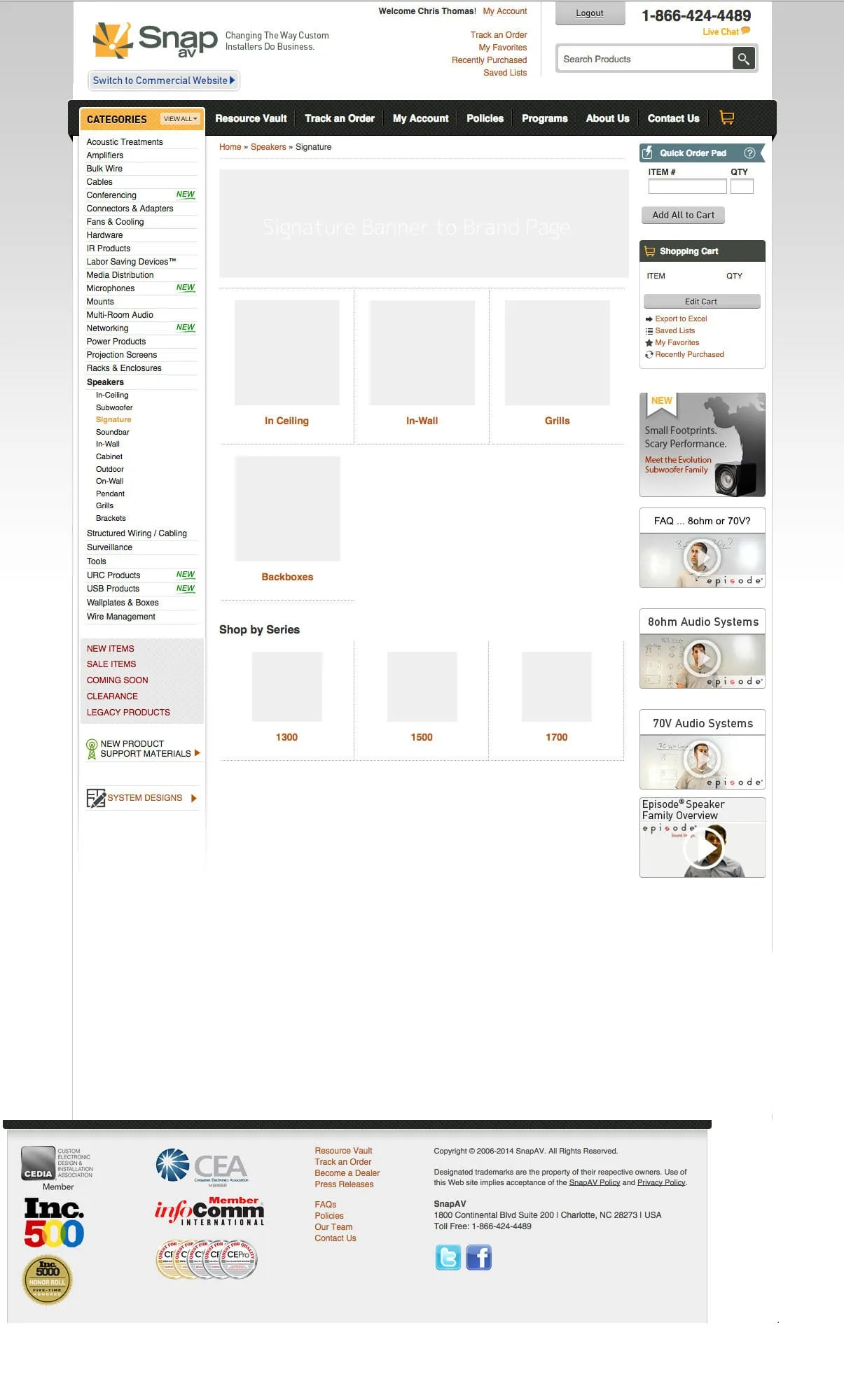
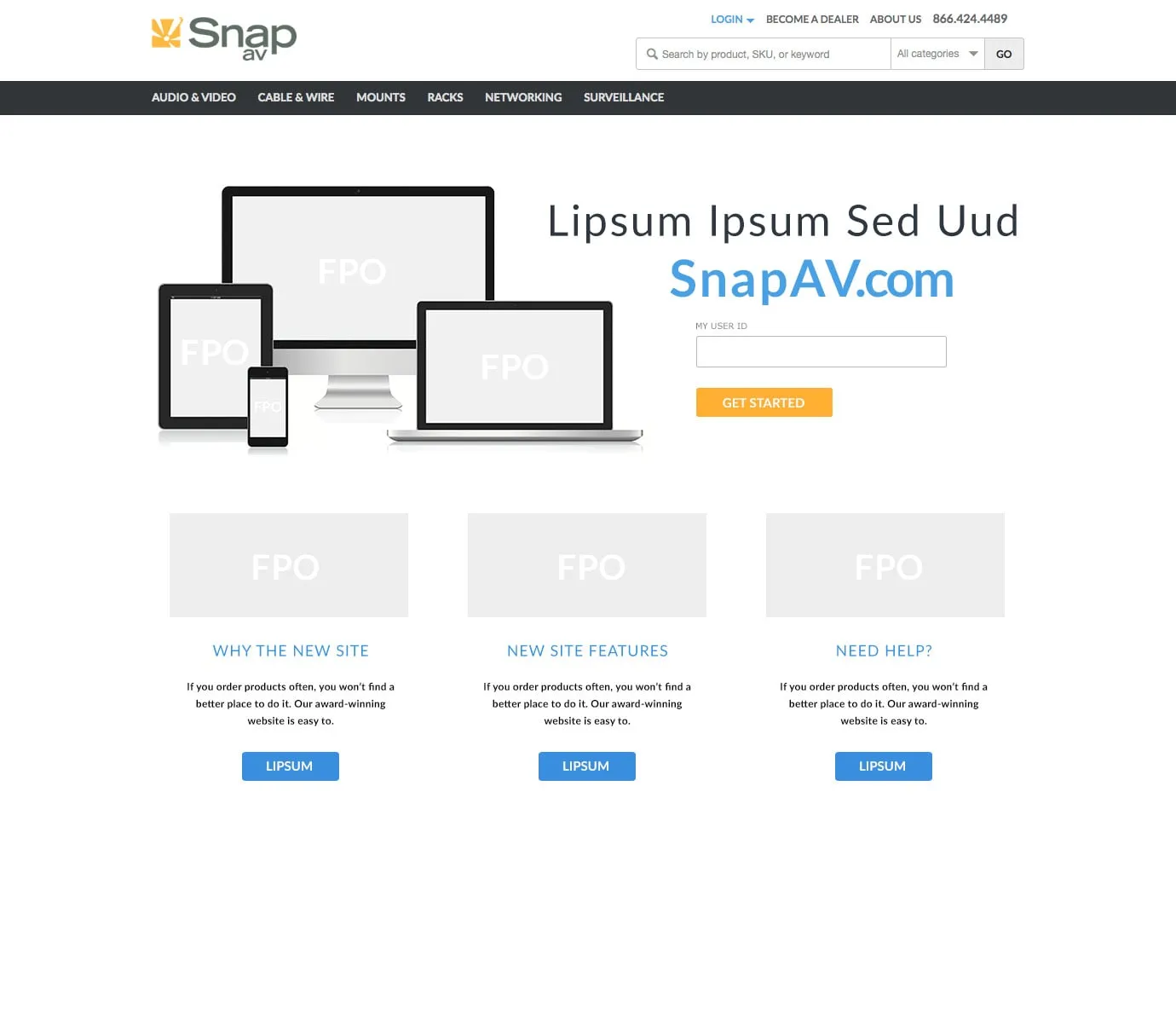
SnapAV’s e-commerce platform had no consistent design system. Layouts were inconsistent, navigation was unclear, and sign-in, partner registration, and content structure created friction that hurt engagement and usability.
My role
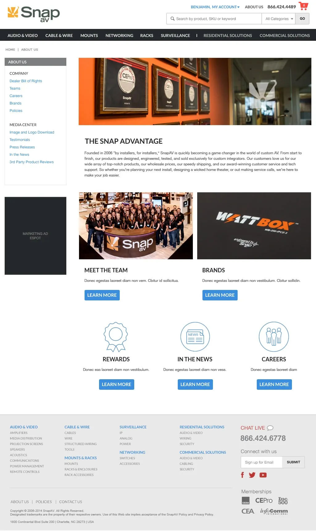
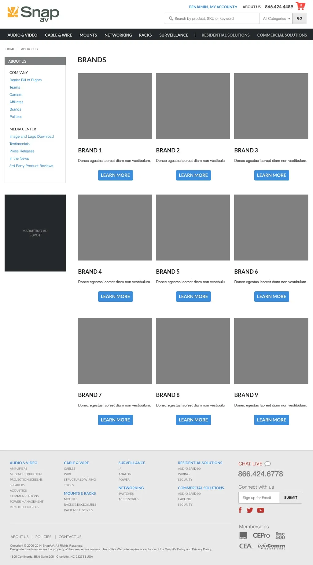
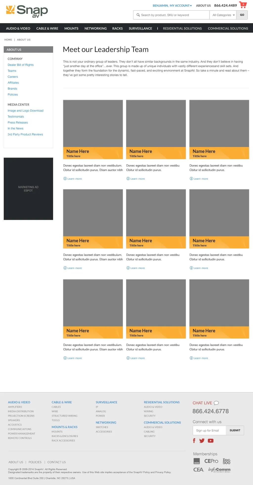
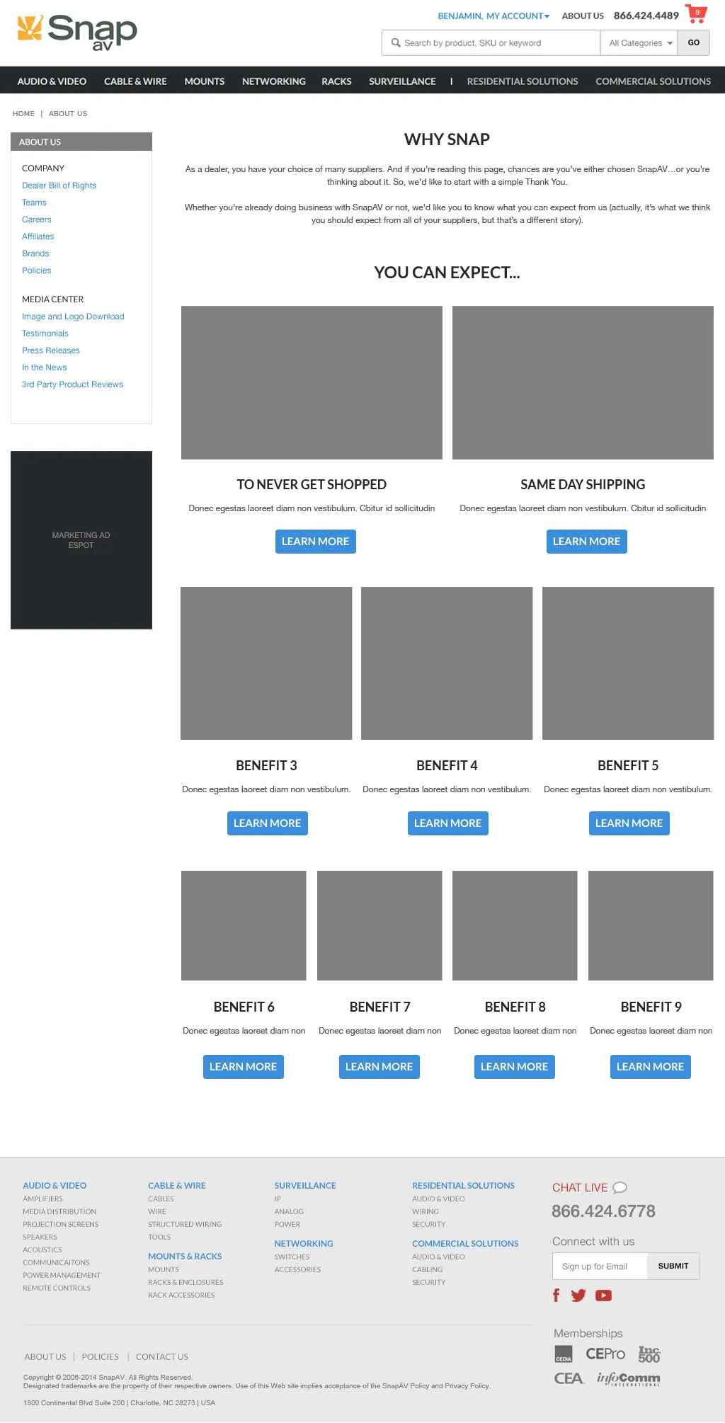
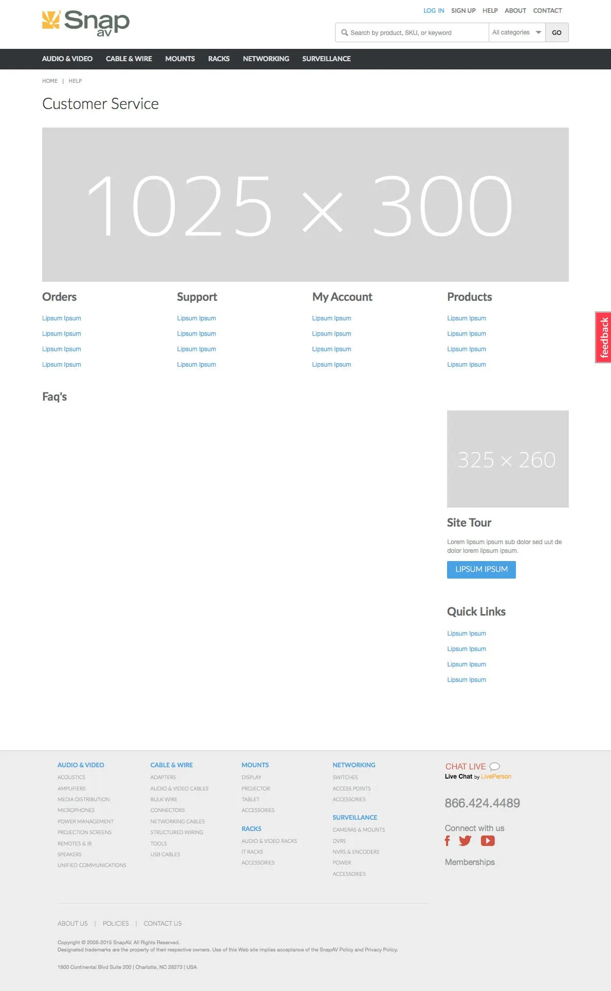
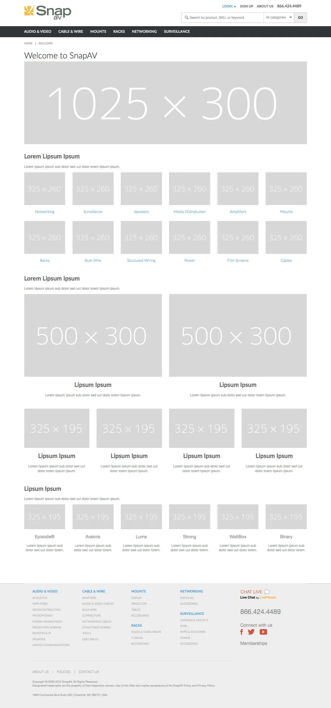
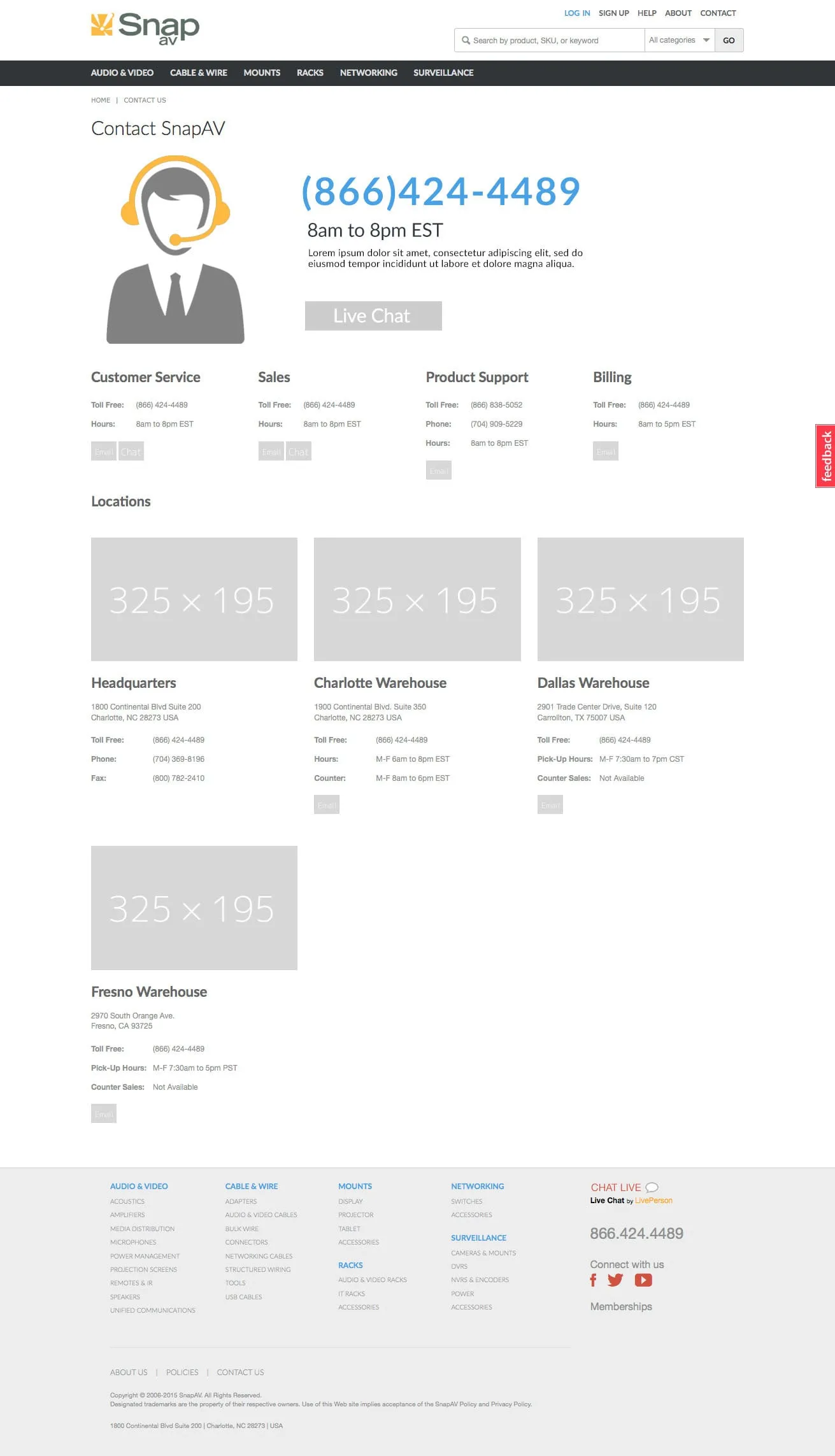
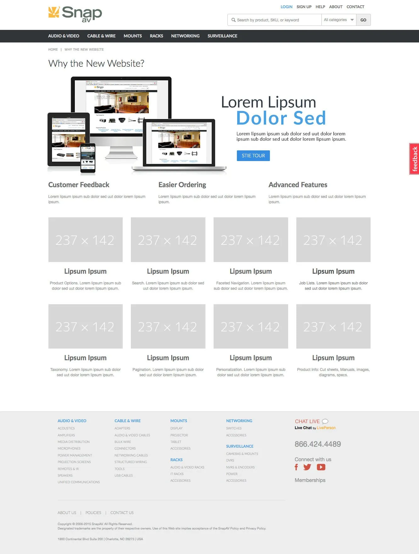
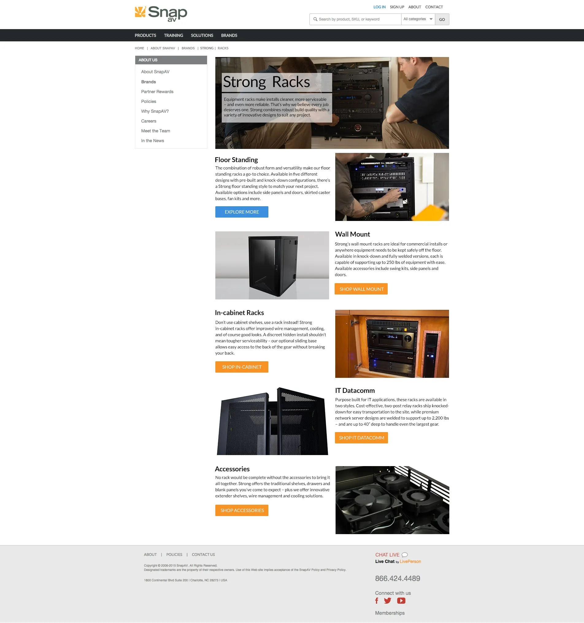
Working with UX designers, contractors, and internal teams, I helped define layout structures, banner sizes, iconography, spacing, and navigation patterns, and created wireframes and high-fidelity mockups.
The approach
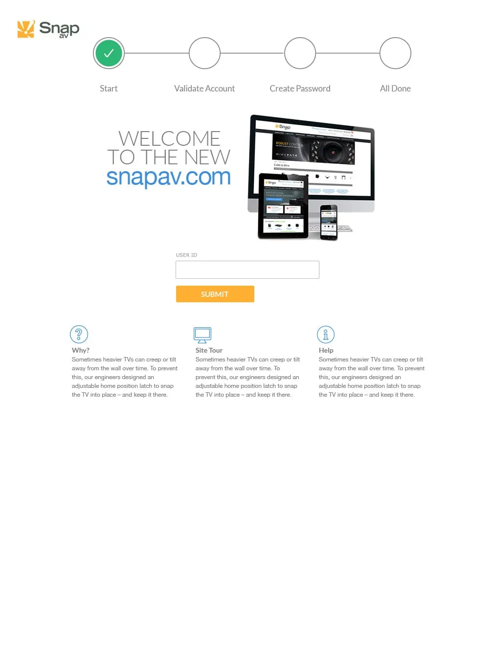
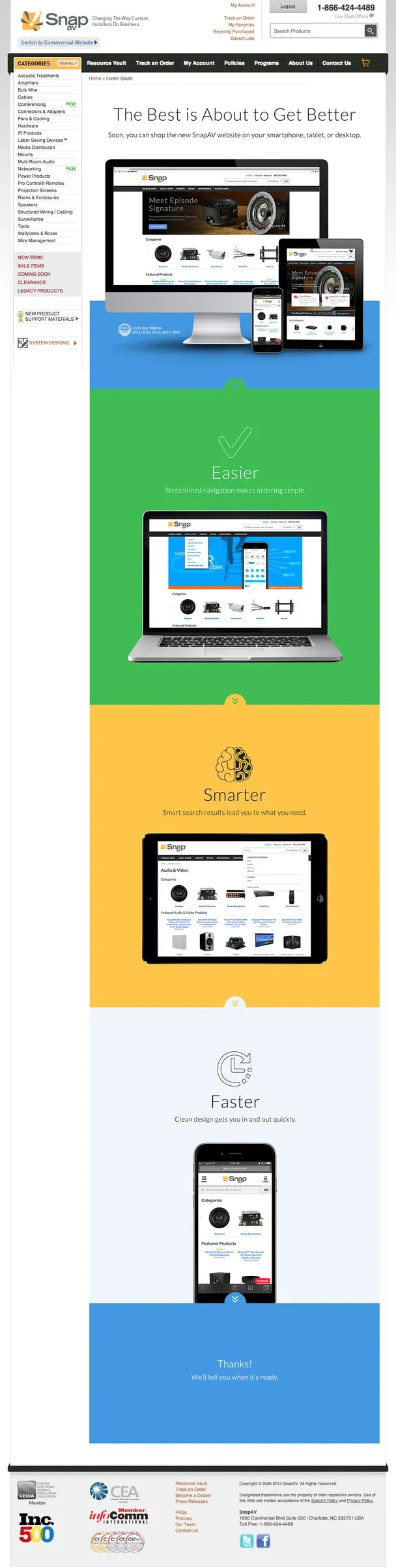
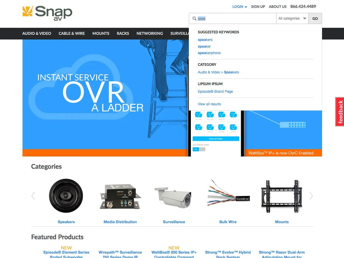
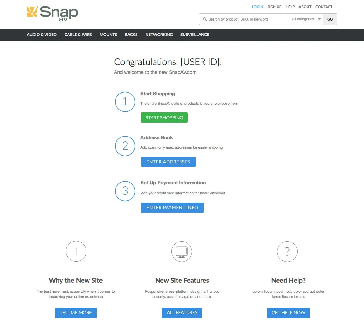
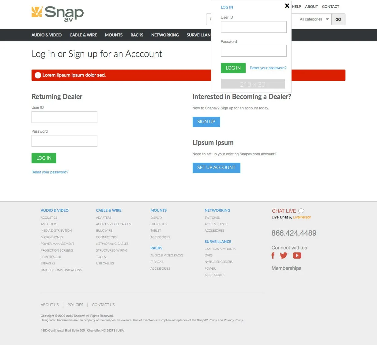
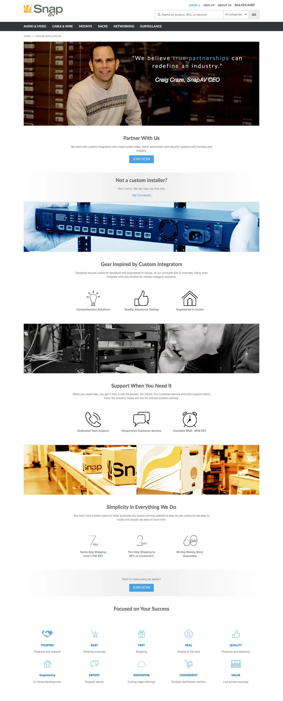
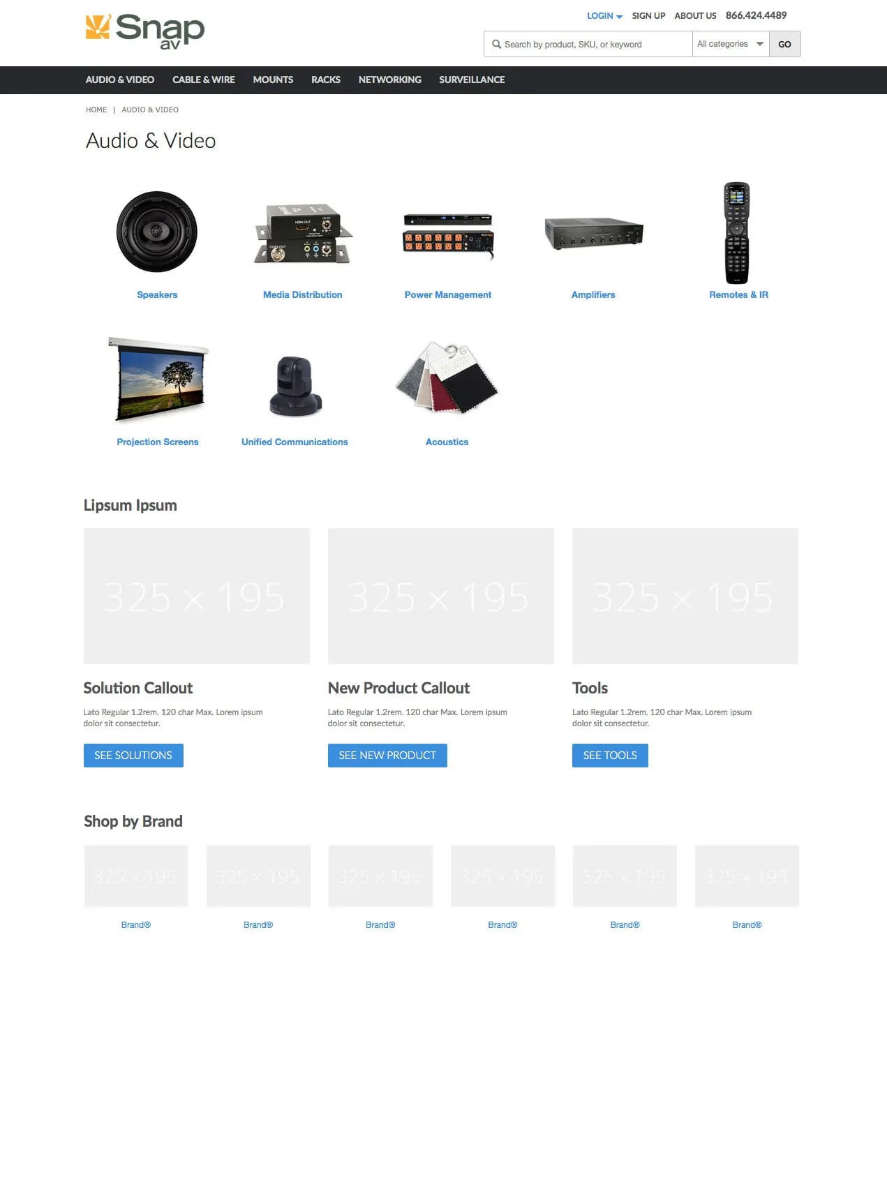
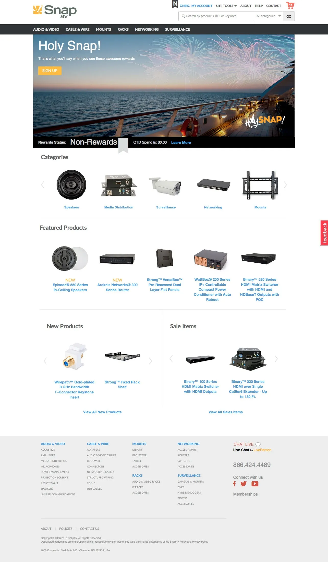
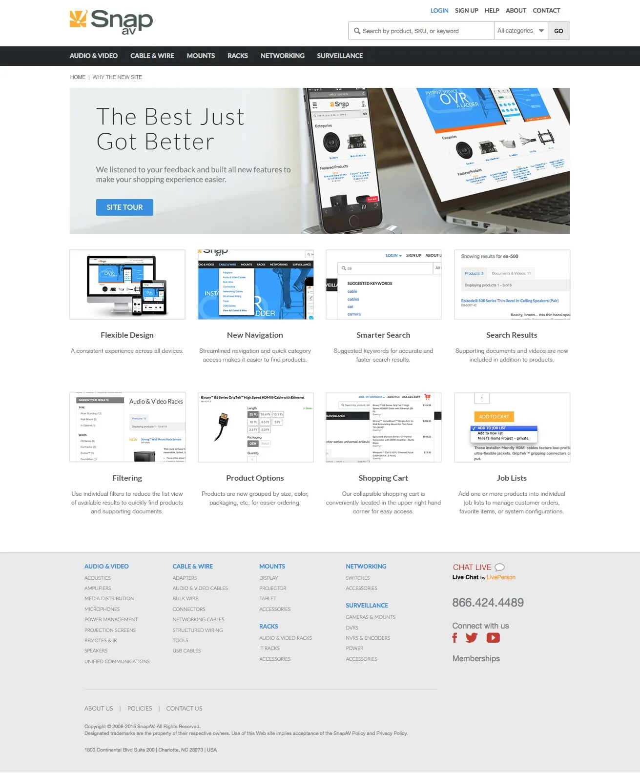
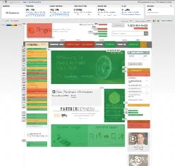
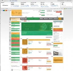
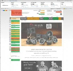
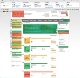
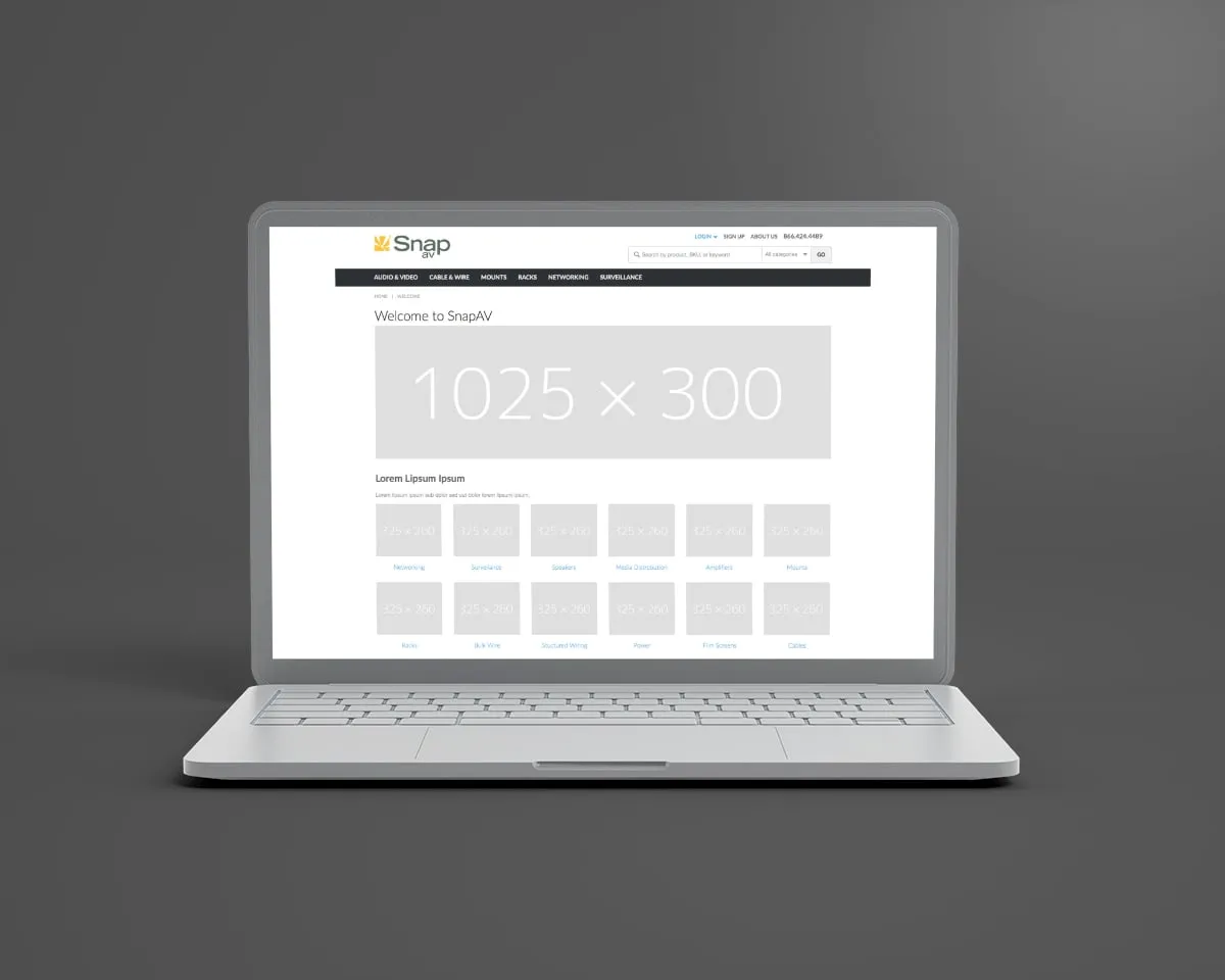
I designed in Adobe XD, Photoshop, and Illustrator, refining the sign-in flow, partner registration, and navigation, and focusing on typography, color, and button styles for accessibility, readability, and a cohesive brand. A key piece was structuring the homepage with a responsive column and banner system, so banners resized as the layout adapted to mobile — keeping promotions and key products visible to dealers on every screen size.
The result
The design system turned the website into a cohesive, user-friendly platform with responsive layouts, clear navigation, and accessible type and color. The scalable framework improved dealer engagement and product visibility and set the foundation for future growth.
The work
 (opens larger)
 (opens larger)
 (opens larger)
 (opens larger)
 (opens larger)
 (opens larger)
 (opens larger)
 (opens larger)
 (opens larger)
 (opens larger)
 (opens larger)
 (opens larger)
 (opens larger)
 (opens larger)
 (opens larger)
 (opens larger)
 (opens larger)
 (opens larger)
 (opens larger)
 (opens larger)
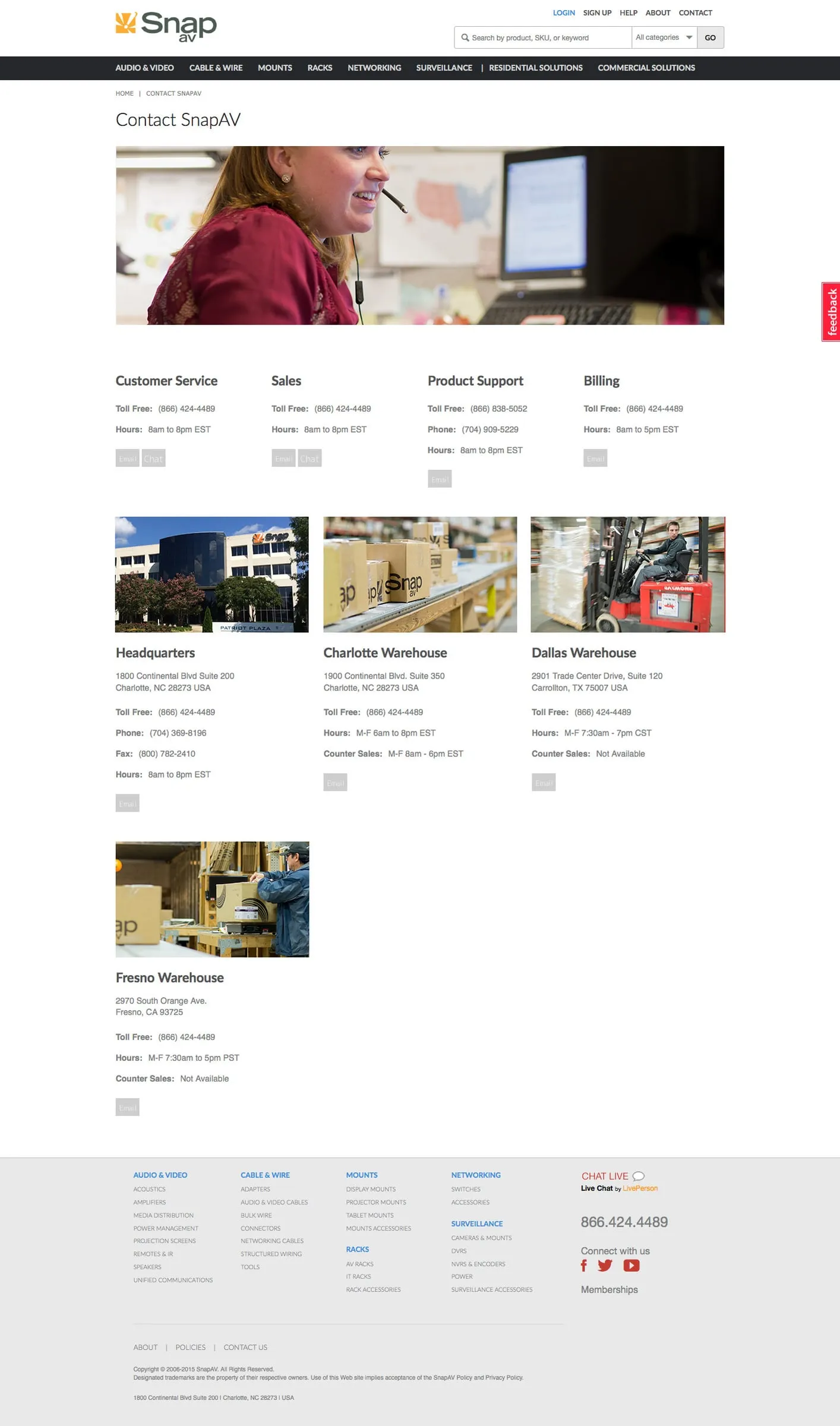 (opens larger)
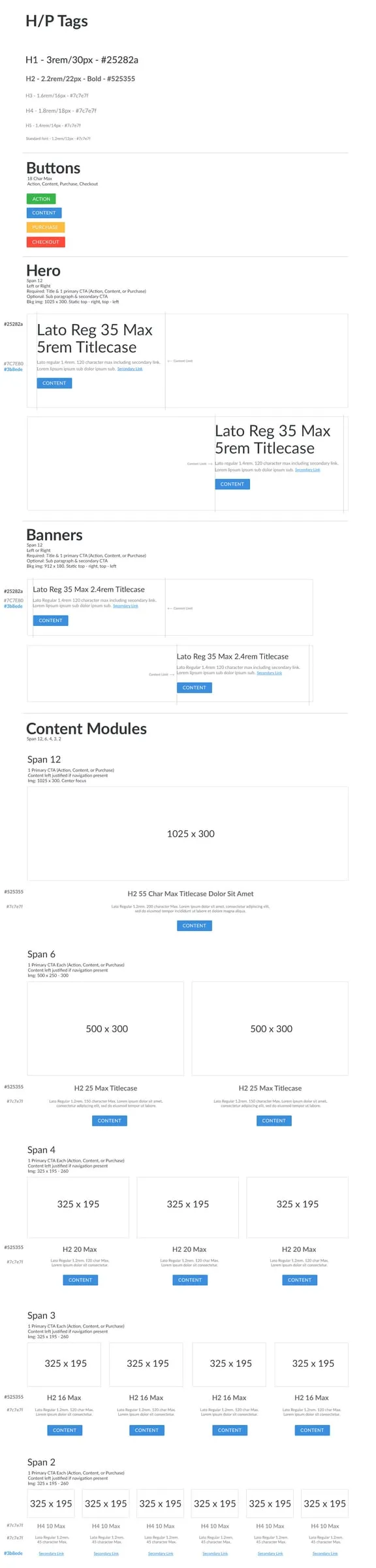 (opens larger)
 (opens larger)
 (opens larger)
 (opens larger)
 (opens larger)
 (opens larger)
 (opens larger)
 (opens larger)
 (opens larger)