AI DAM Librarian
UX Designer
Self-initiated concept
Summary
Health education campaigns on TV screens, flyers, and posters across BlueCross BlueShield of South Carolina, with each design rebranded automatically for four companies.
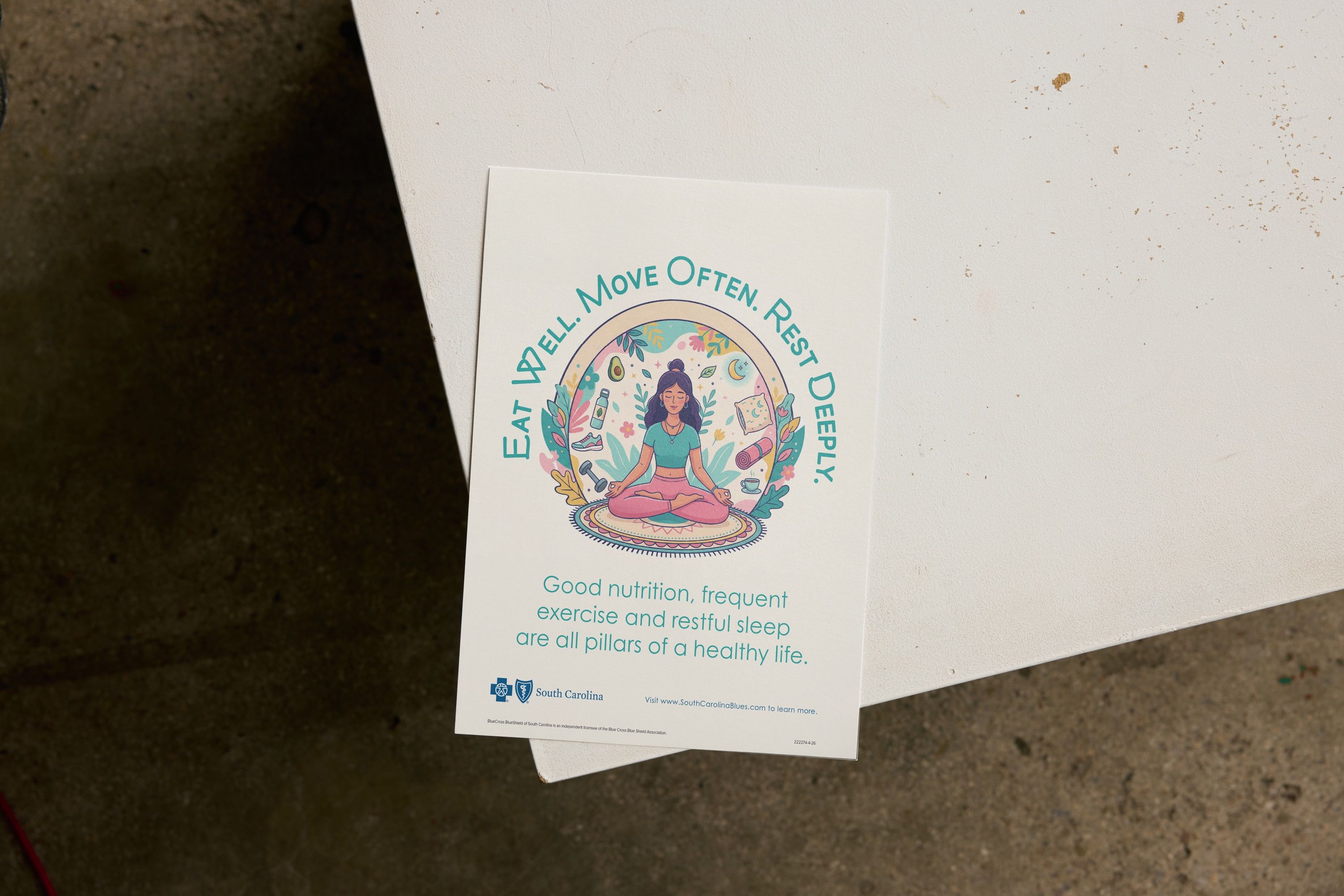
Corporate Marketing Communications at BlueCross BlueShield of South Carolina runs a monthly health campaign. Each one takes a single health topic and turns it into resources that teach members how to stay healthier. Healthier members also mean fewer claims.
Every campaign has to work for four companies: BlueCross BlueShield of South Carolina, BlueChoice HealthPlan, National Alliance, and PAI. Each has its own logo and branding. The same message also has to work on a TV screen across a waiting room, a flyer in someone’s hand, and a large poster on a bulletin board.
As art director, I created the look, the feel, and the messaging for two campaigns in 2026: healthy living, and tobacco and lung cancer. I designed every piece. I also built the automated system that turned each finished design into a branded version for every company.
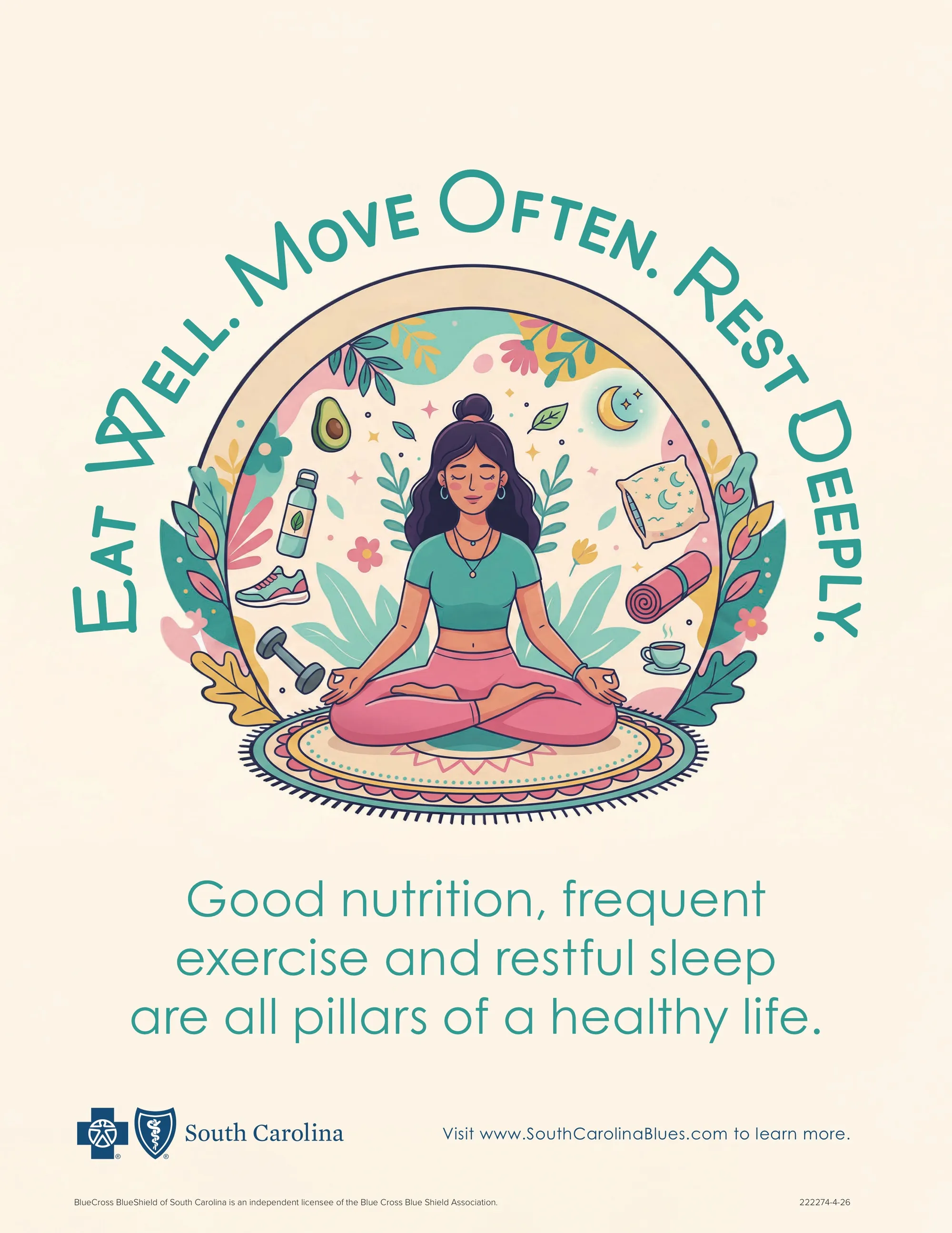
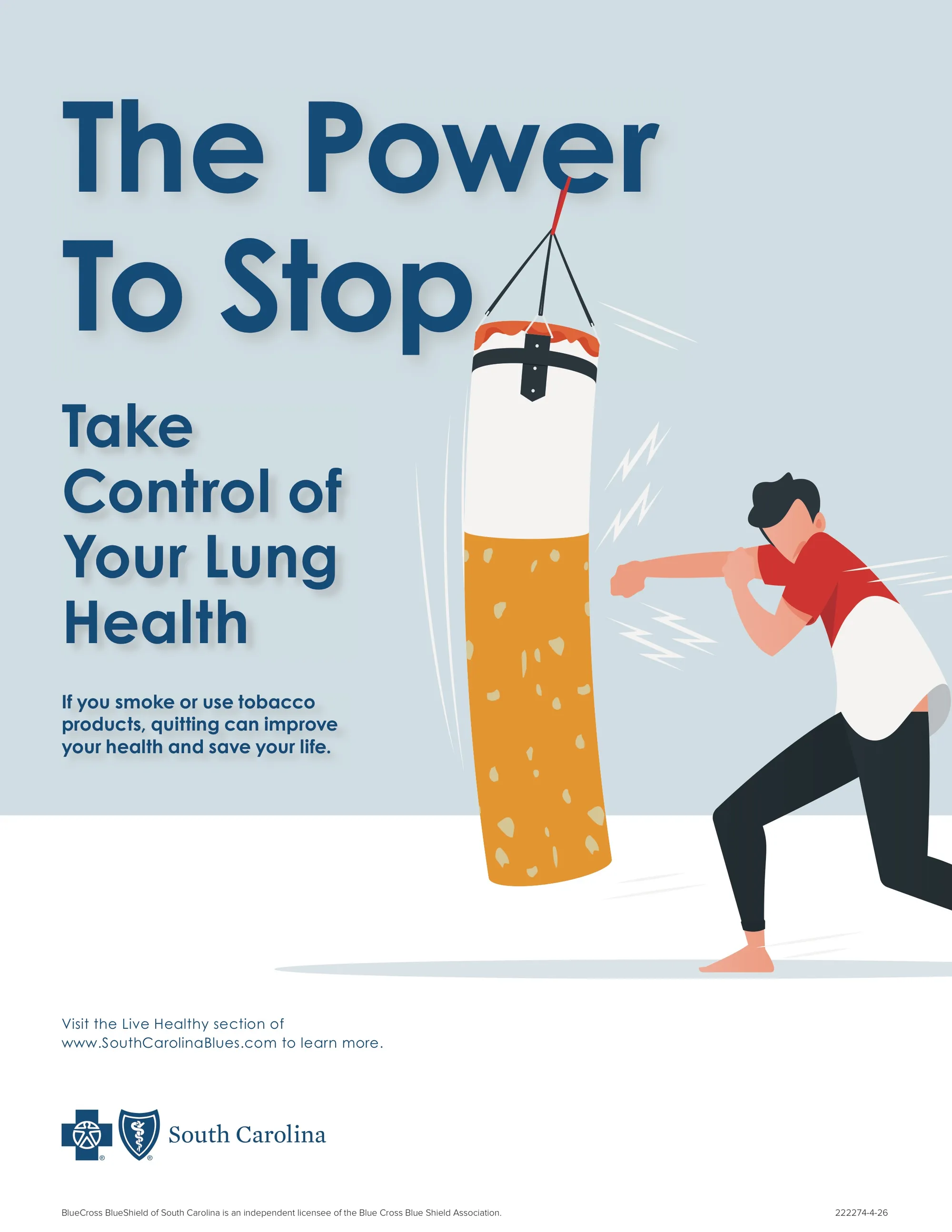
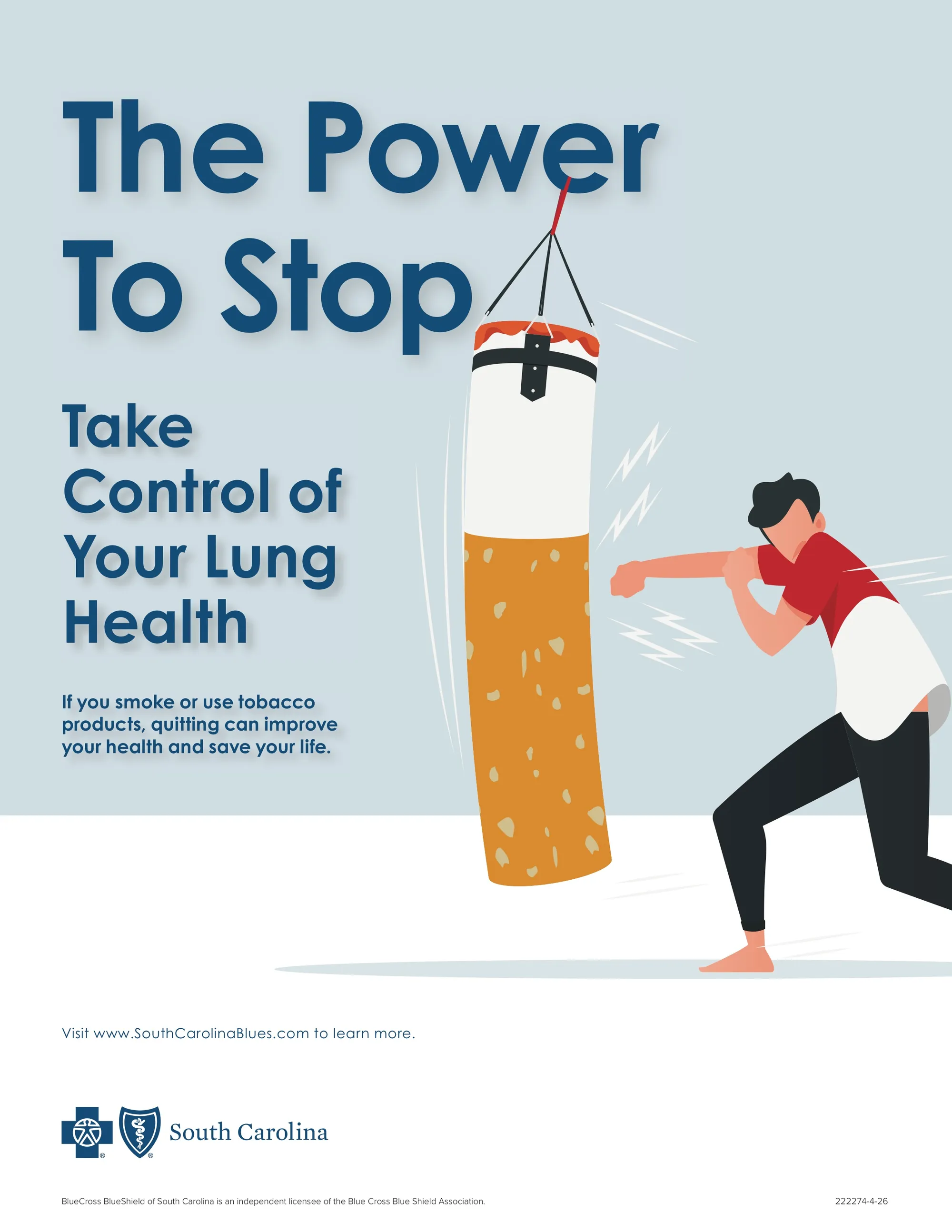
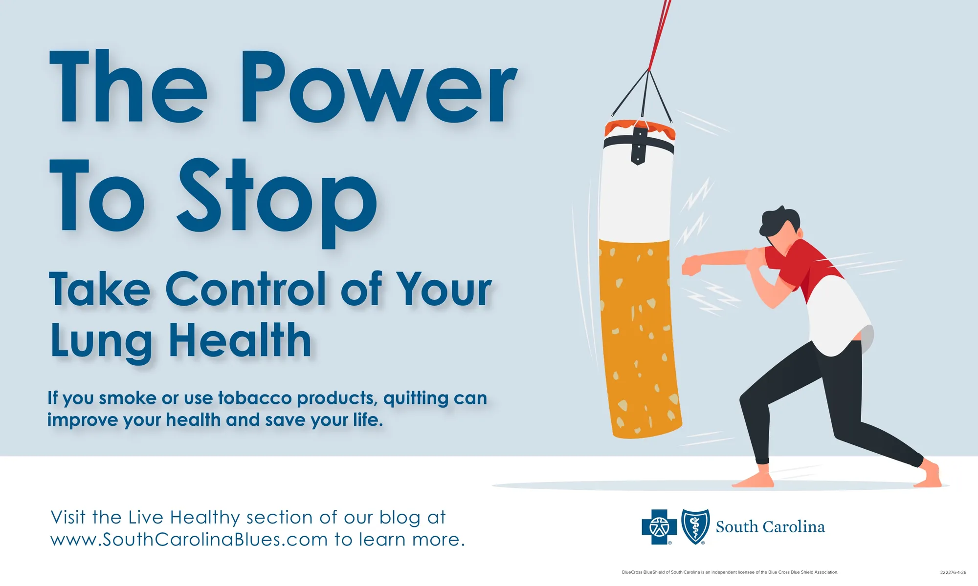
One clear idea per topic. For healthy living, the line “Eat Well. Move Often. Rest Deeply.” puts three habits into one easy rhythm, with a calm, warm look to match. For tobacco, “The Power To Stop” shows a man punching a giant cigarette like a punching bag, so quitting reads as strength, not loss.
Artwork made to fit. The tobacco illustration started as a stock illustration. I redrew and edited it heavily, simplifying it and changing it until it carried the idea on its own. The healthy living artwork started as AI-generated art. I refined and retouched it, reworked the details, and gave it the texture and look I was after.
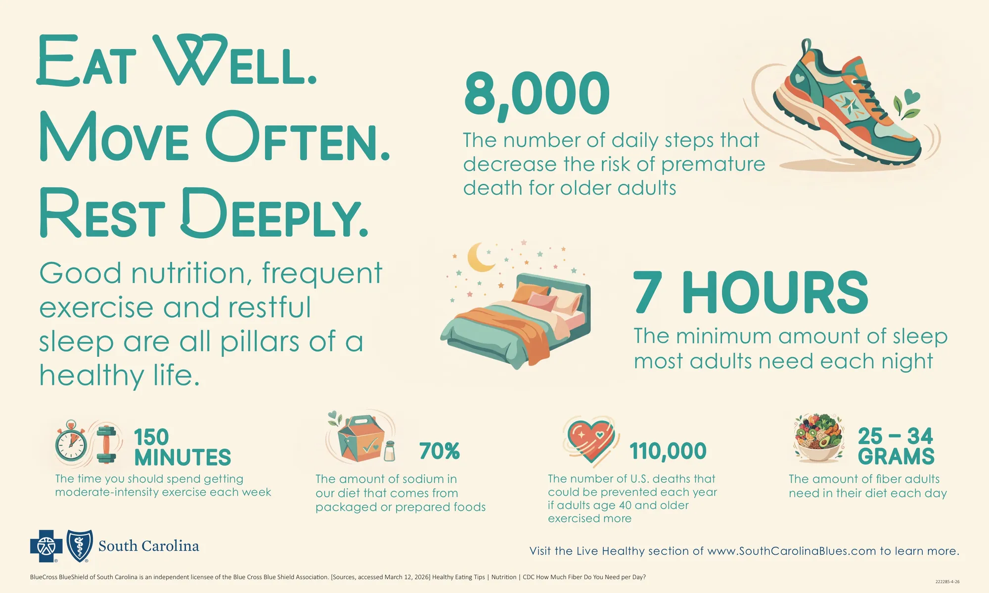
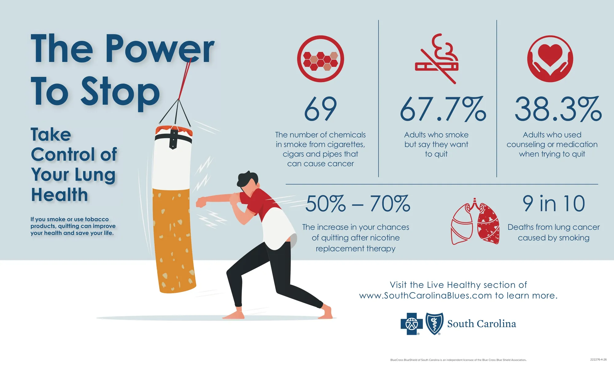
Facts you can read from across the room. The infographics turn the research into a few big numbers with simple icons. That way they work on a screen people walk past and as a poster on a bulletin board.
One design, every brand. Instead of rebuilding each piece by hand, I set up an automated system. It takes the final design and produces a version for each company, swapping in the right logo every time. That’s how each campaign became 18 pieces.
Everywhere people gather. The pieces ran on TV screens networked across our buildings, in waiting rooms and lunch rooms. Flyers went out to departments across the company and were also enlarged into posters. The infographics were printed as large posters for the bulletin boards where most departments post news.
Two campaigns, each with 18 branded pieces, reached waiting rooms, lunch rooms, and bulletin boards across BlueCross BlueShield of South Carolina. Each one carried a single message, shown the same way on every screen, flyer, and poster, for all four companies.
 (opens larger)
 (opens larger)
 (opens larger)
 (opens larger)
 (opens larger)
 (opens larger)