Luma Packaging Redesign
Summary
Asked for plain brown boxes, I proposed and tested a cost-effective blue packaging system that made Luma stand out on shelves and became the standard for other Snap One brands.
- Client
- Snap One
- My role
- Packaging Designer
Results
- Packaging system adopted as the standard for many other Snap One brands
- Delivered within budget using a two-color print
The problem
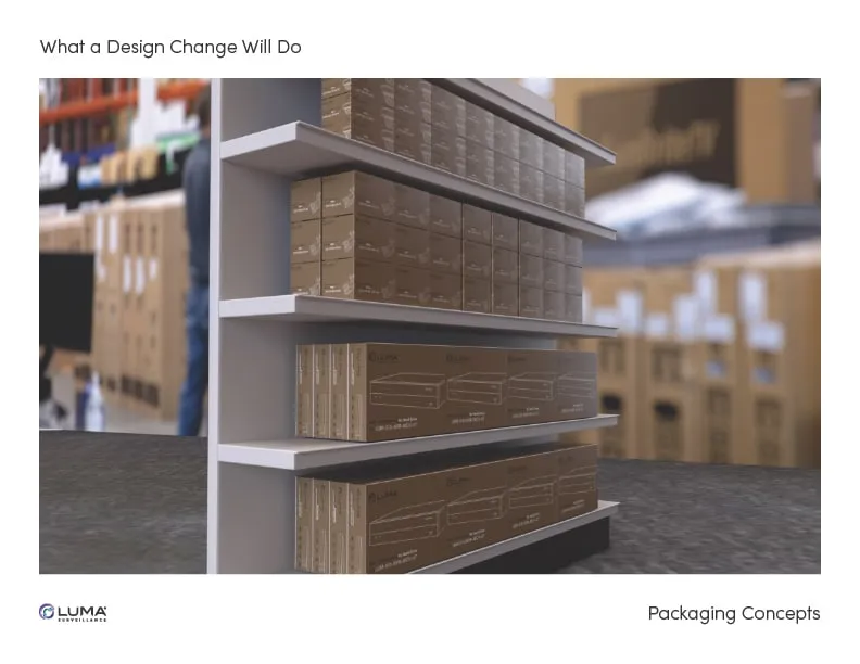
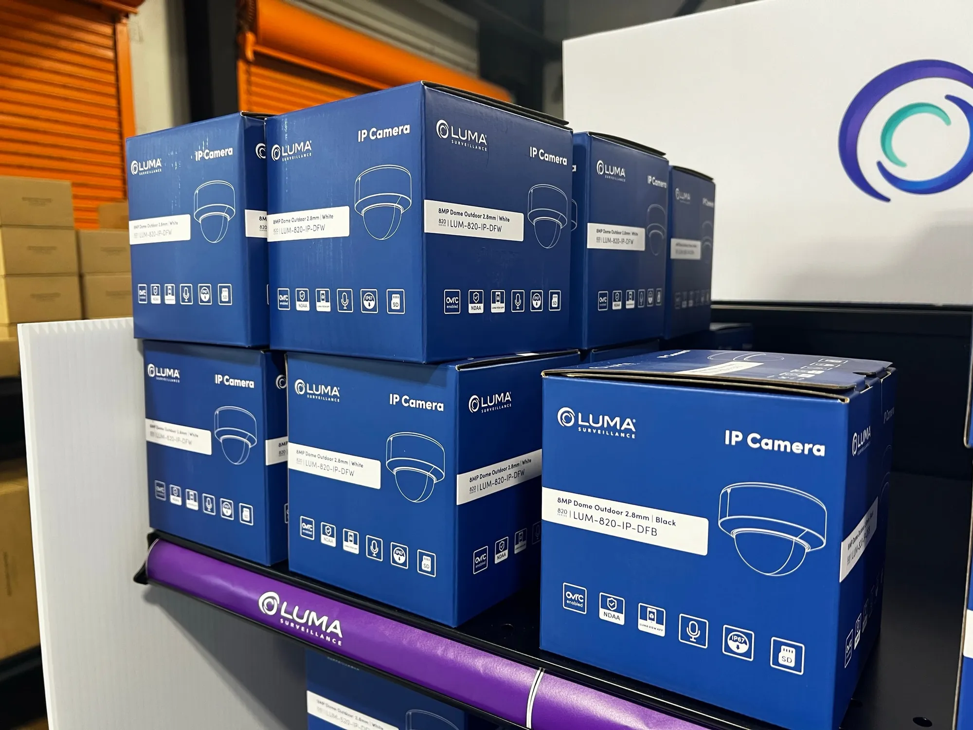
I was originally asked to design simple brown boxes for Luma’s packaging. I could see that approach would weaken the brand’s identity and impact — especially as Snap One opened local stores where Luma would sit on shelves next to competitors.
My role
I led the packaging design, from competitor research and concepts through 3D renderings, augmented reality testing, and the final design systems for cameras and NVRs.
The approach
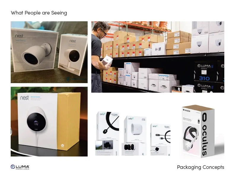
Competitor research. I analyzed competitor packaging, including boxes with printed sleeves and images, to see how Luma could stand apart on store shelves.
Designs to explore. I mocked up blue-and-white concepts to find cost-saving options that still improved brand visibility, and experimented with full-color sleeves that fit over brown boxes — a flexible, cost-effective way to tailor packaging for different products.
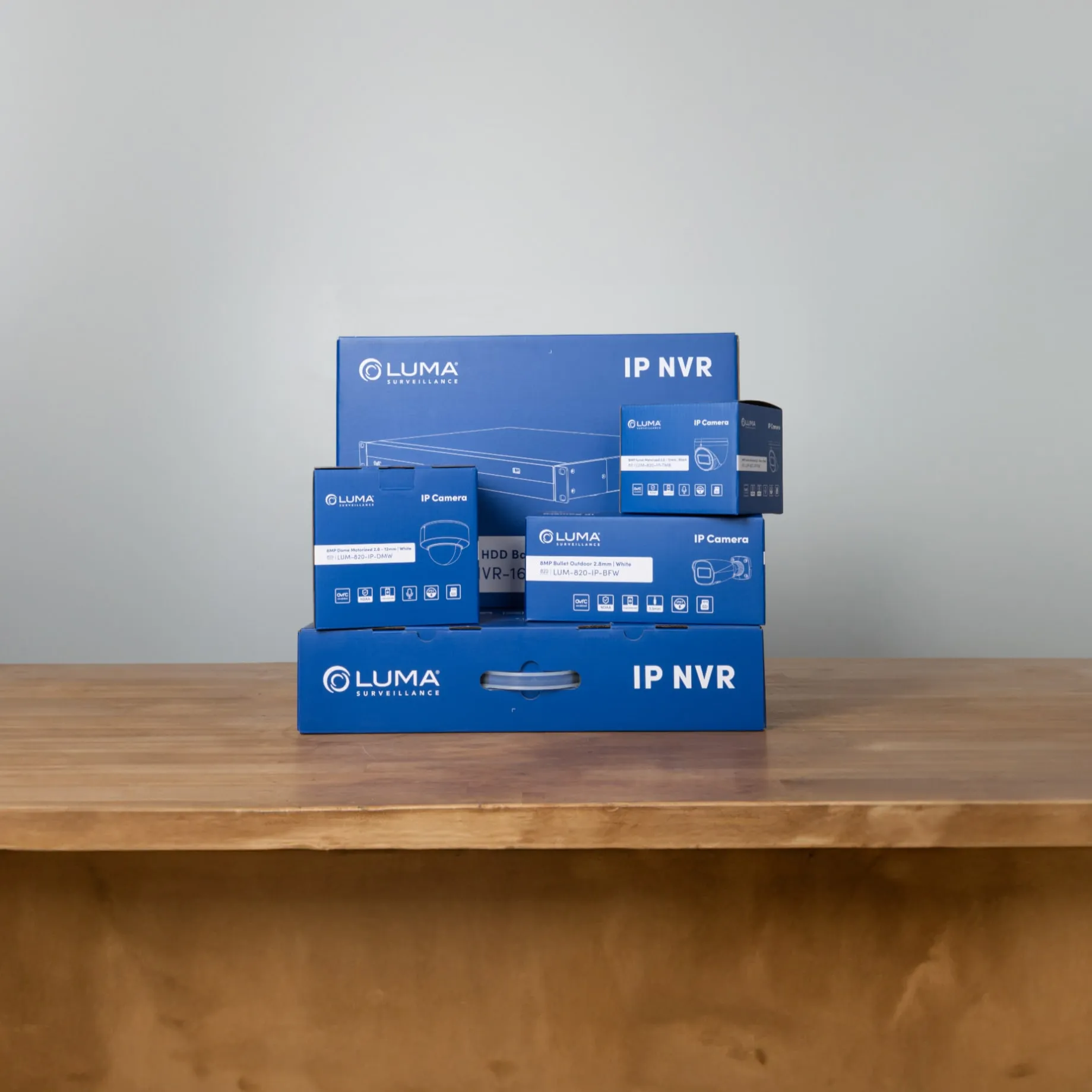
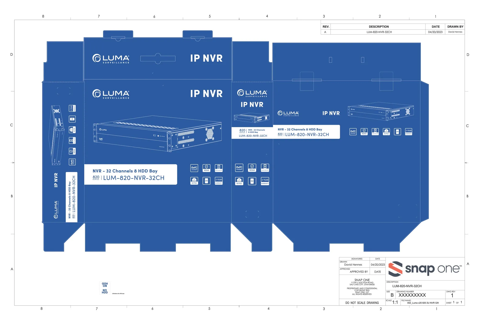
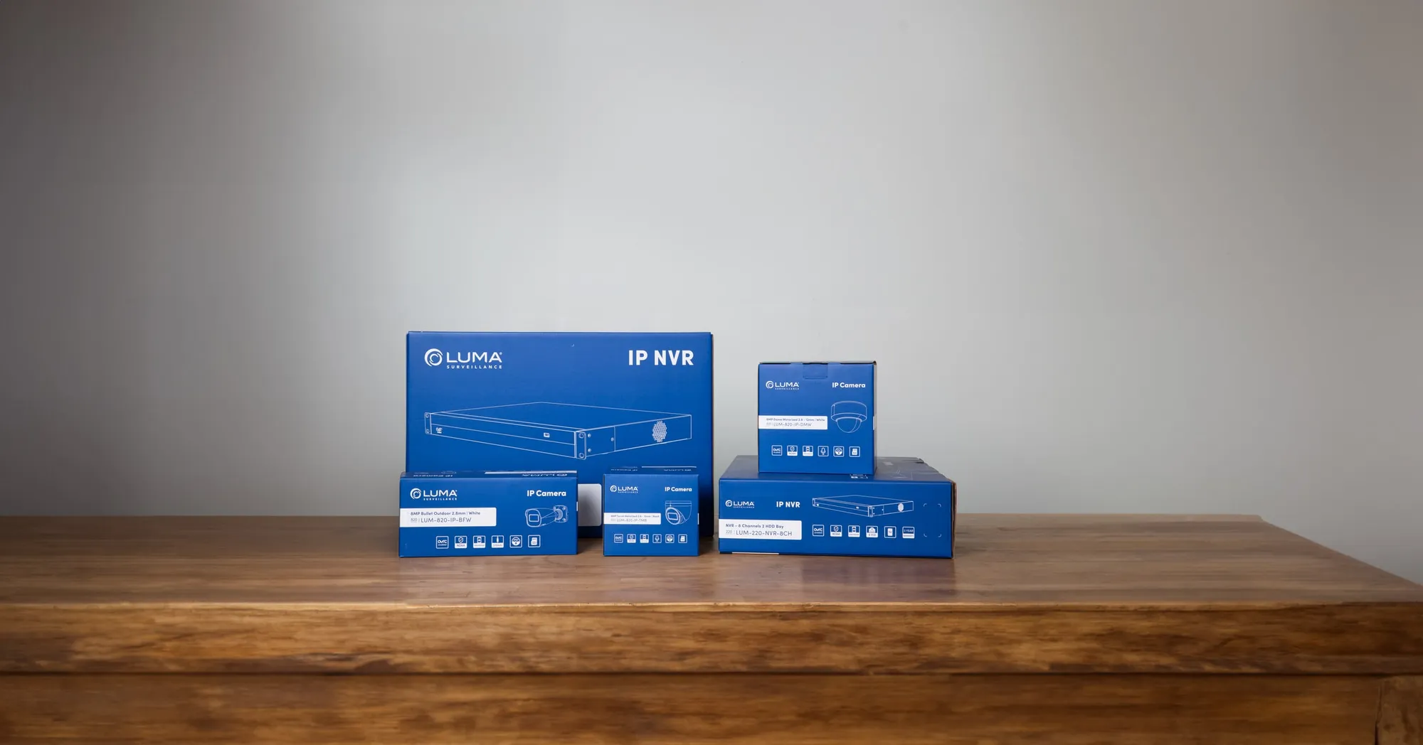
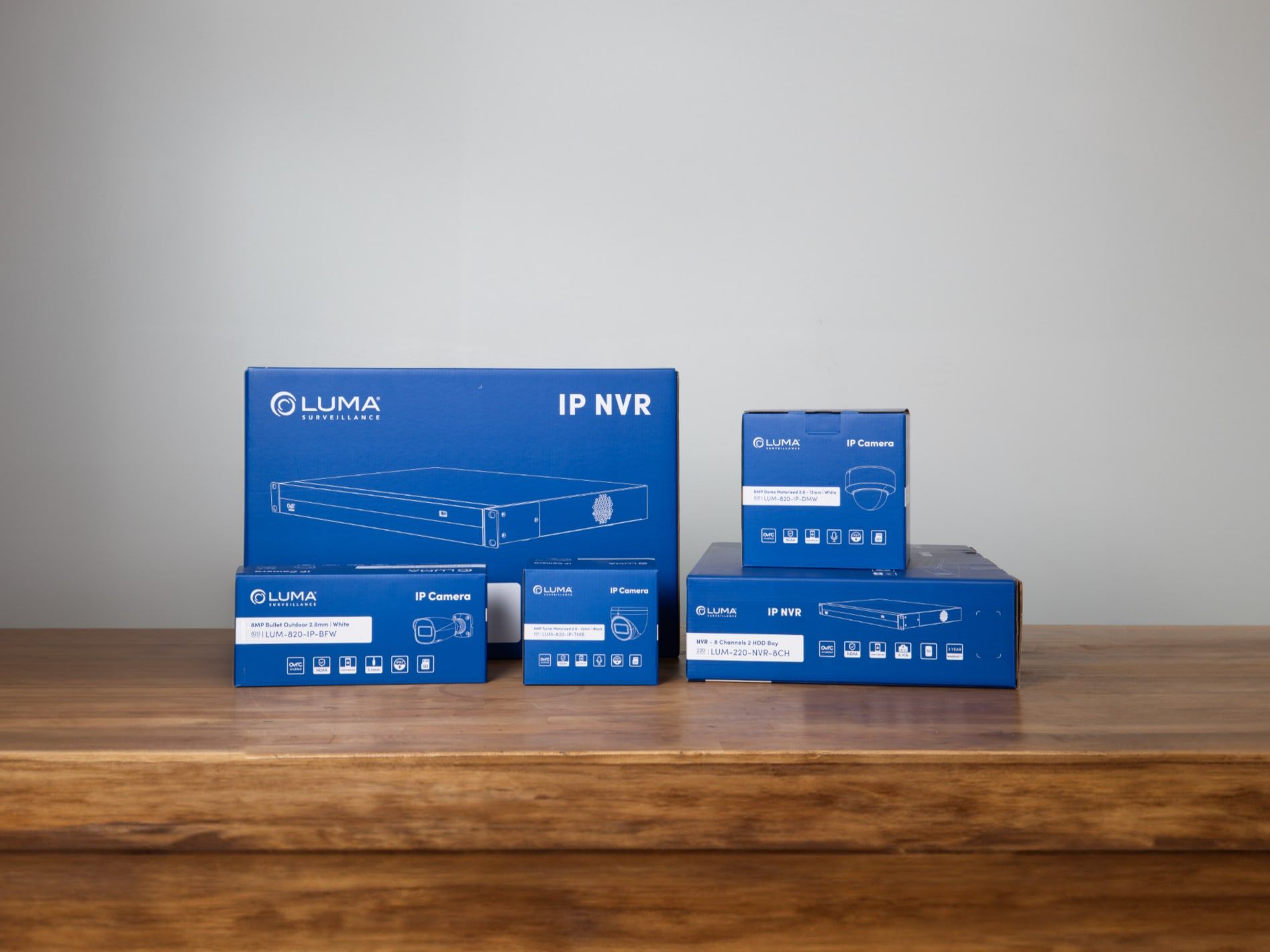
The blue box. I developed a blue-and-white line art design that helps dealers identify products at a glance while keeping costs down with only two colors.
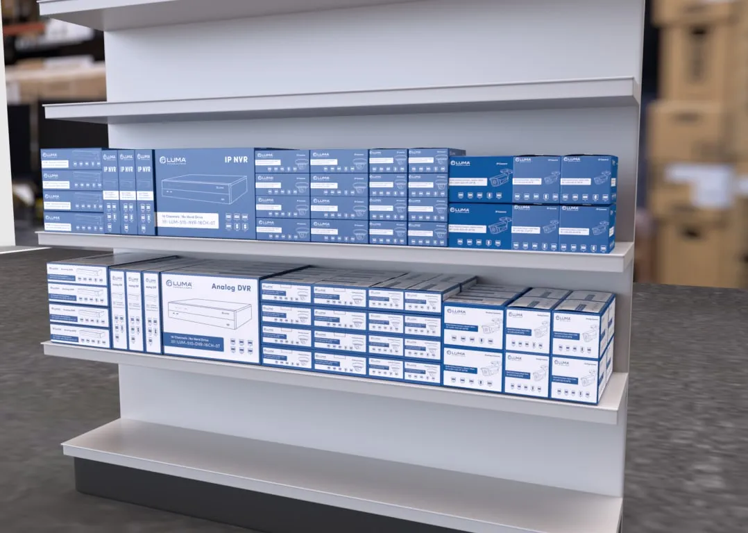
Augmented reality testing. To save money on print samples, we used AR to place the packaging designs virtually in test stores. Product managers and dealers across the United States reviewed them and gave feedback without physical prototypes, and we refined the design in real time.
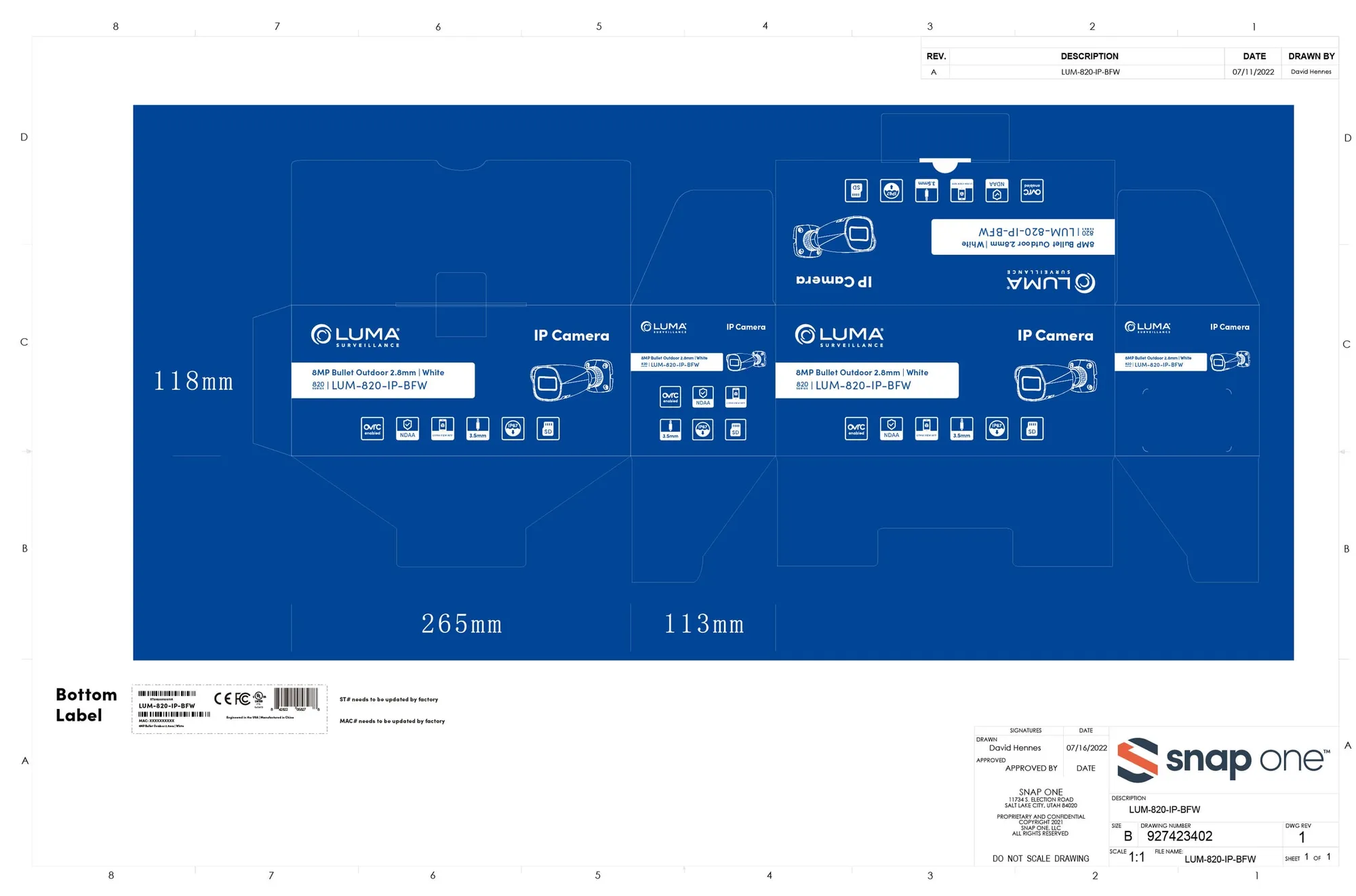
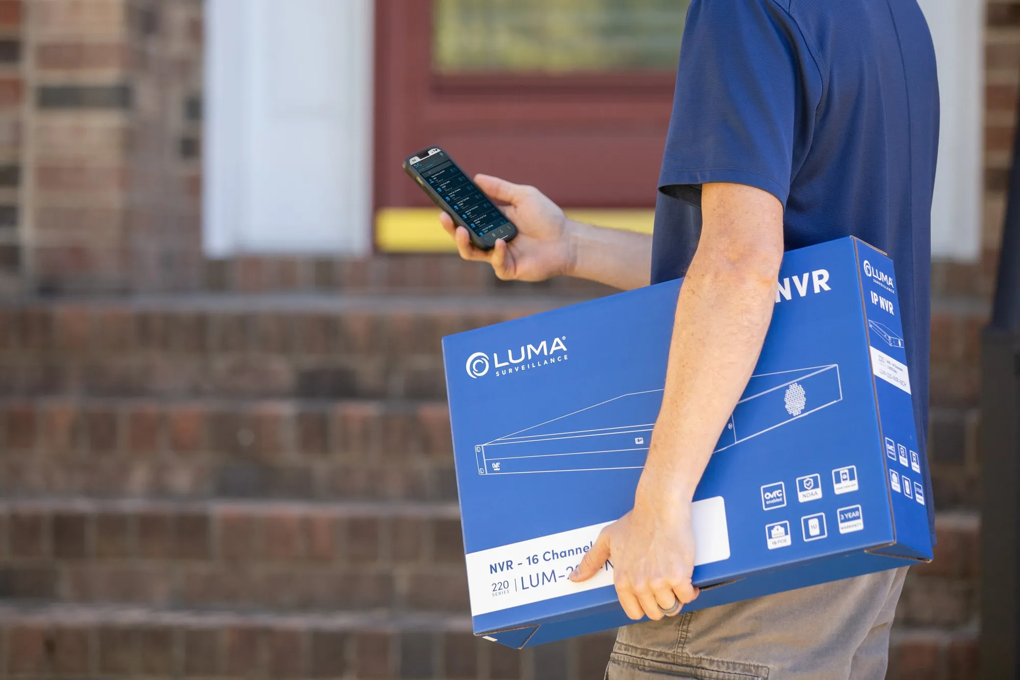
Design systems for NVRs and cameras. I built flexible systems to handle different product sizes, features, and model numbers — modular icons, uniform layouts, and consistent line drawings — so every variant looks like part of one family.
The result
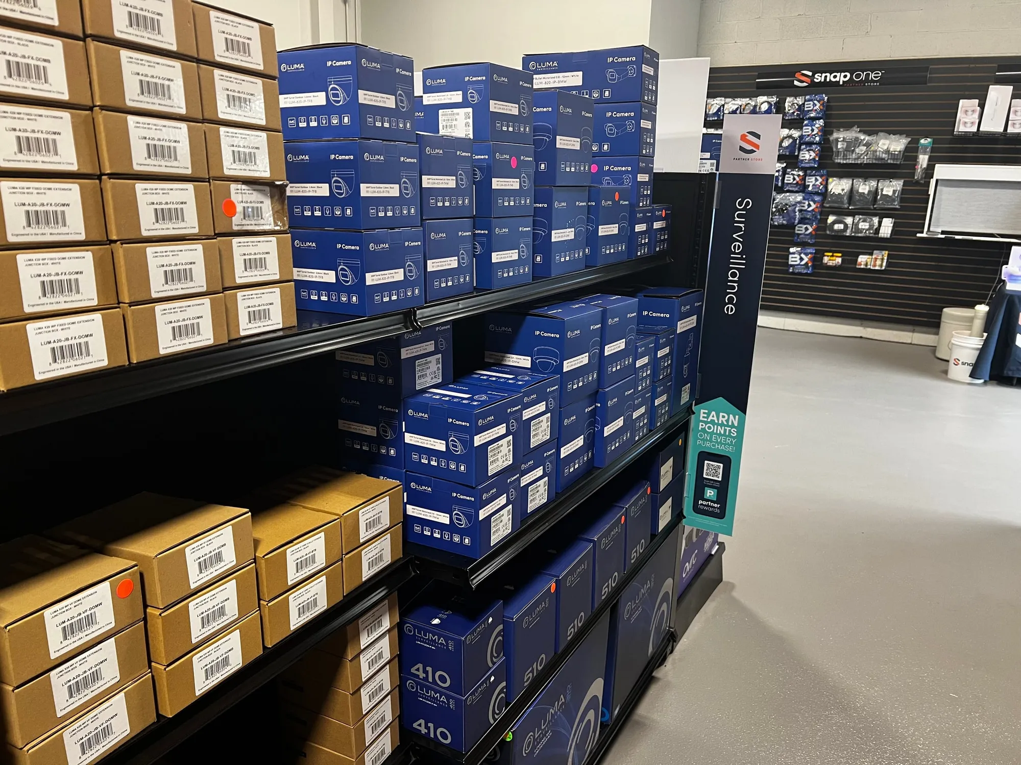
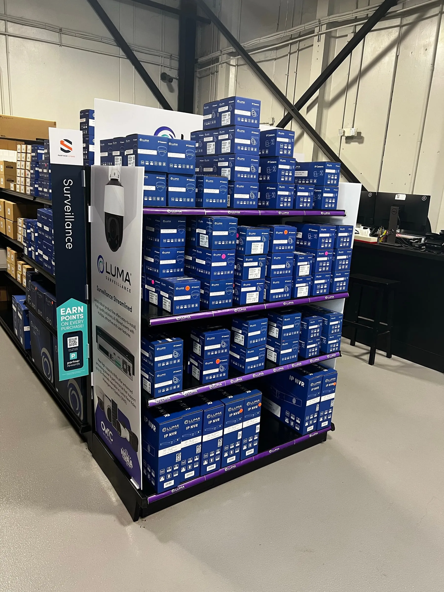
The redesigned packaging made the product line far more visible in local stores and easy for dealers to identify, understand, and tell apart. It worked seamlessly with local signage to create a unified display, and the project stayed within budget using a two-color scheme.
The Luma packaging was such a success that it became the standard for packaging across many other Snap One brands.