


Snap One Logo Rebrand
Summary
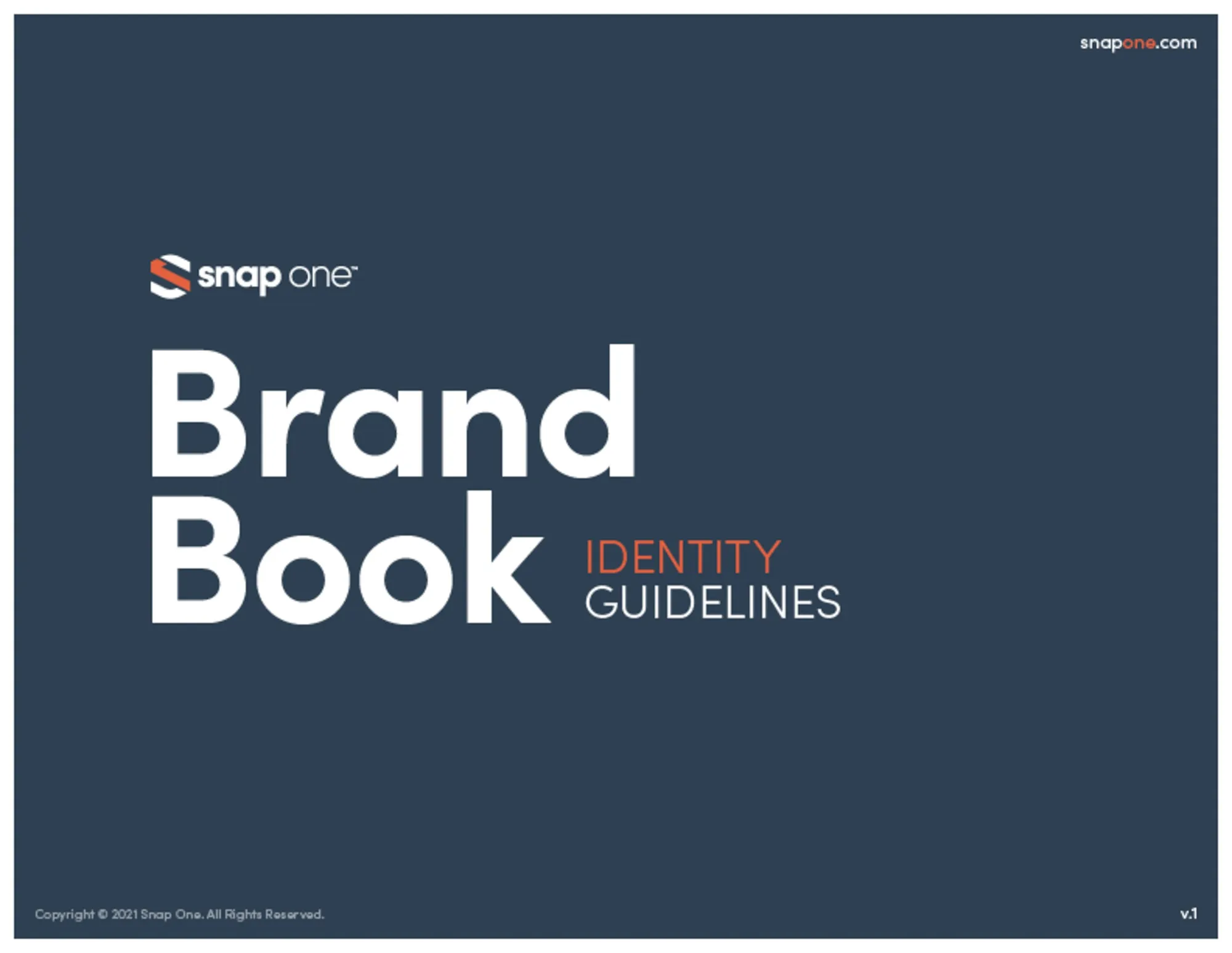
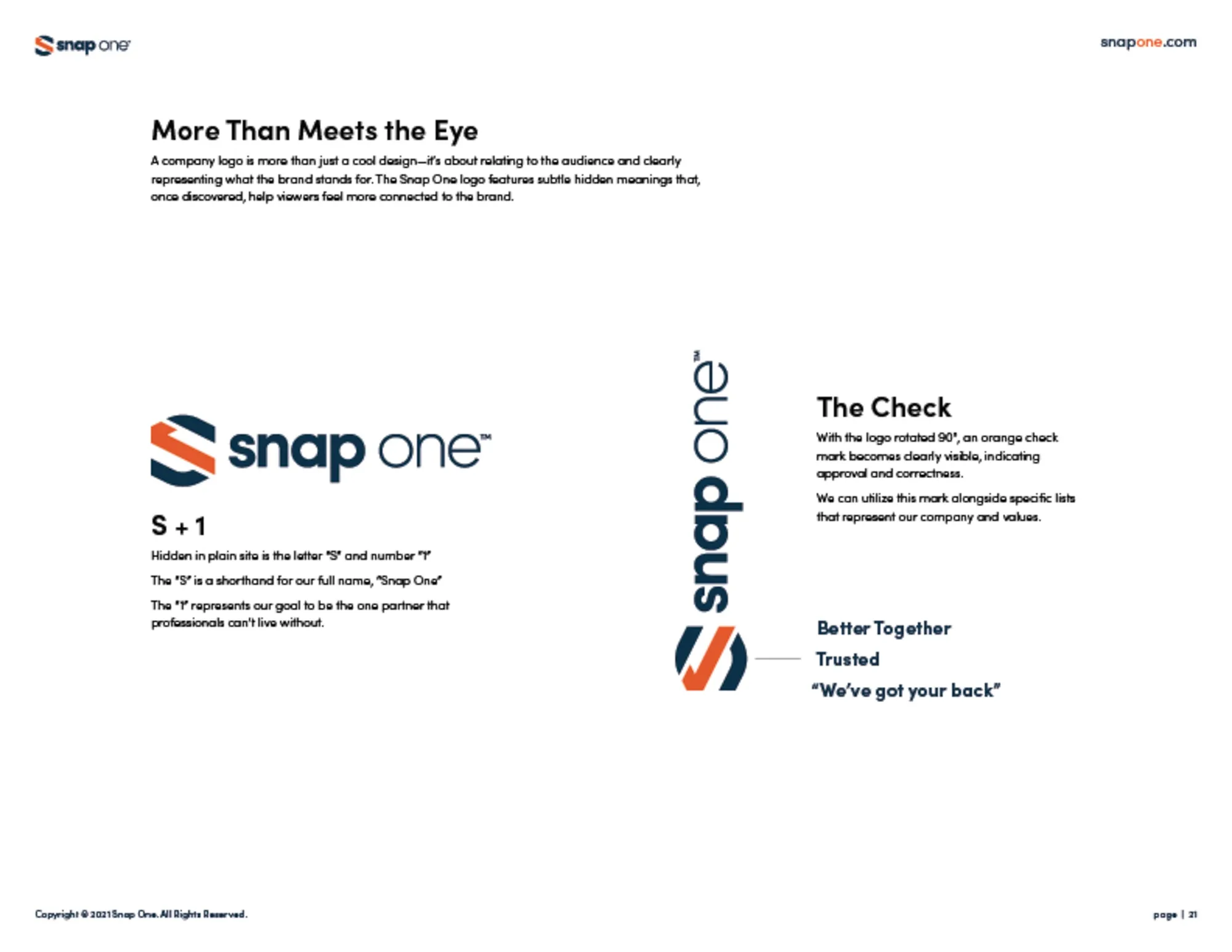
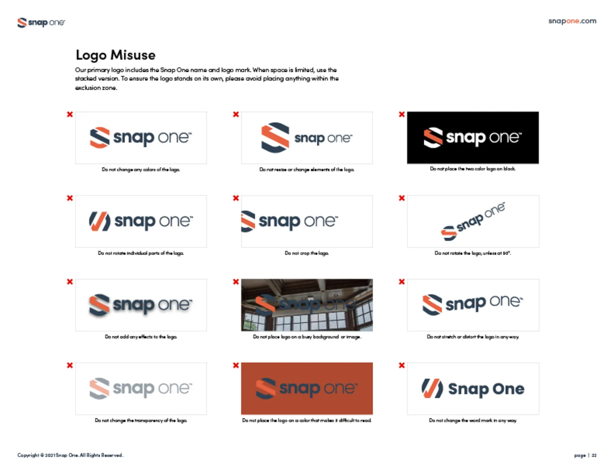
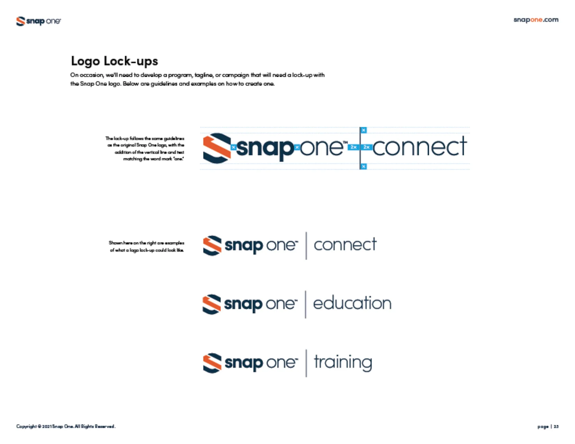
A new logo and brand book for Snap One, with guidelines for voice, logo use, color, type, icons, photography, and layout components.
- Client
- Snap One
- My role
- Brand Designer
The problem
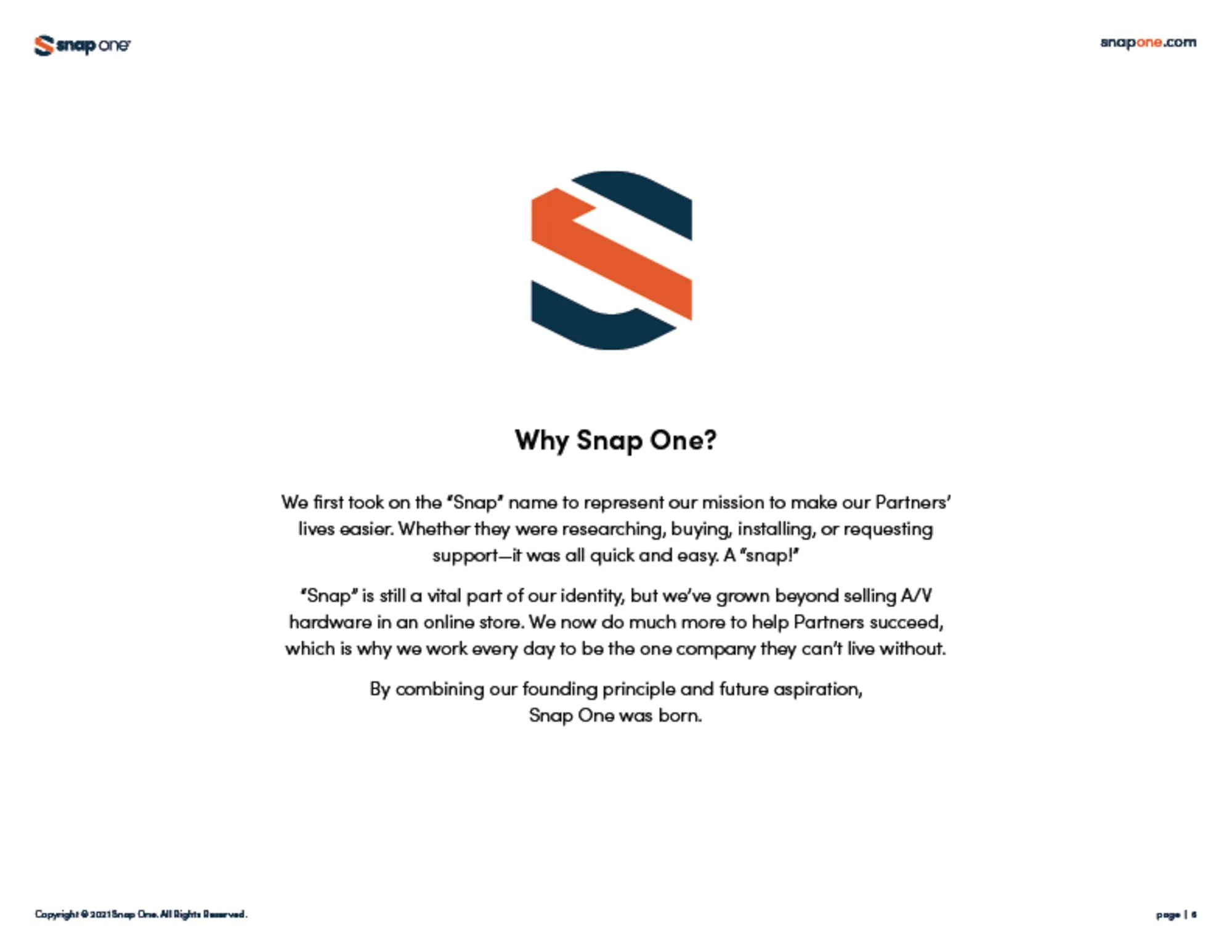
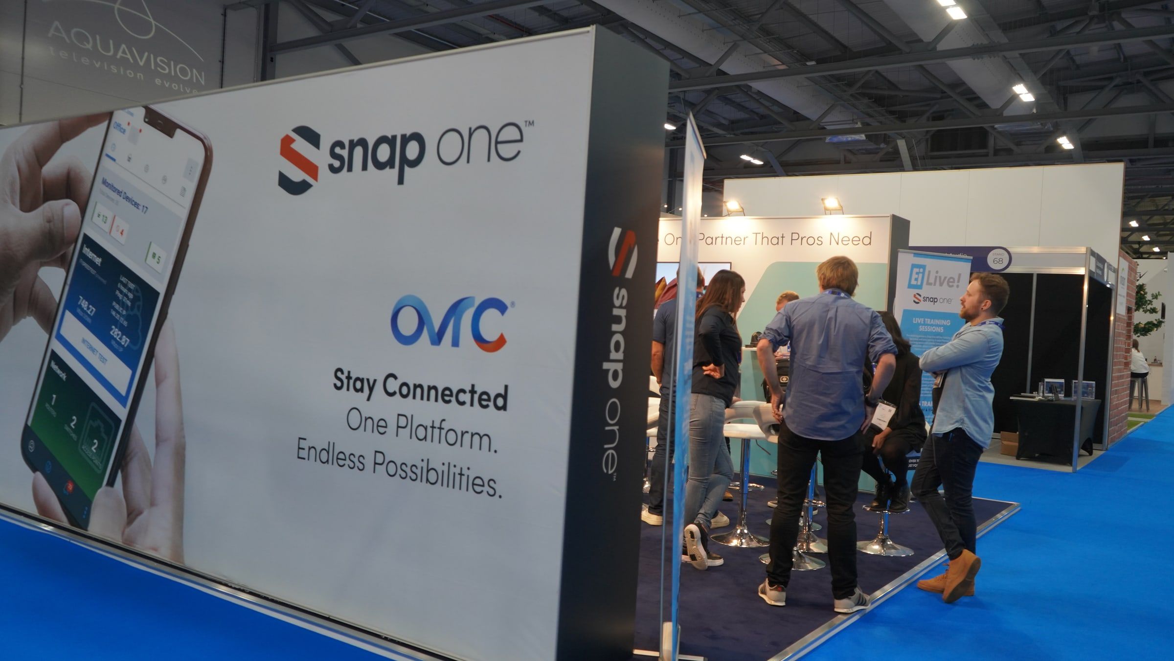
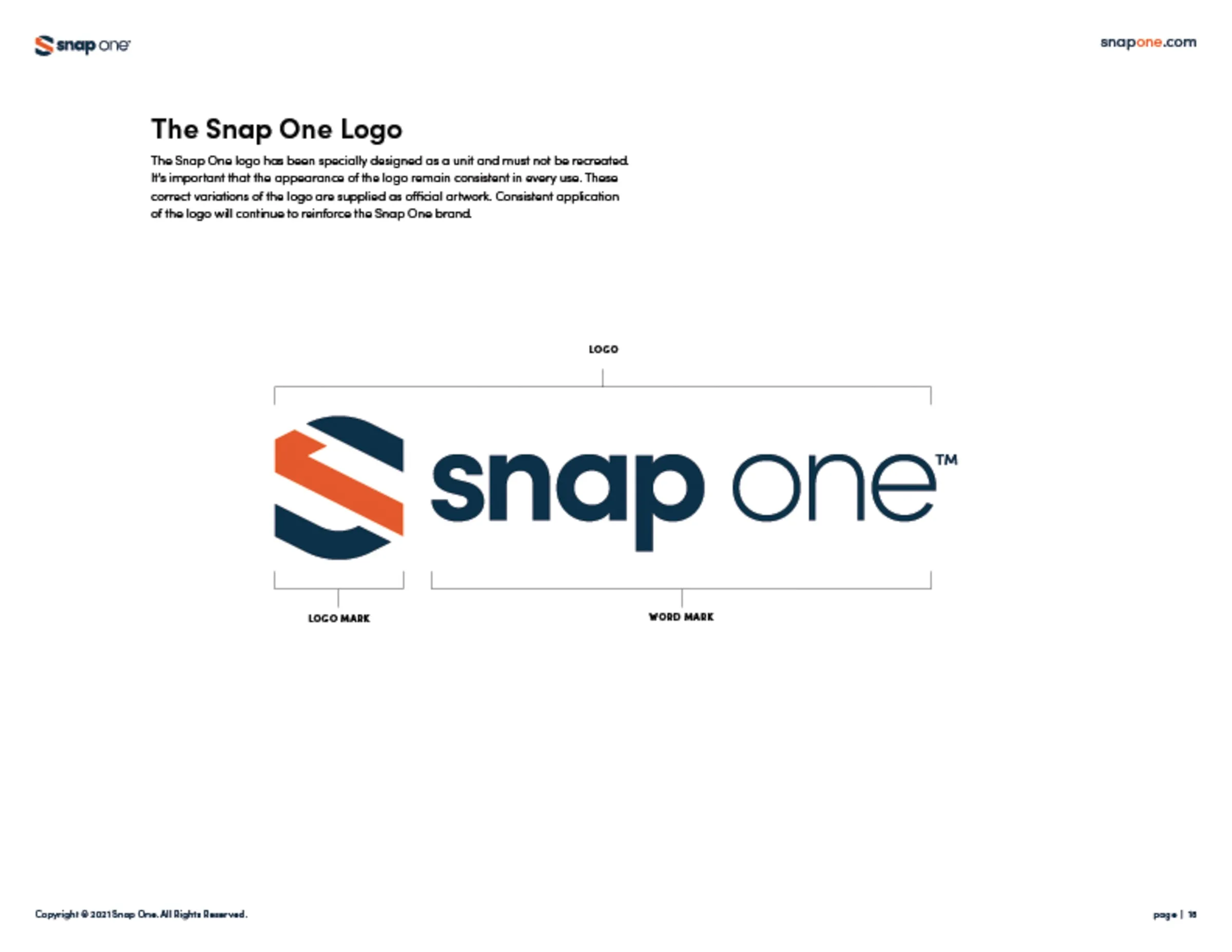
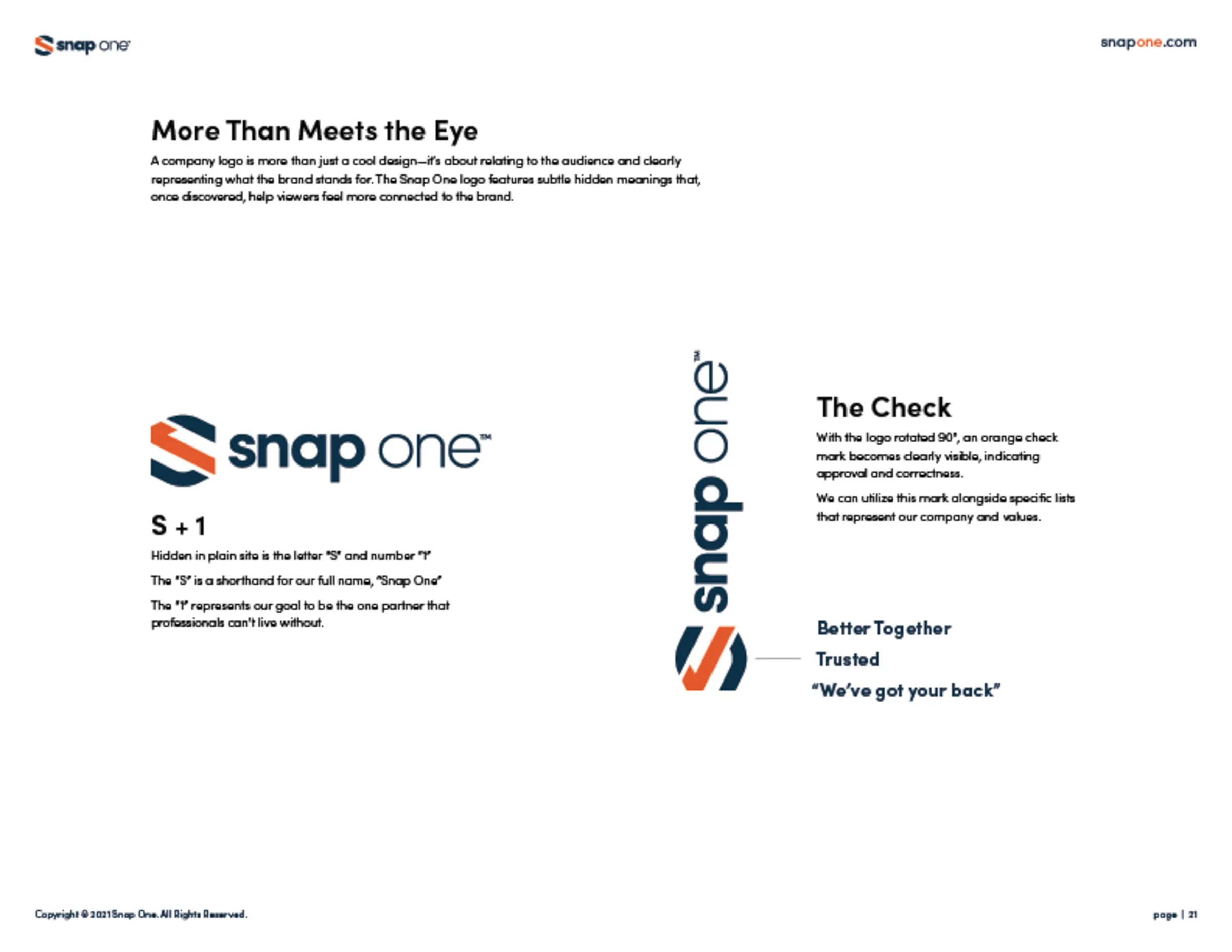
The company was preparing to go public on the stock exchange and needed a new name and a new look to match. The identity had to reflect its forward-thinking ethos and industry-leading position, and work consistently across every platform.
My role
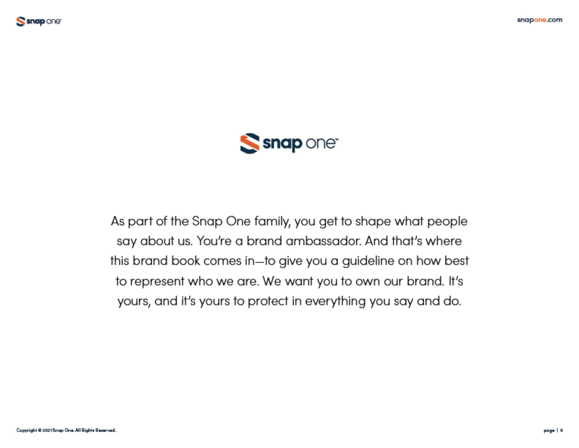
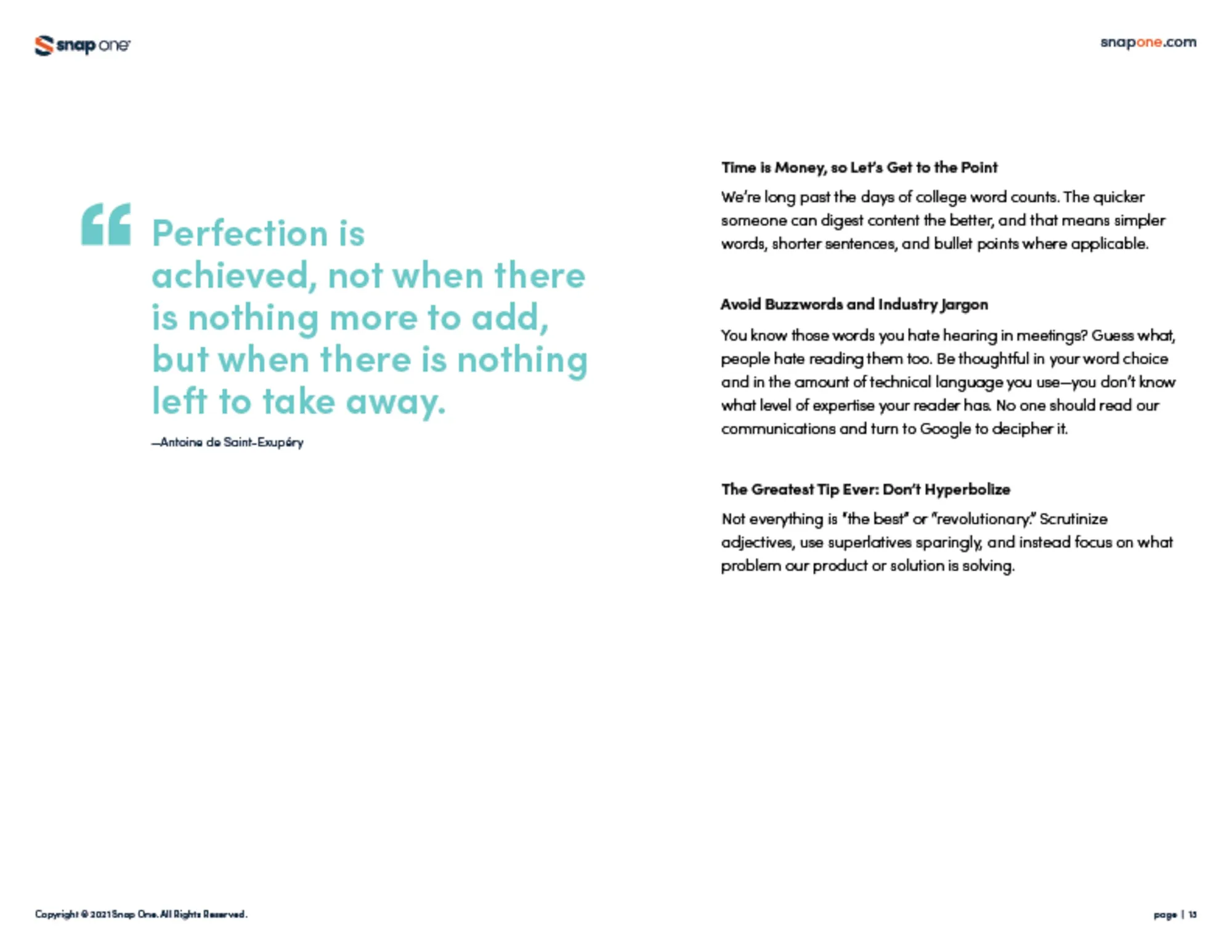
Going public, the team was tasked with creating an all-new brand name and logo. We worked on the concept together. Once the concept was set, we worked our way down into a design system everyone else could follow. I worked on that design system, and with my creative director I filled out every piece of the brand book.
The approach
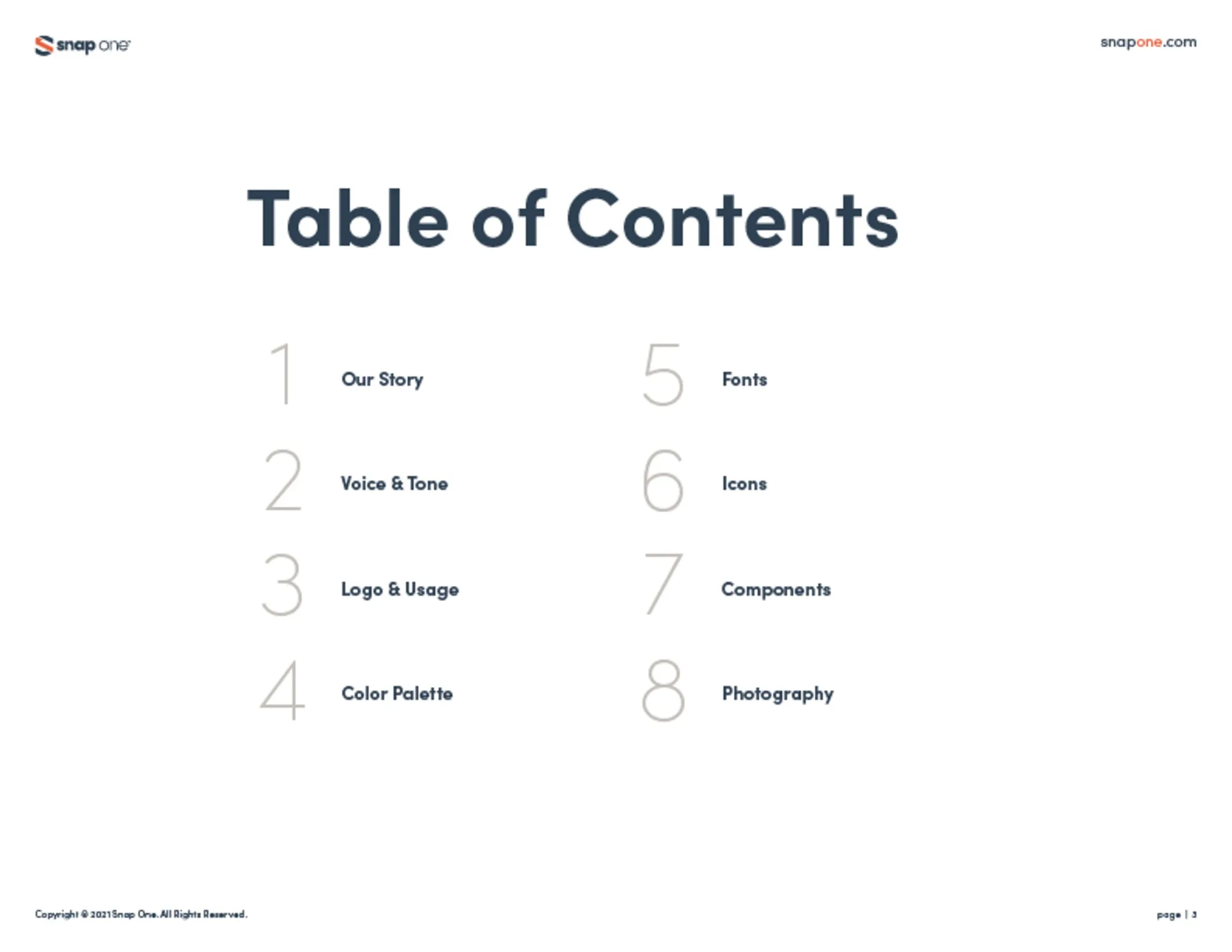
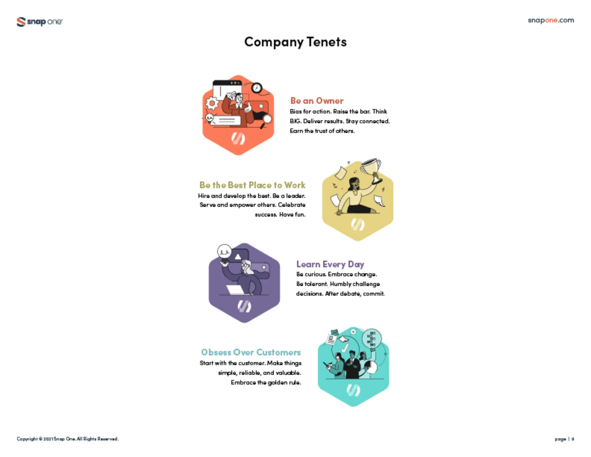
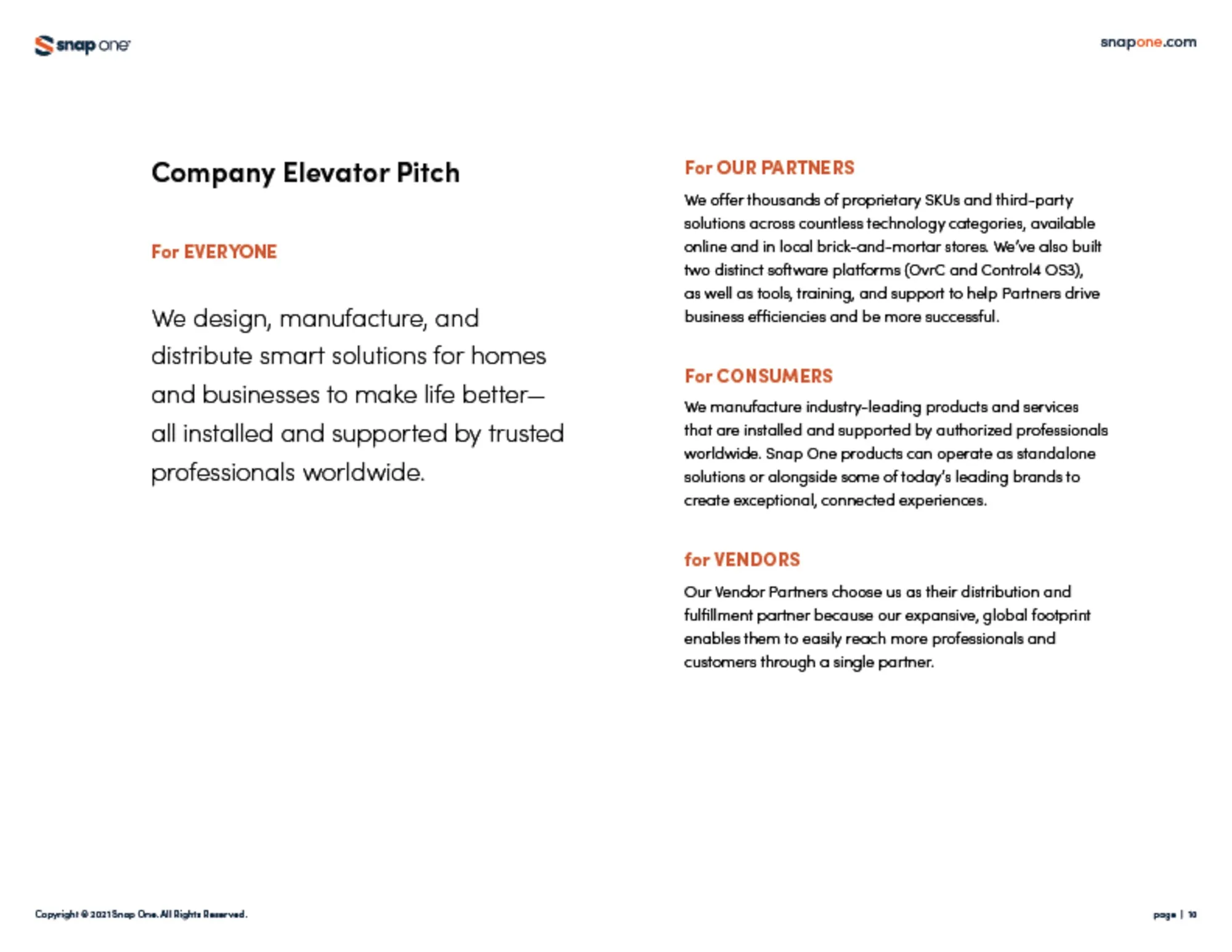
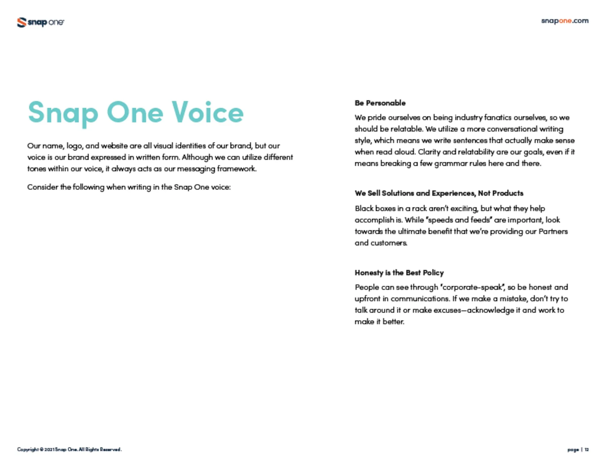
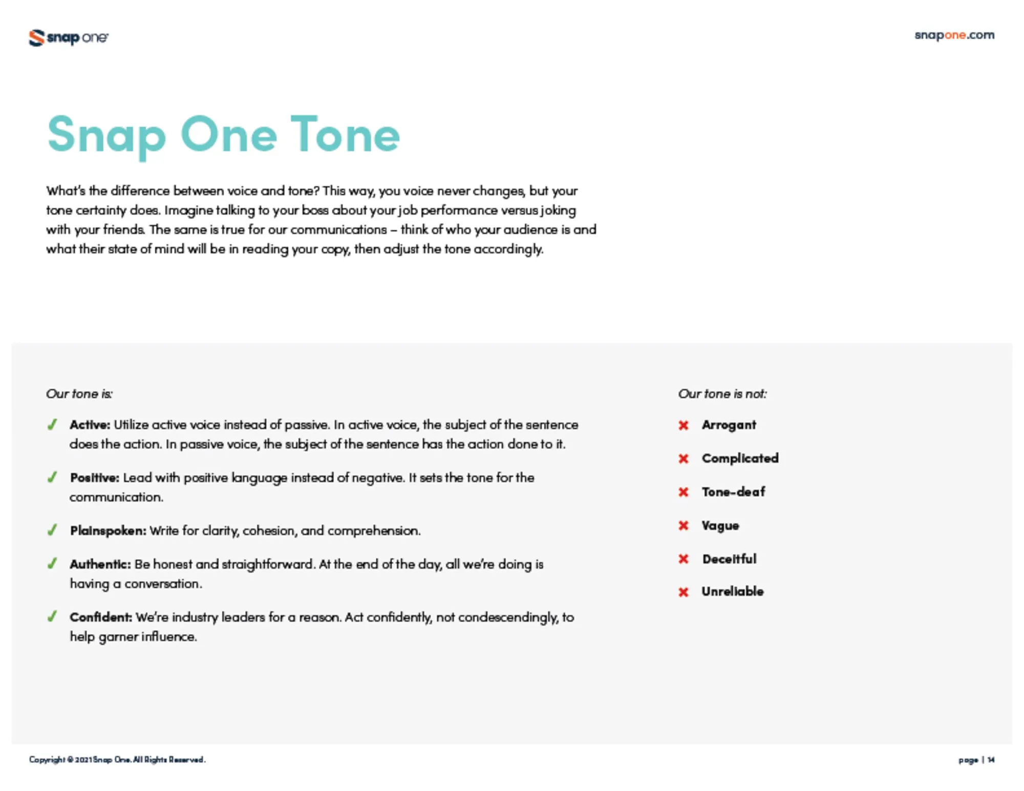
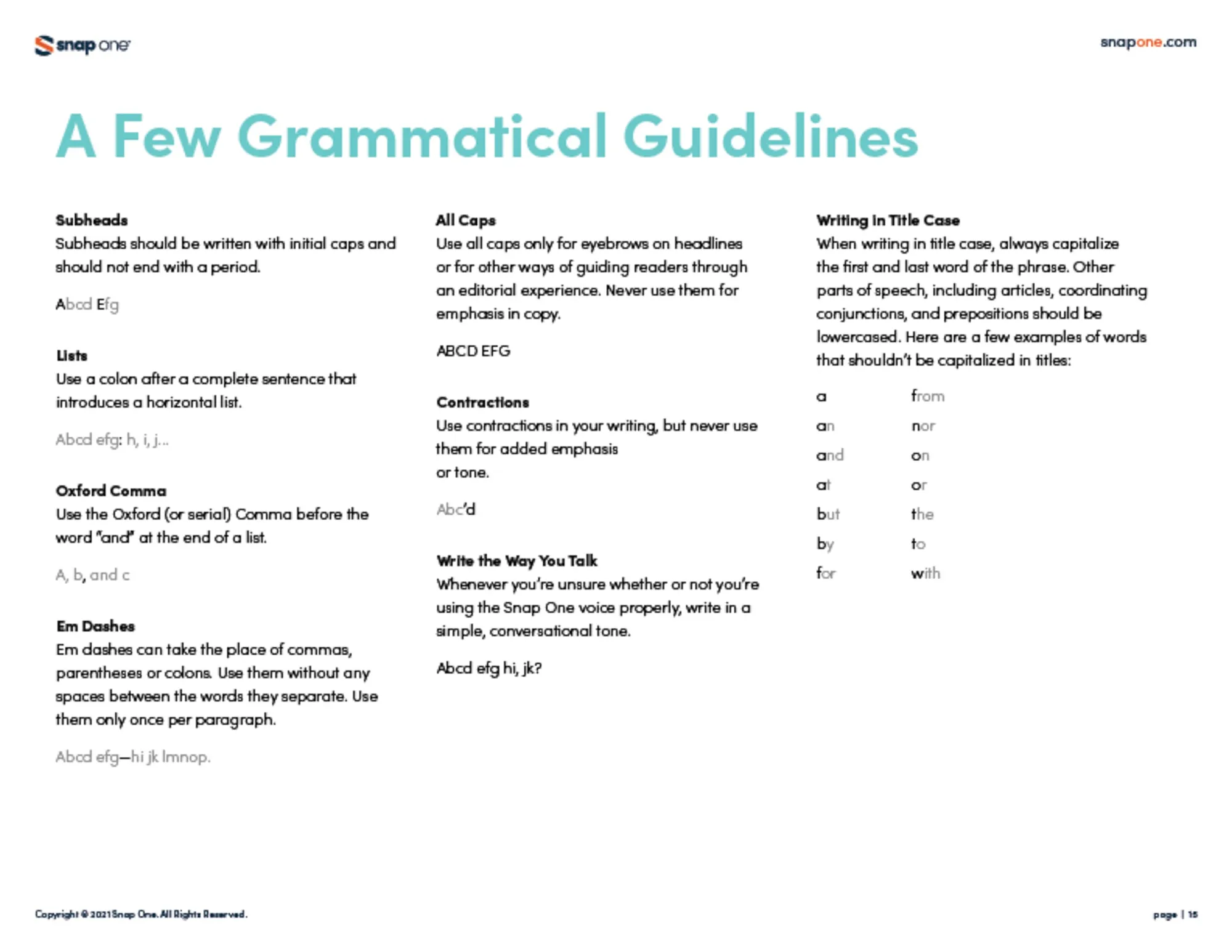
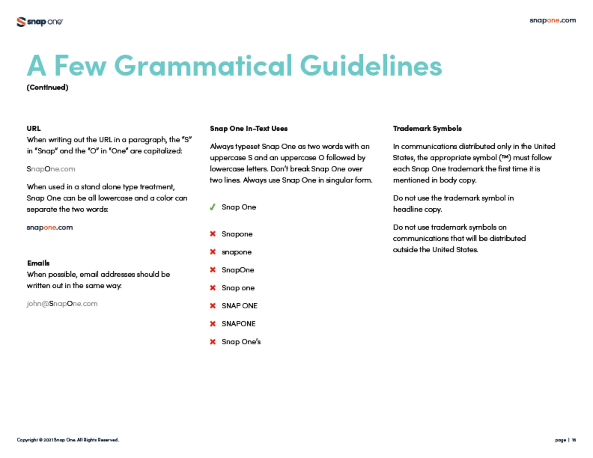
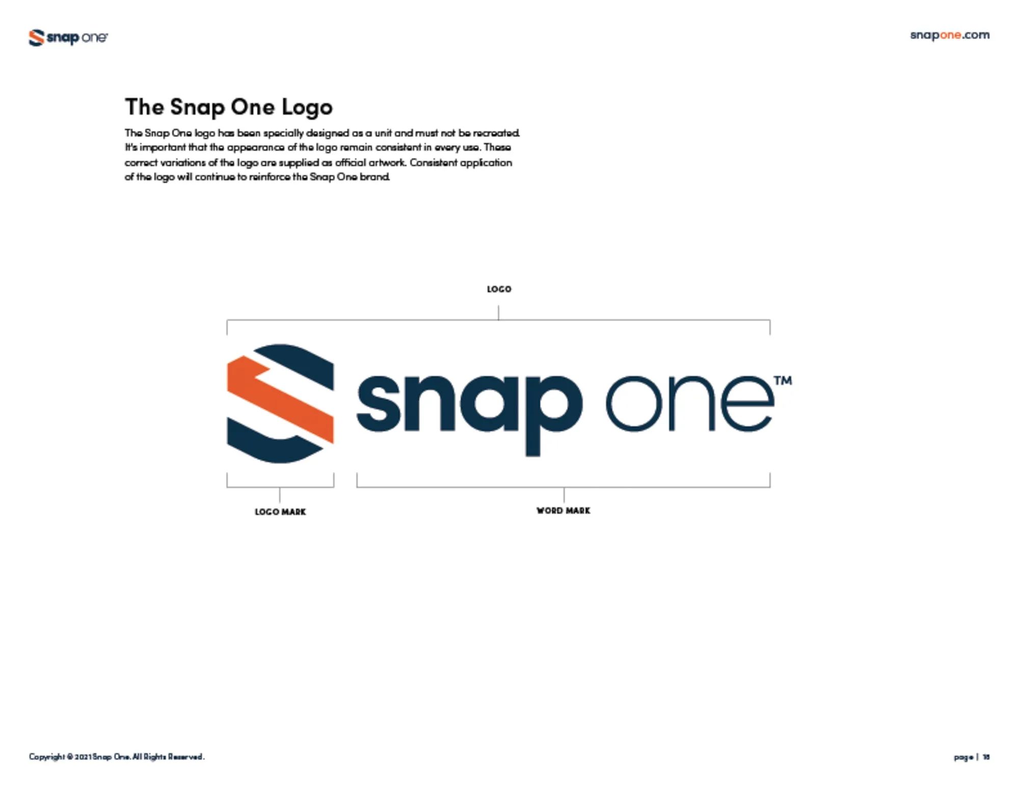
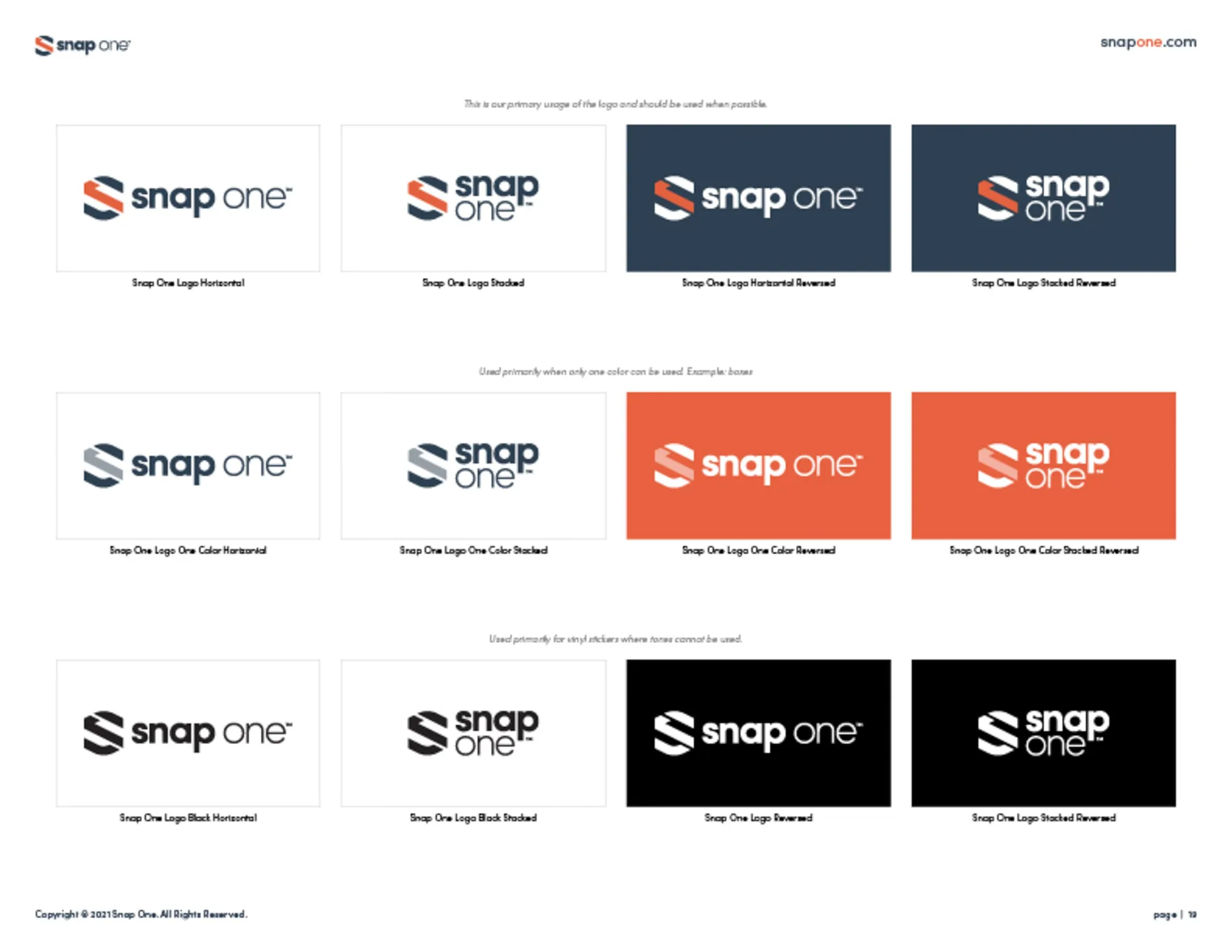
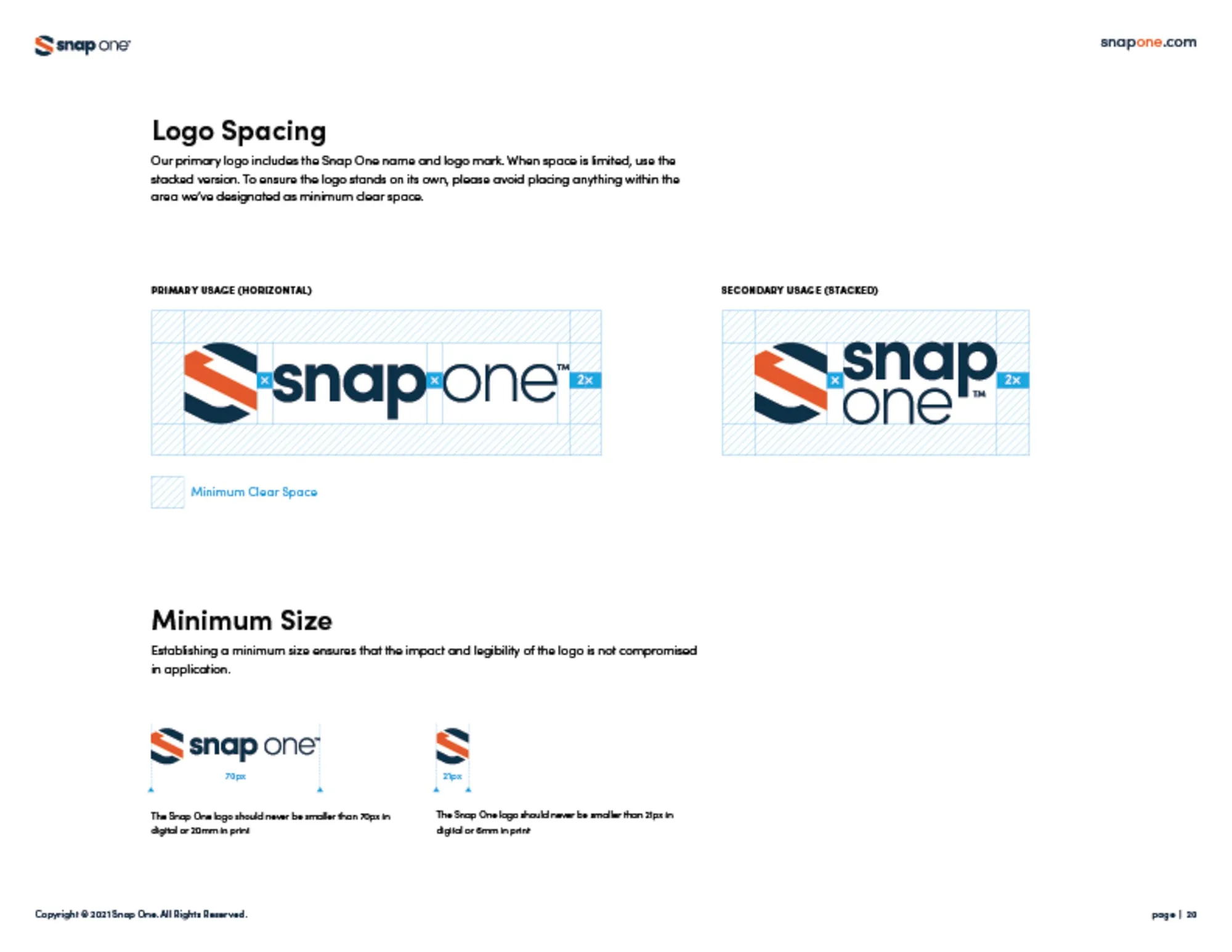
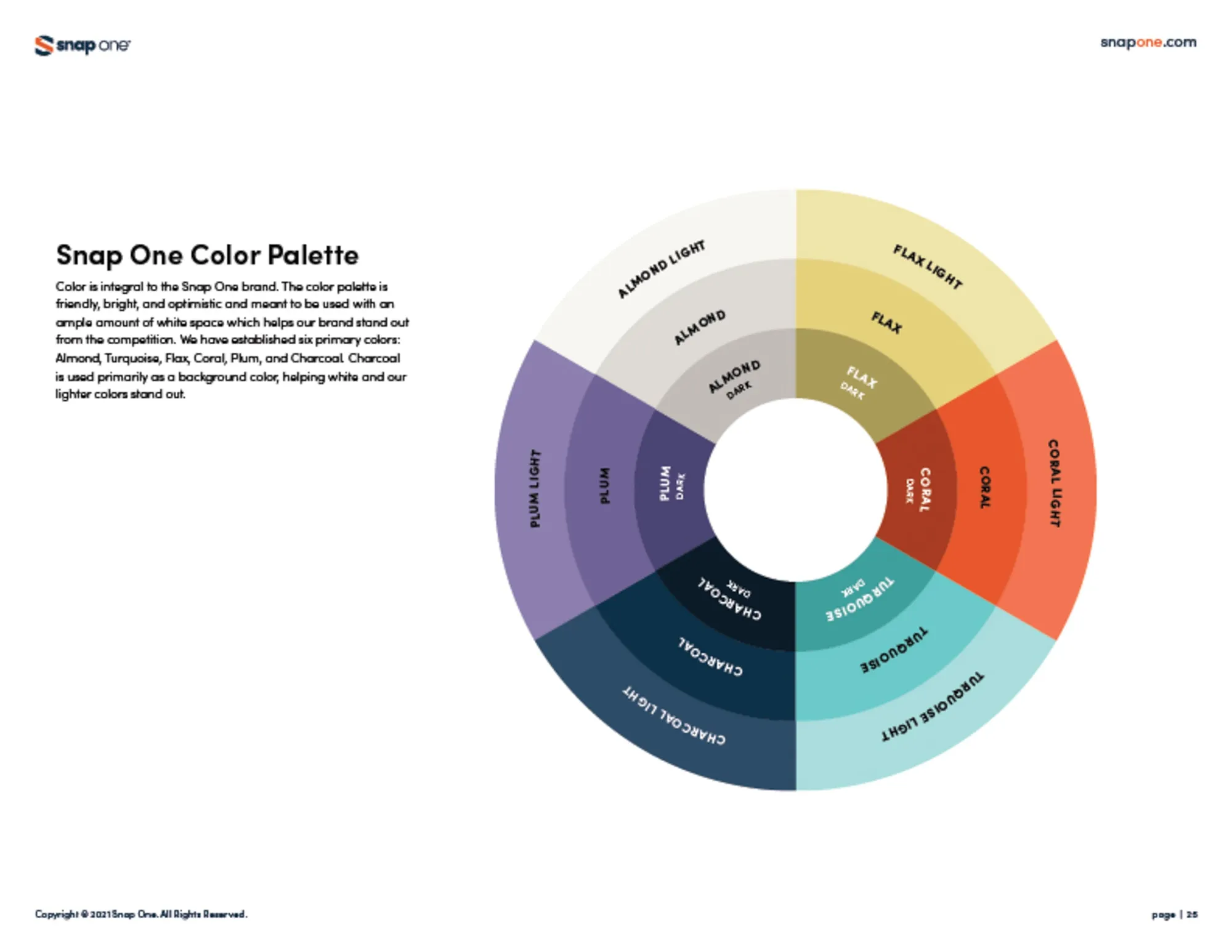
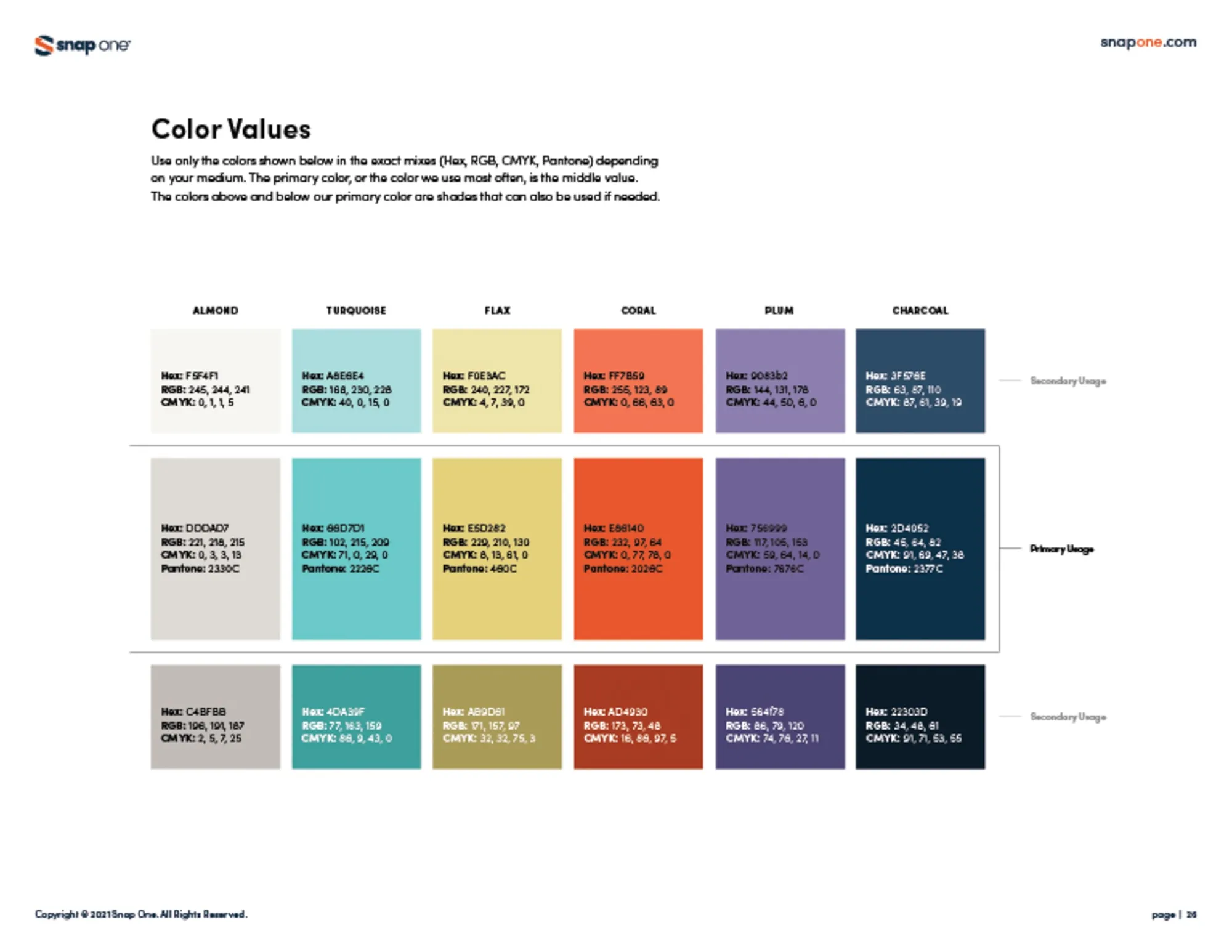
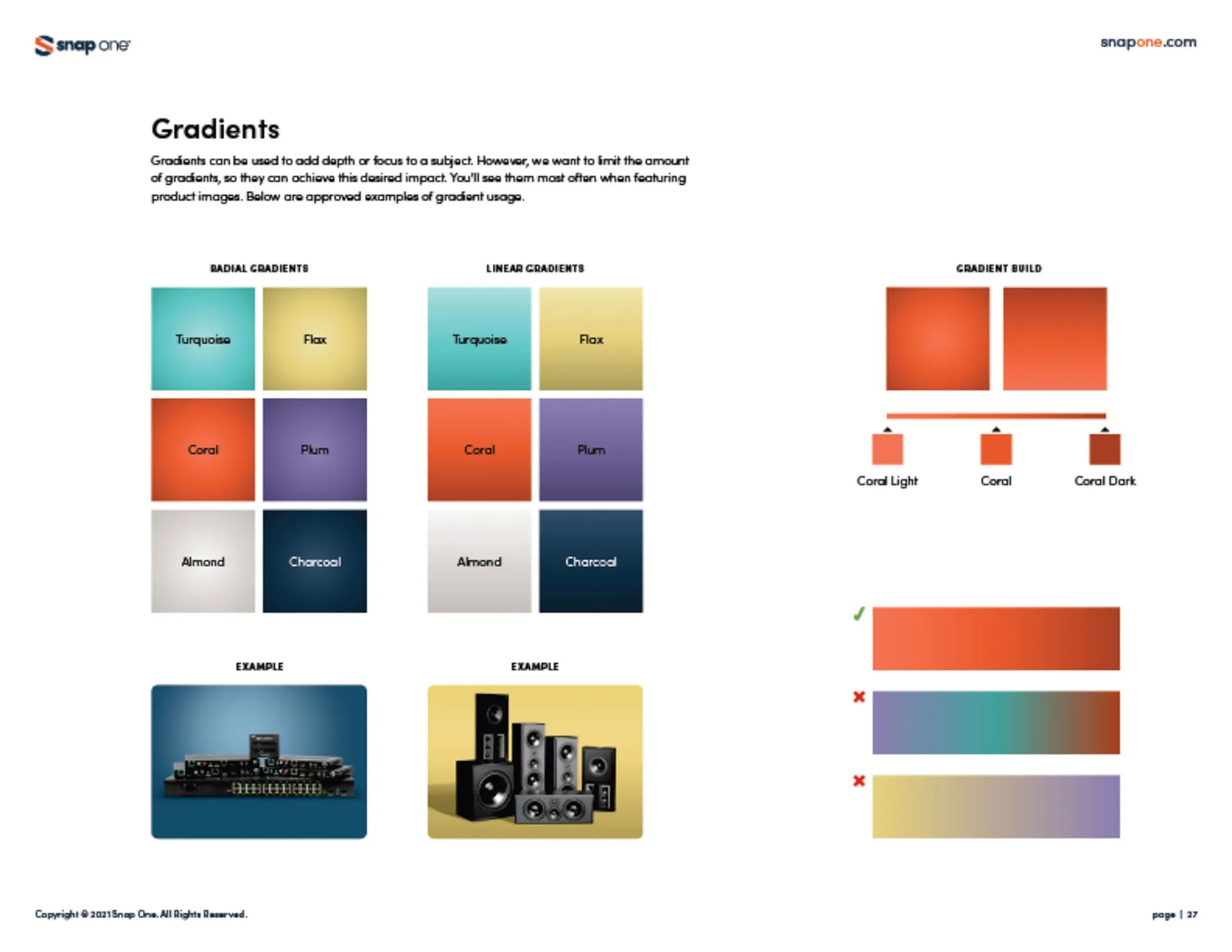
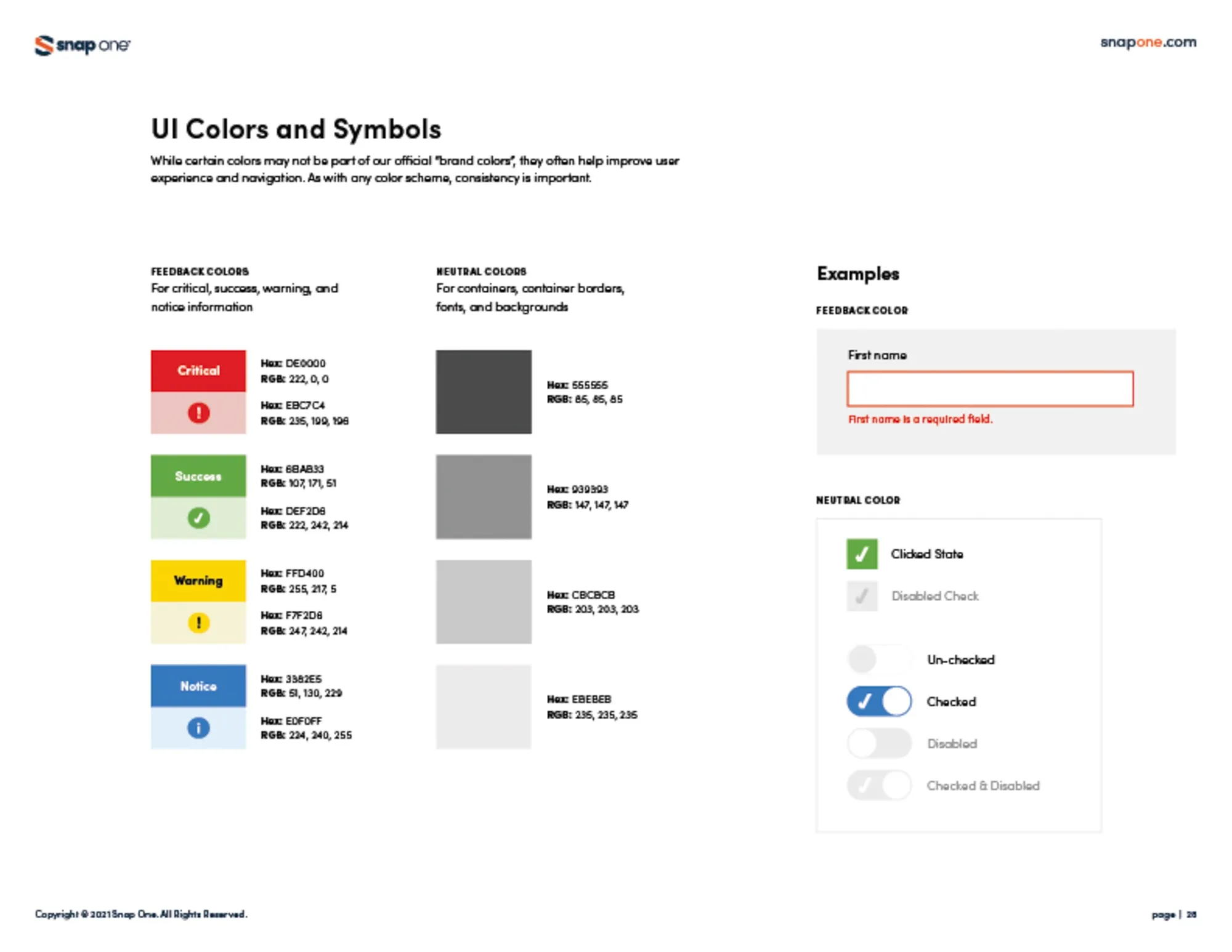
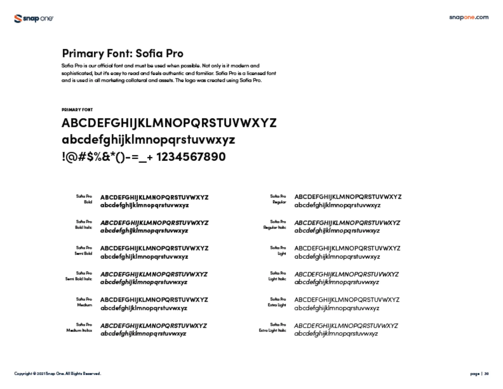
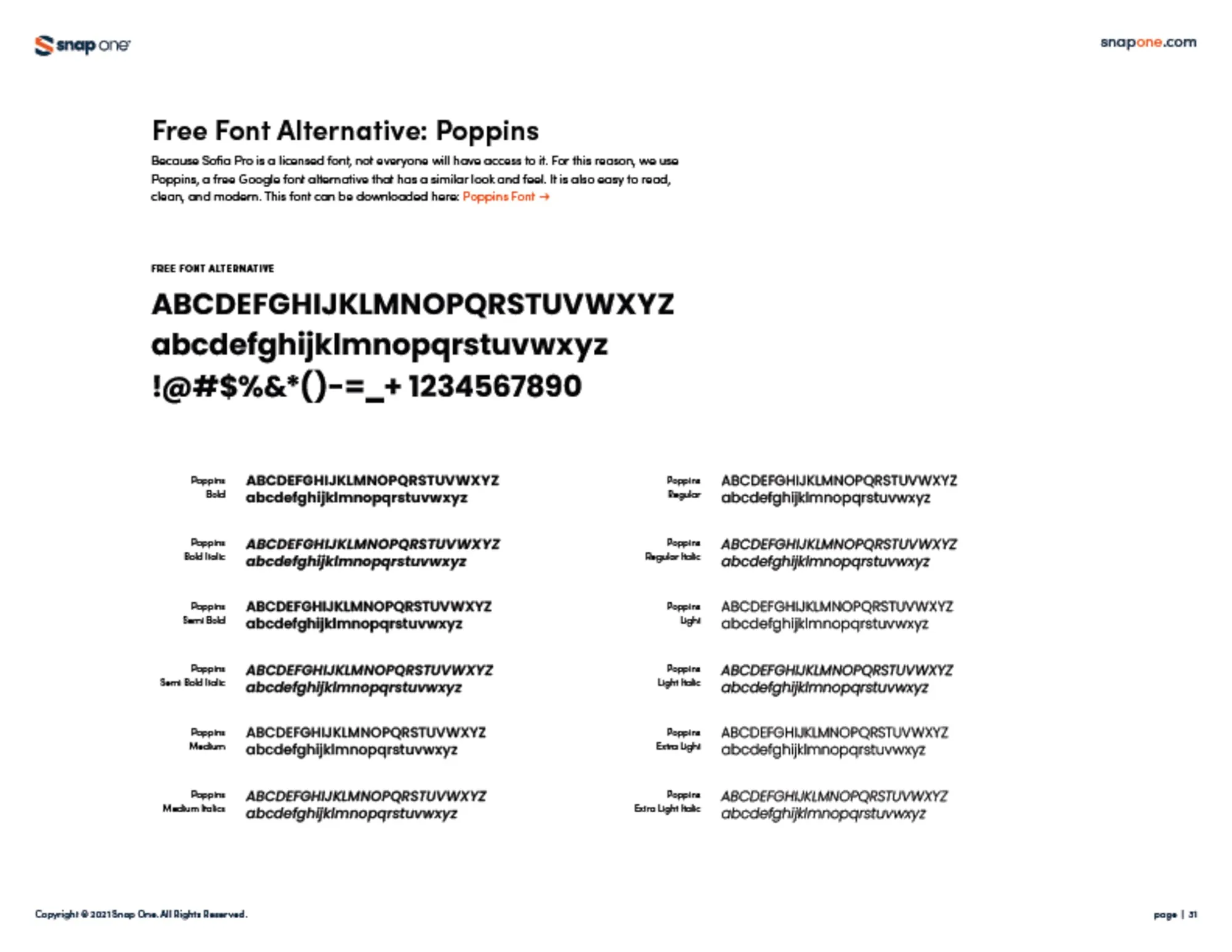
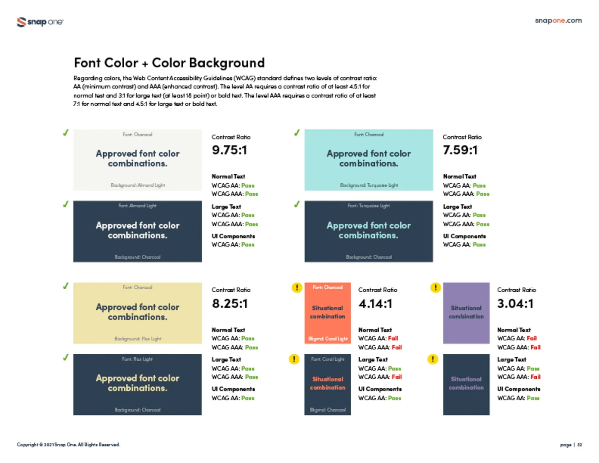
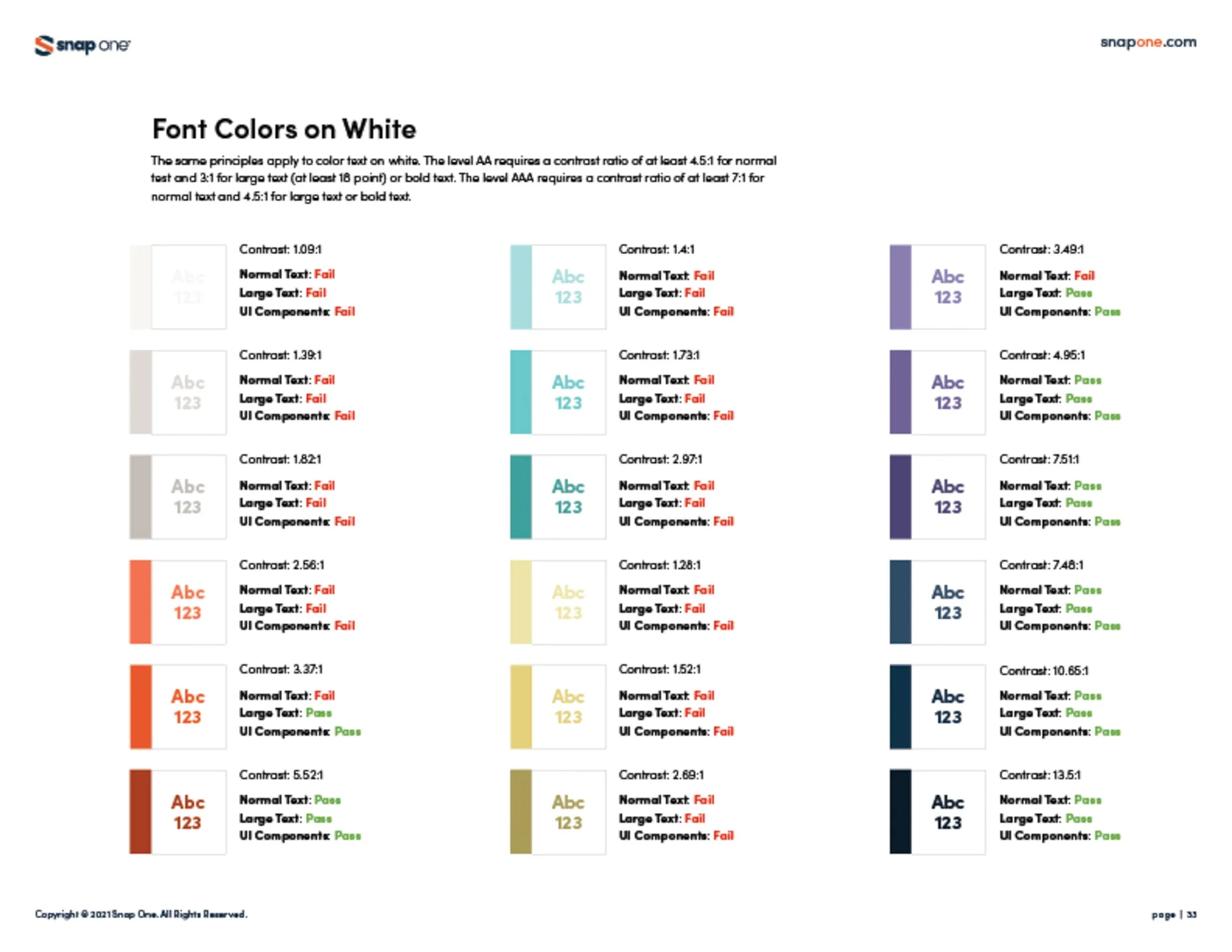
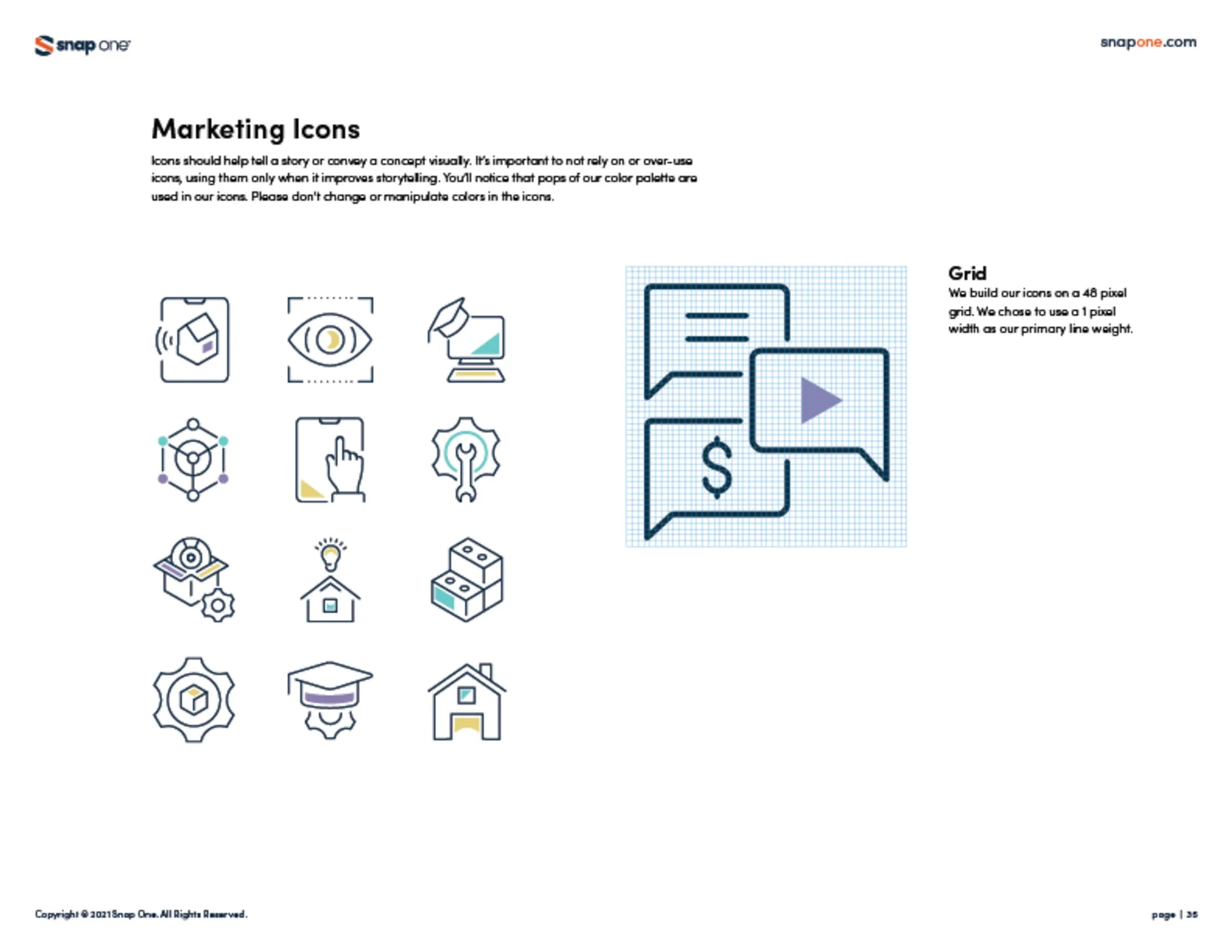
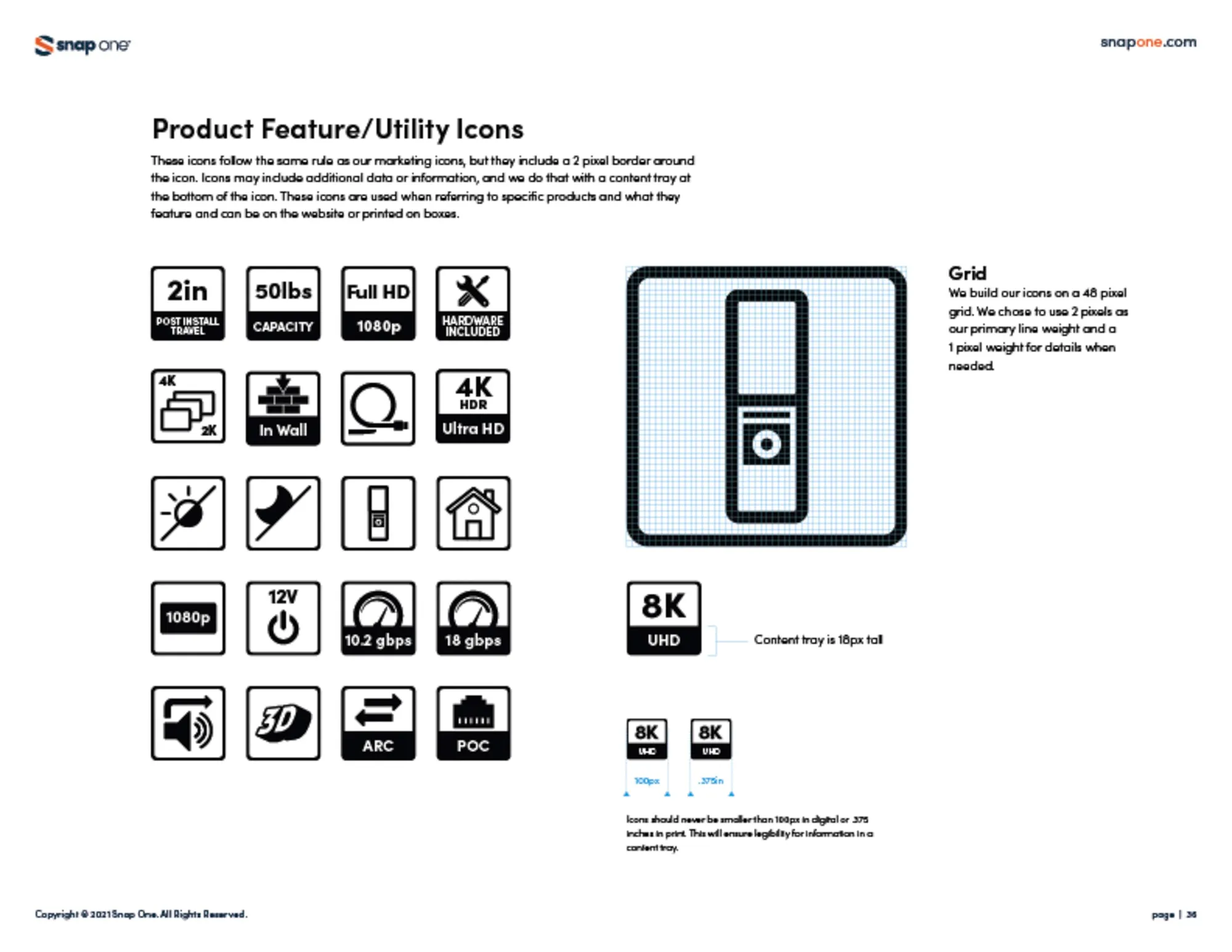
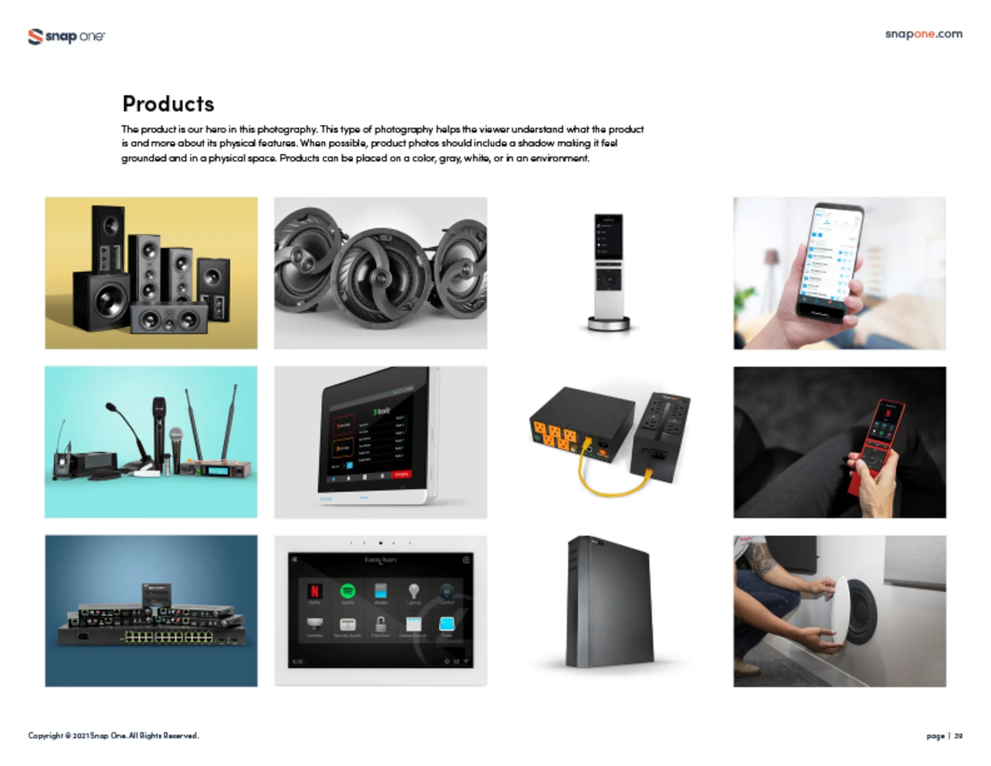
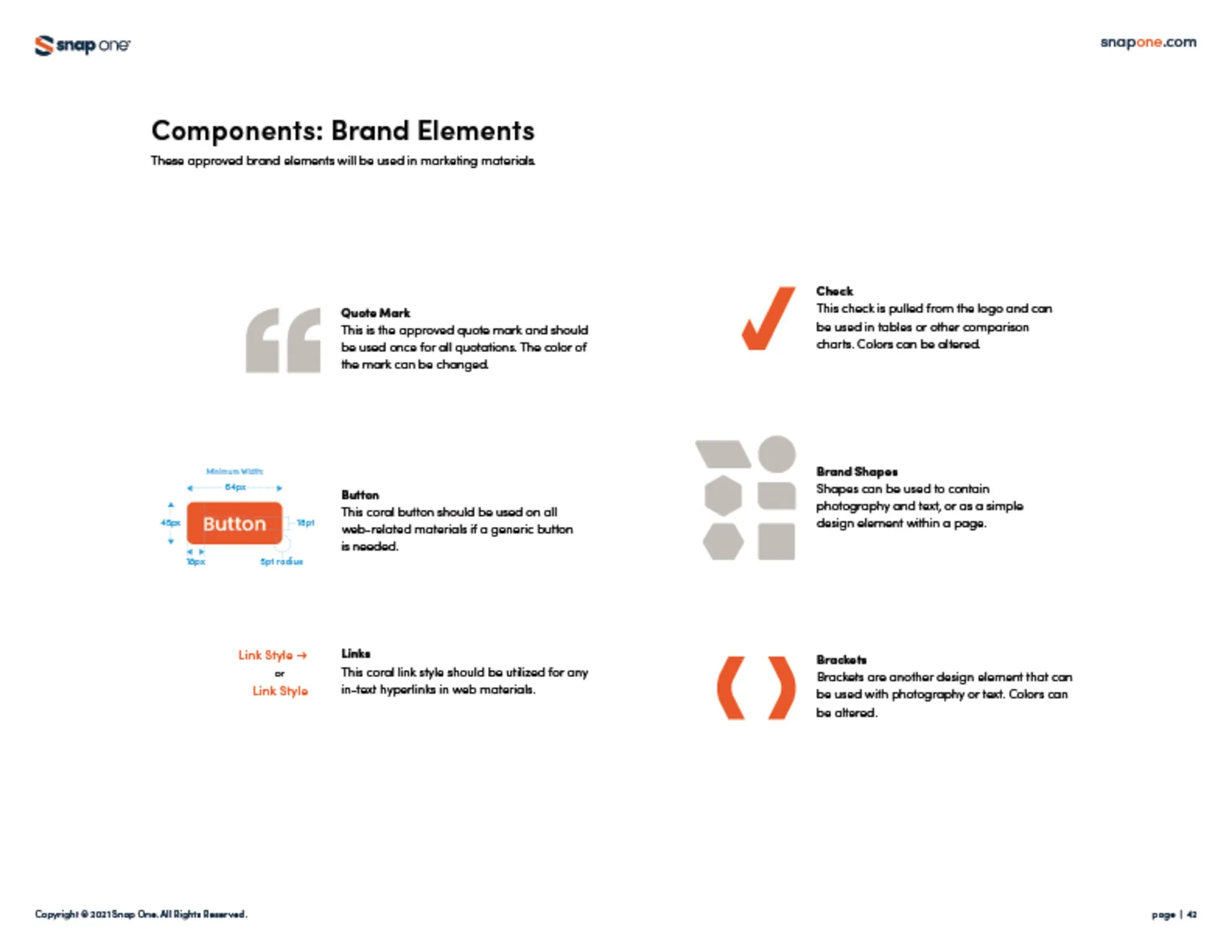
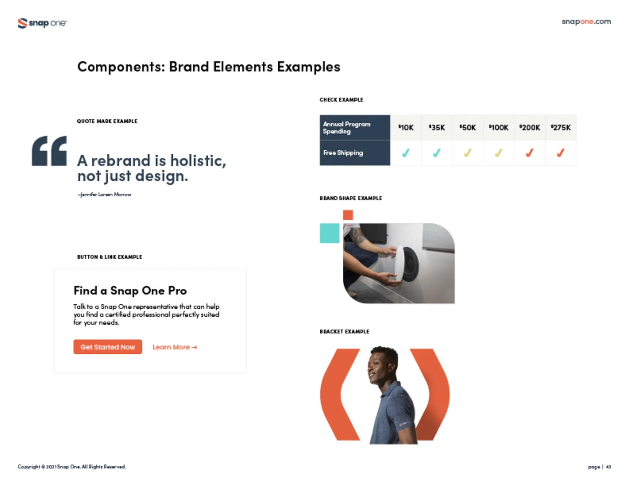
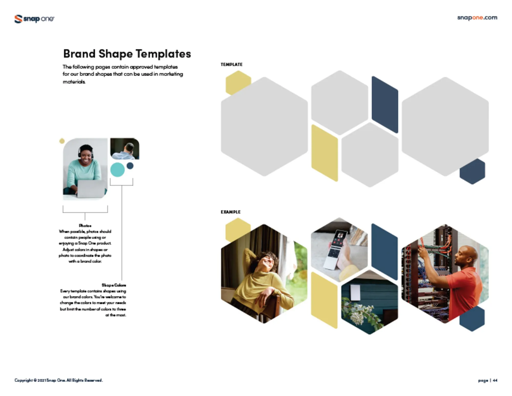
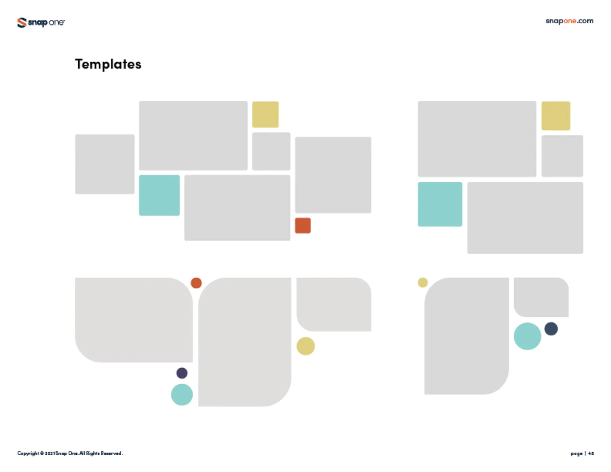
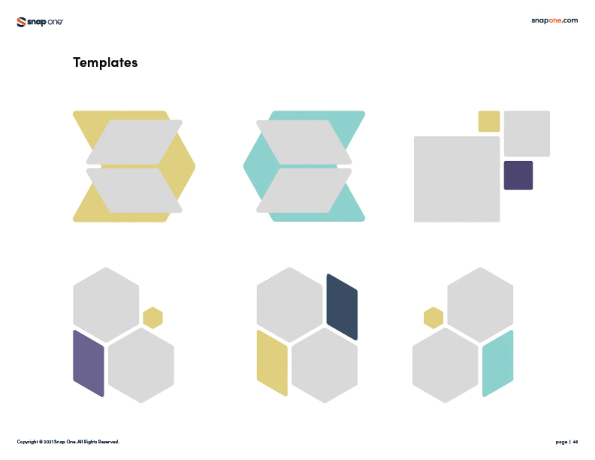
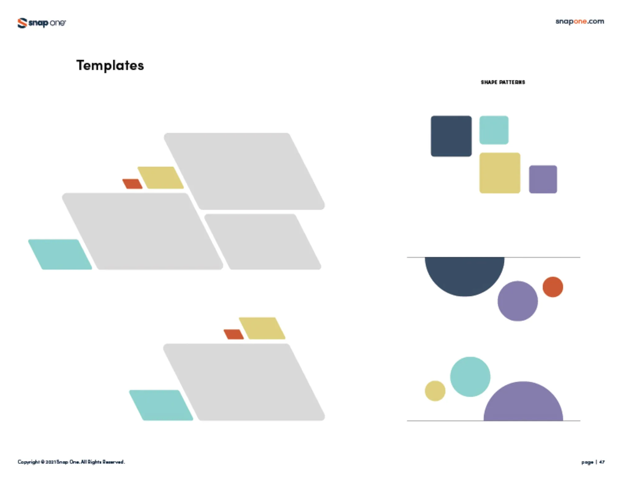
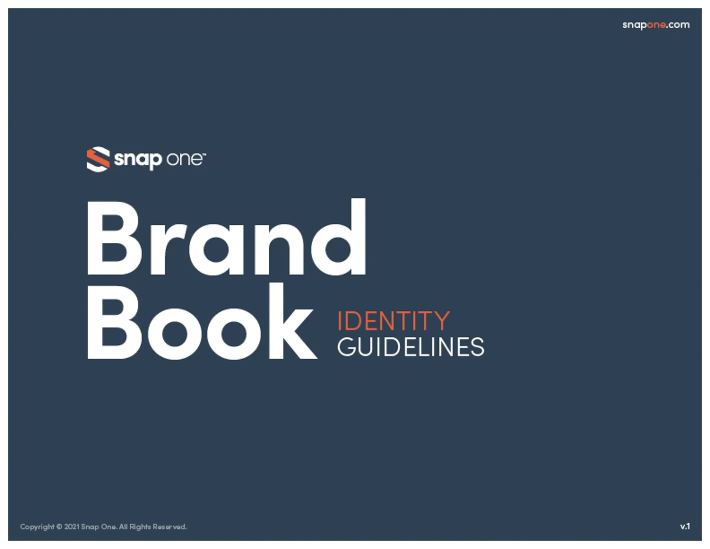
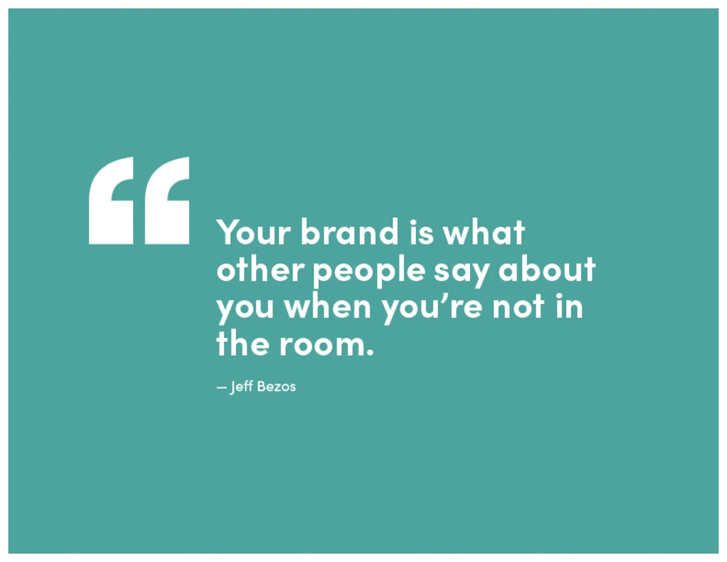
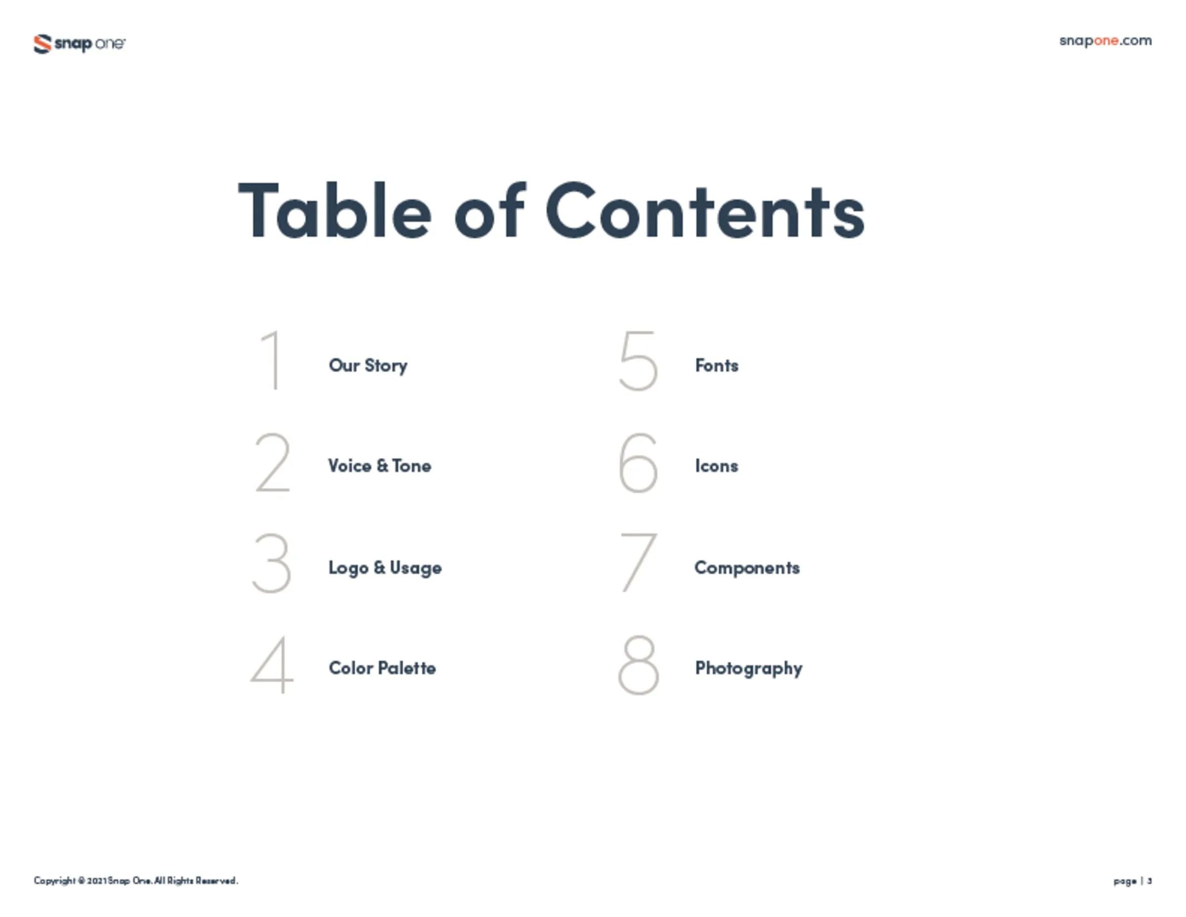
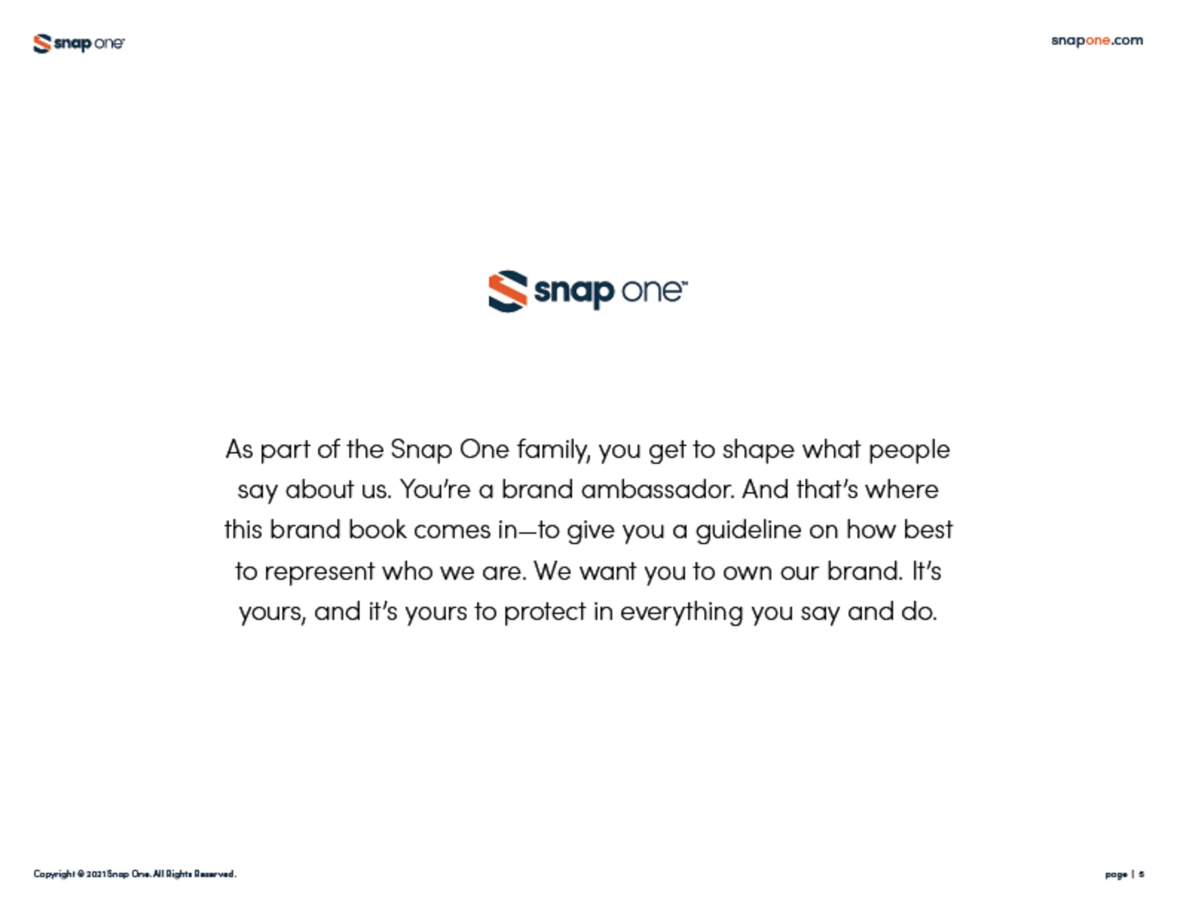
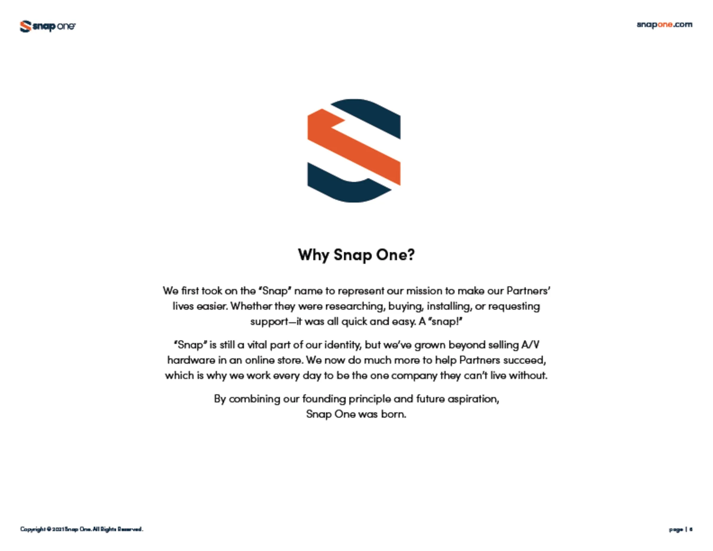
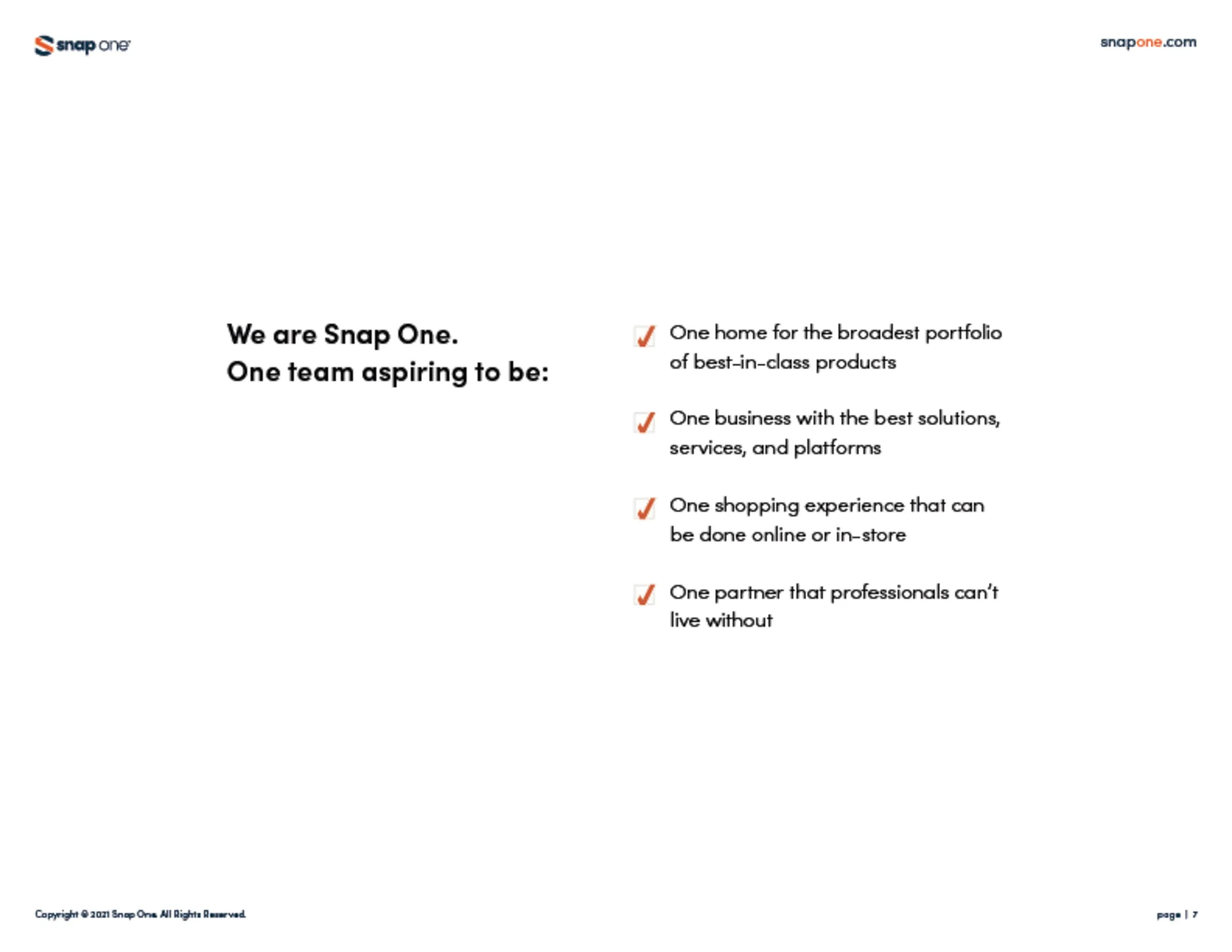
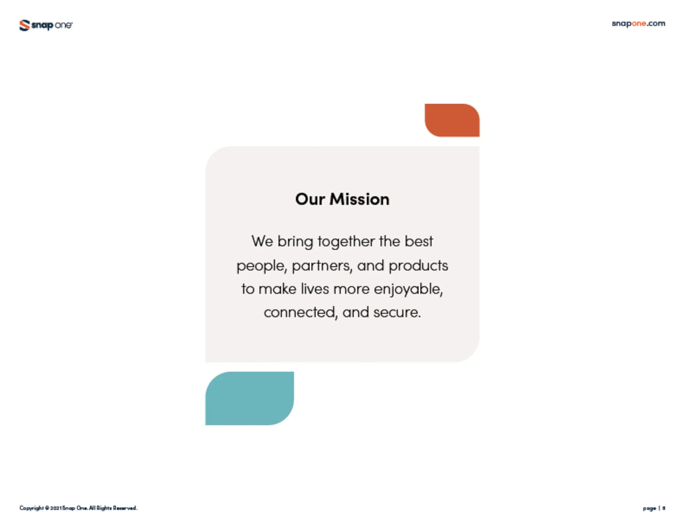
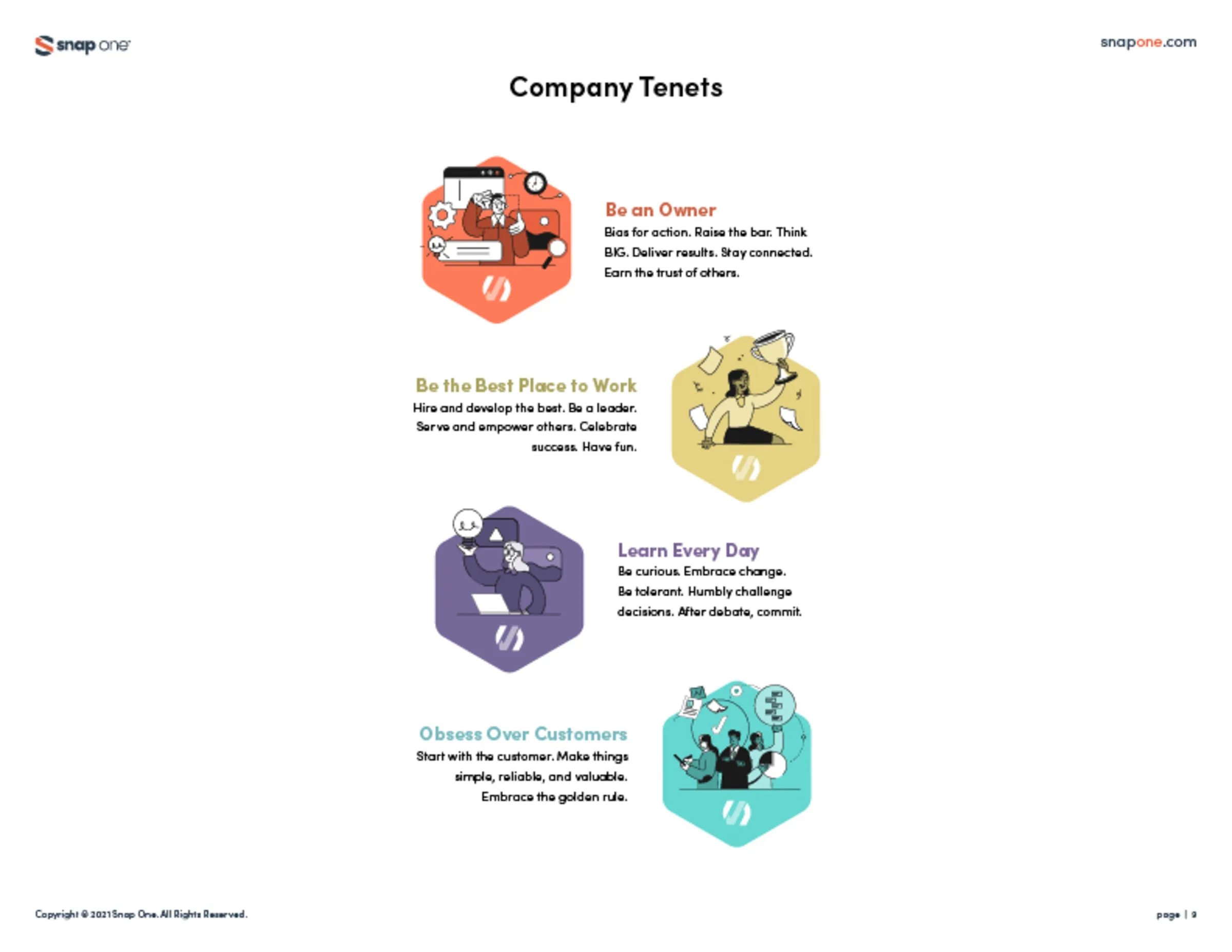
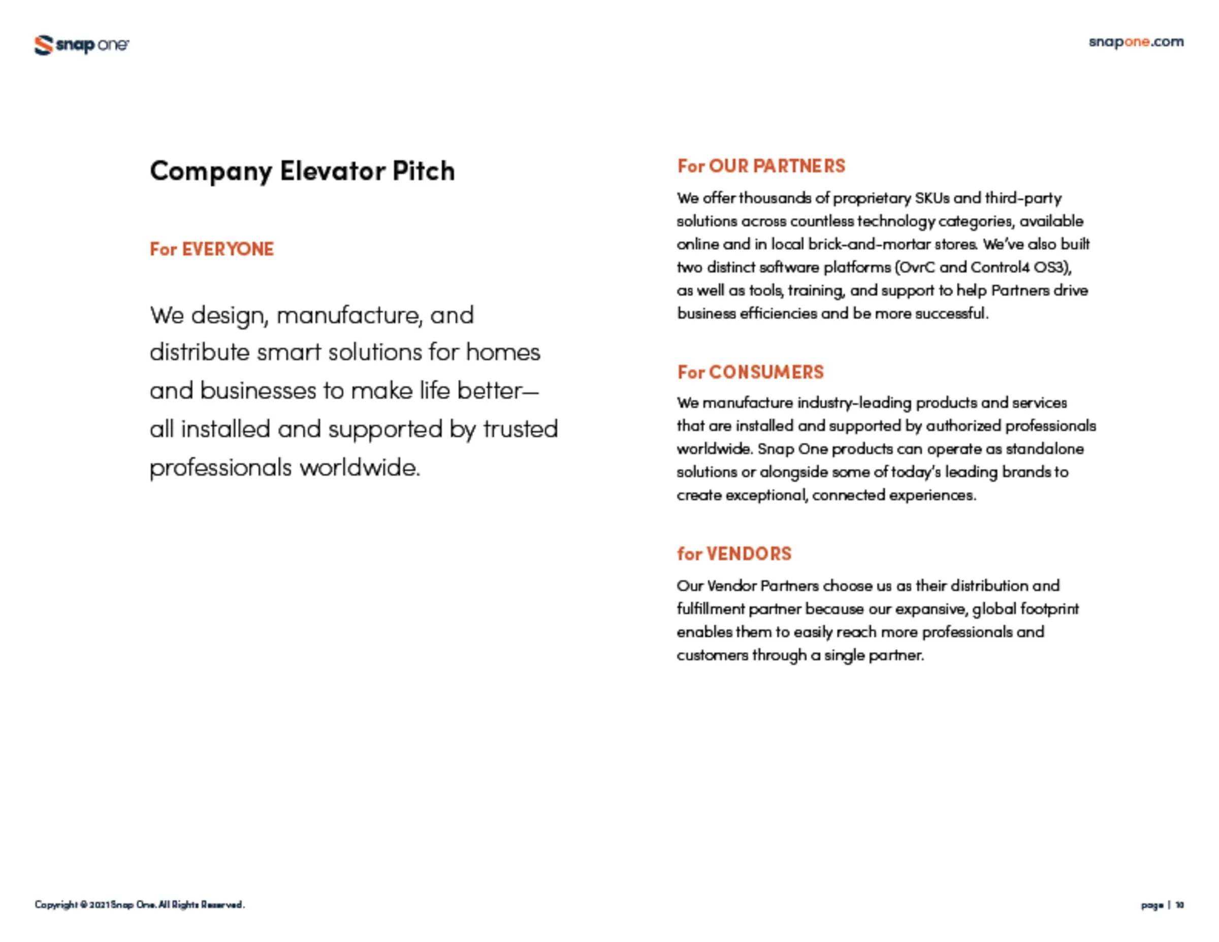
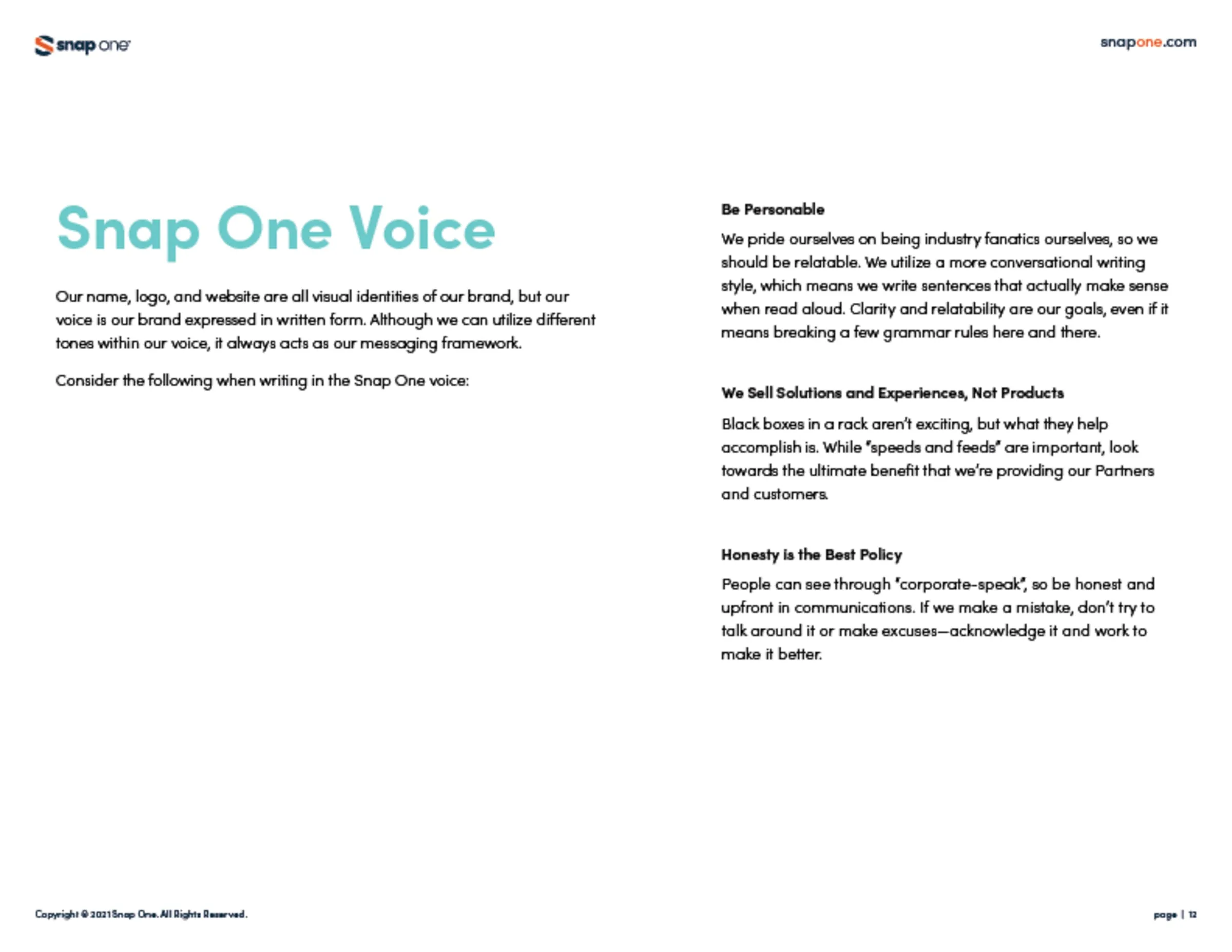
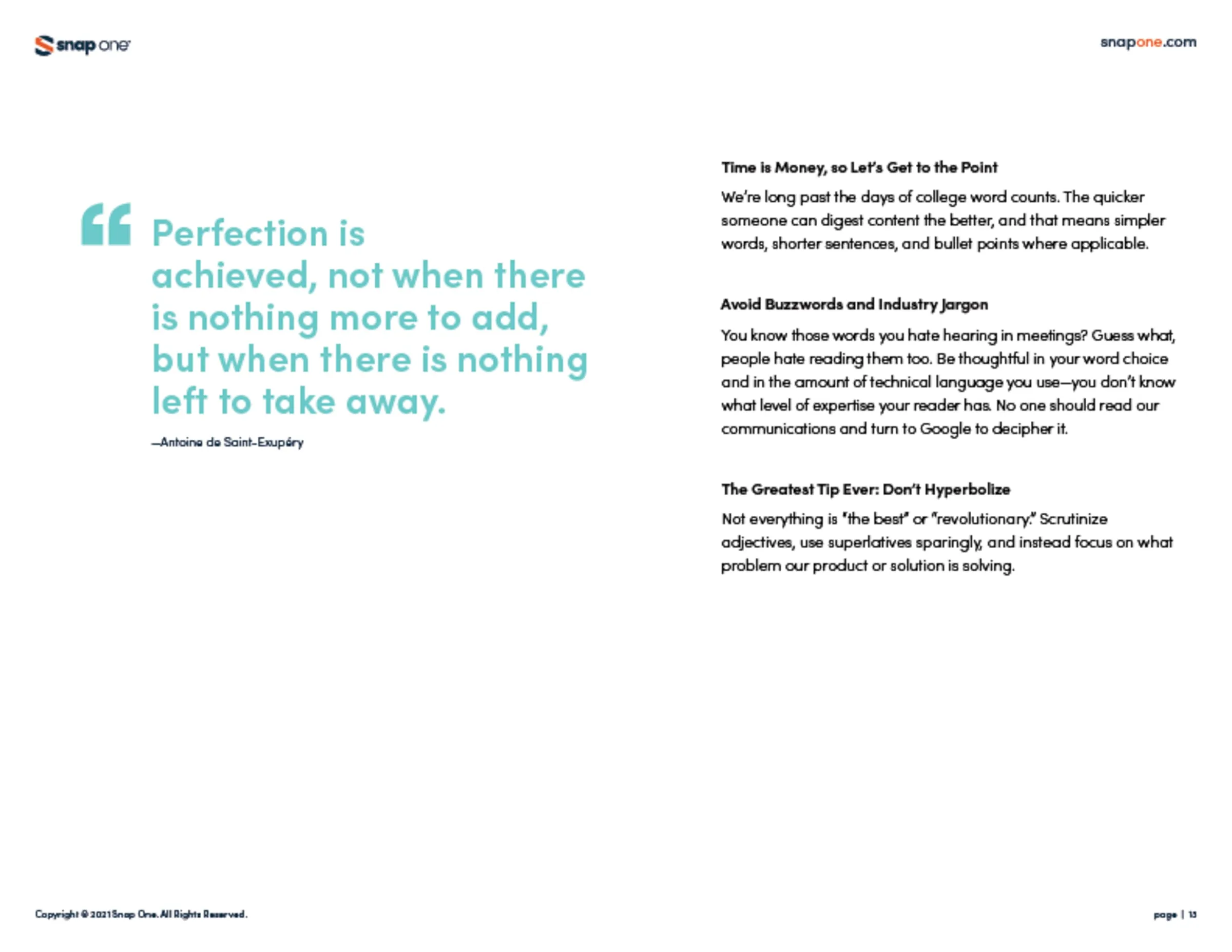
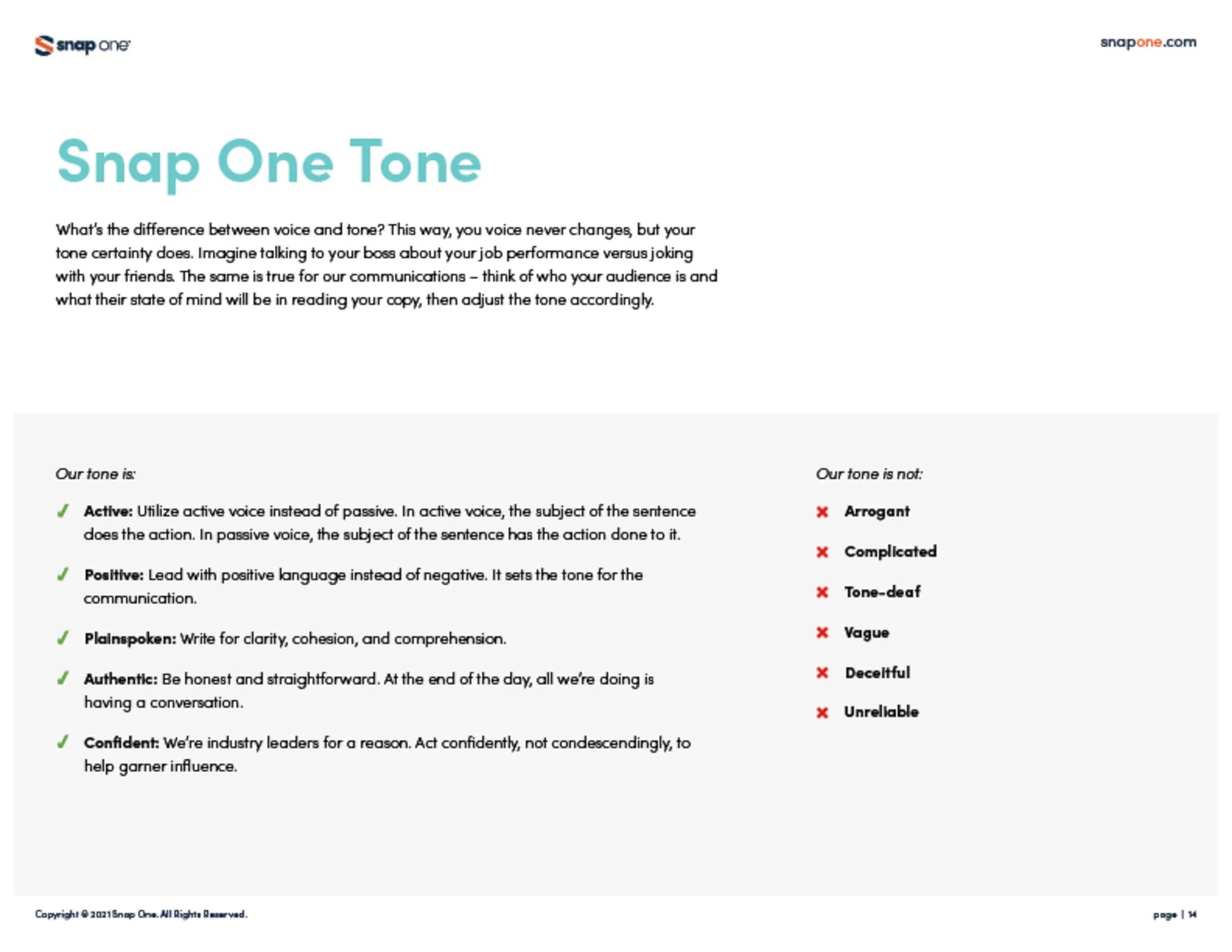
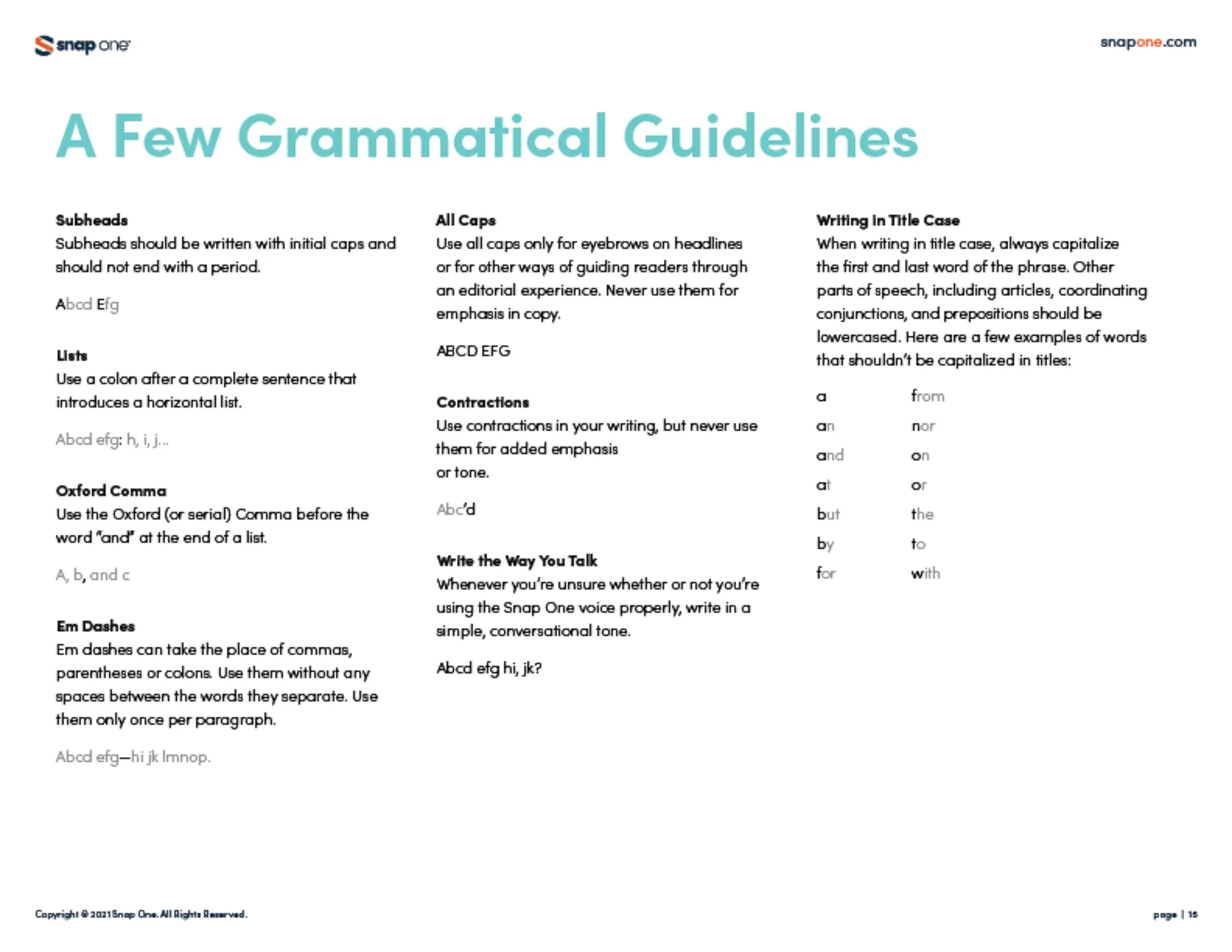
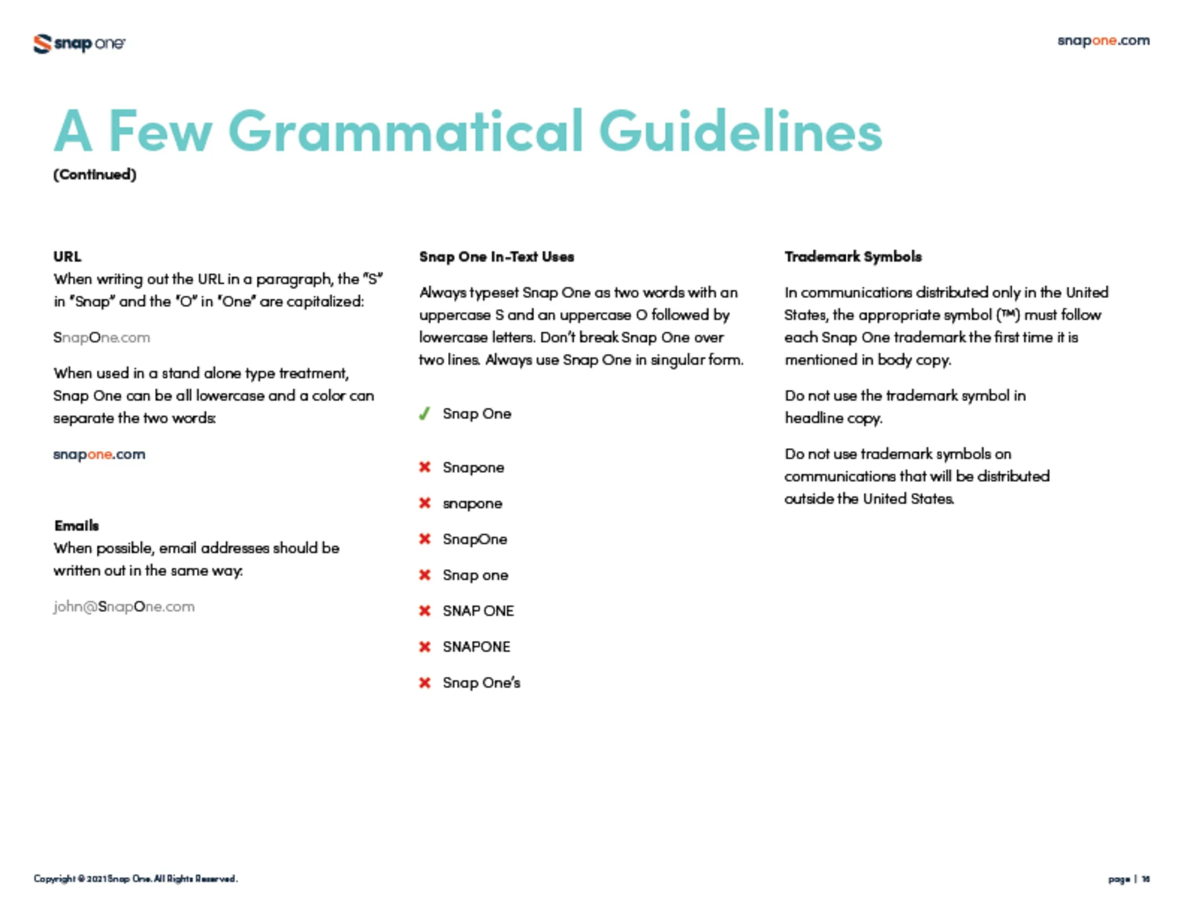
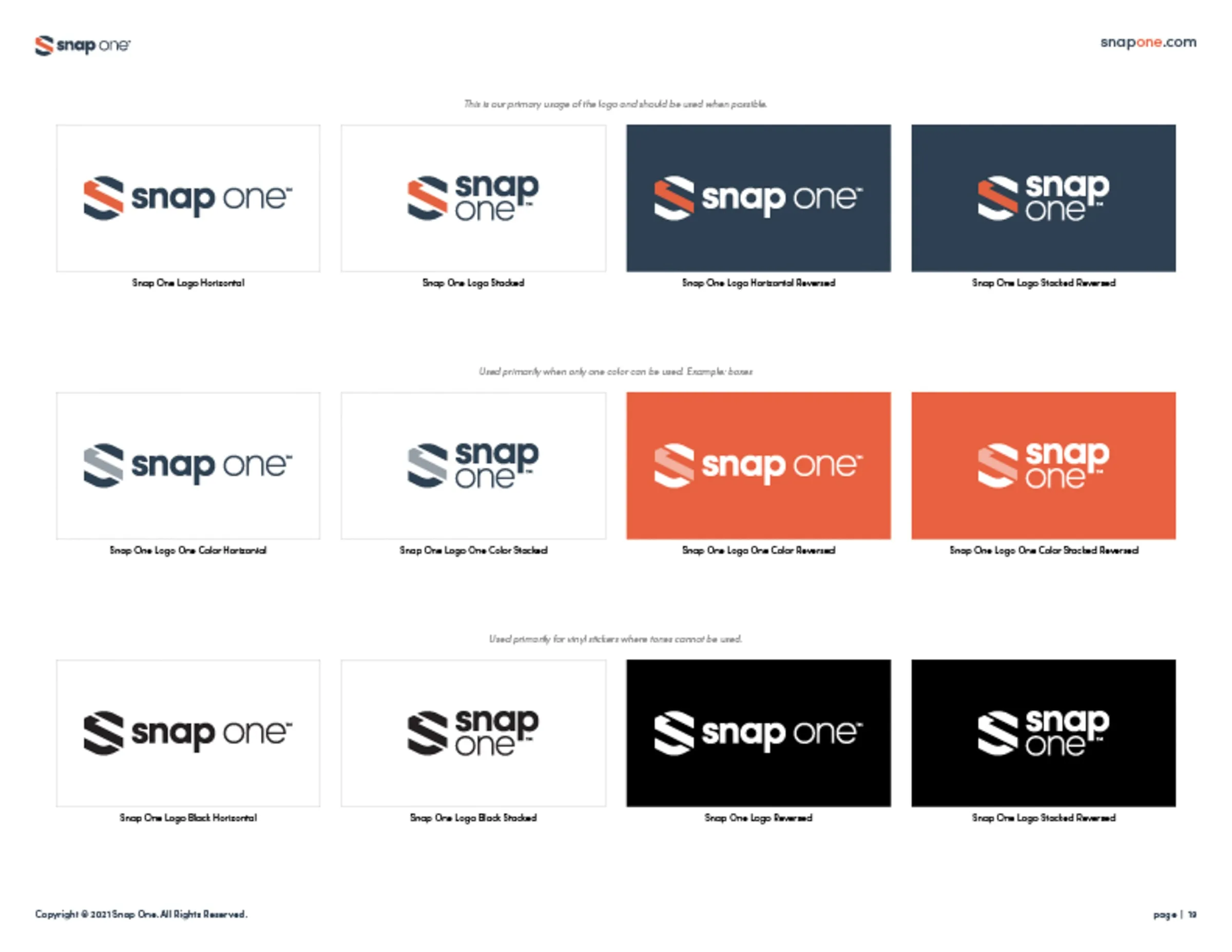
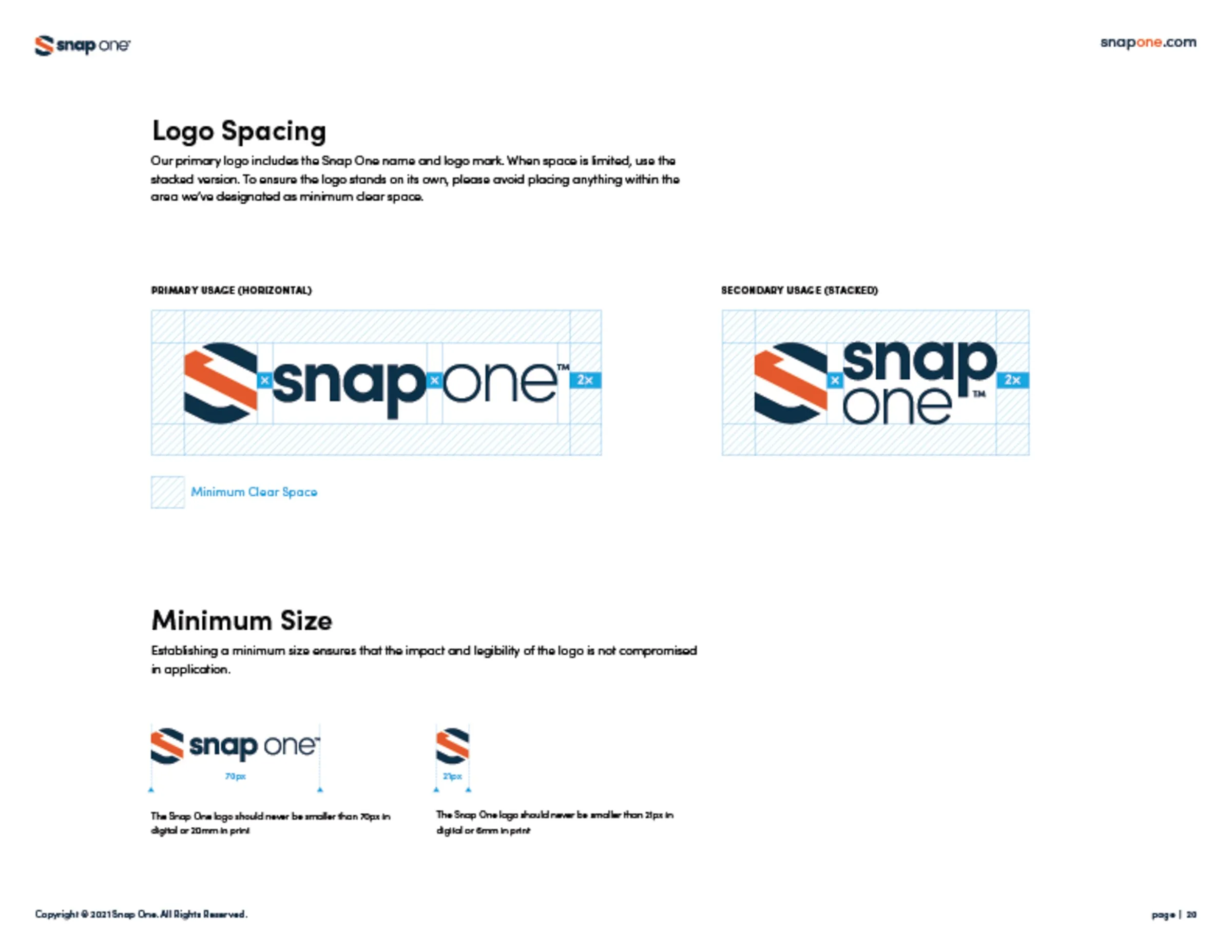
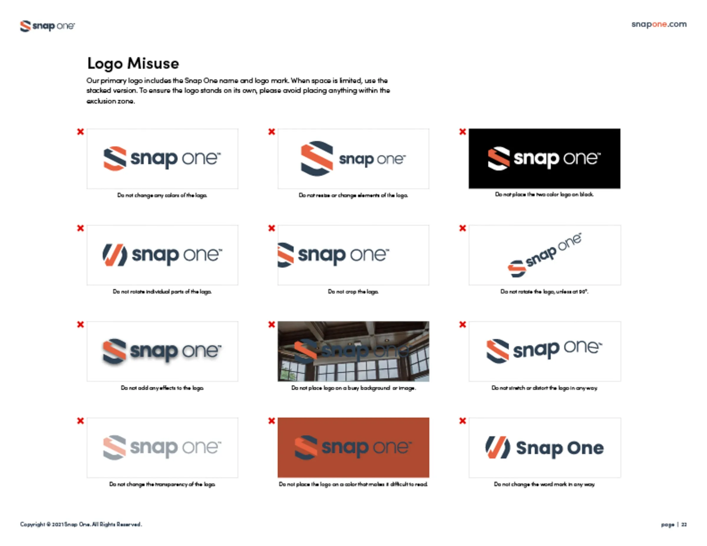
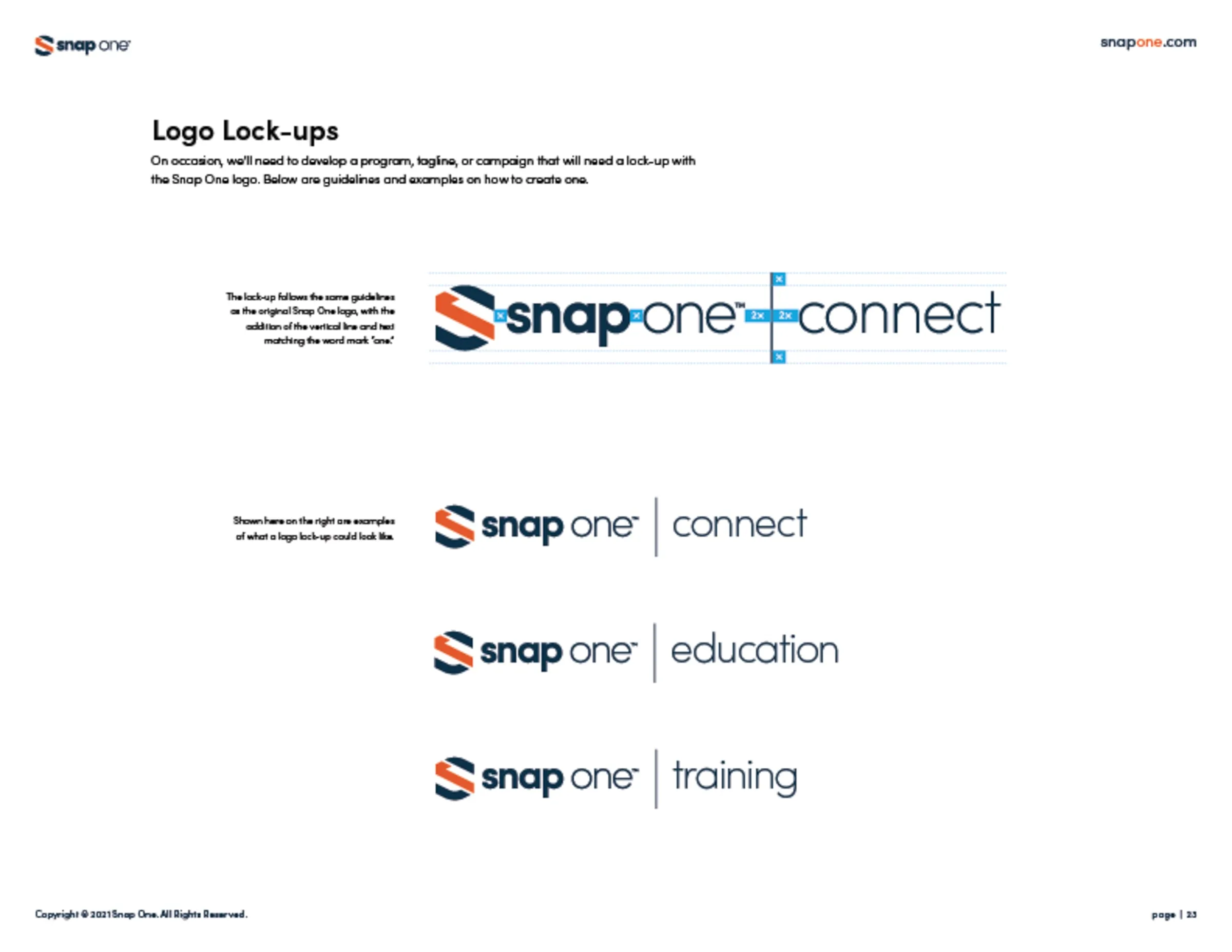
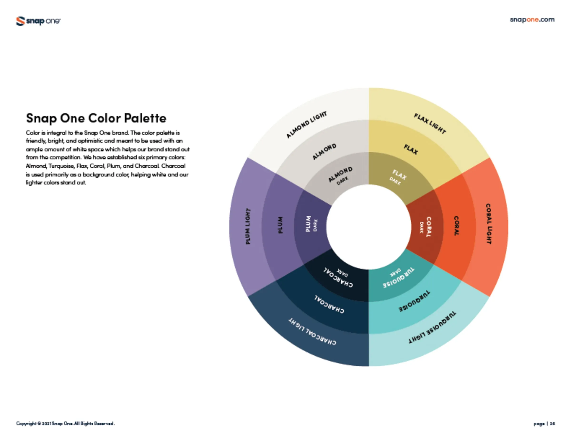
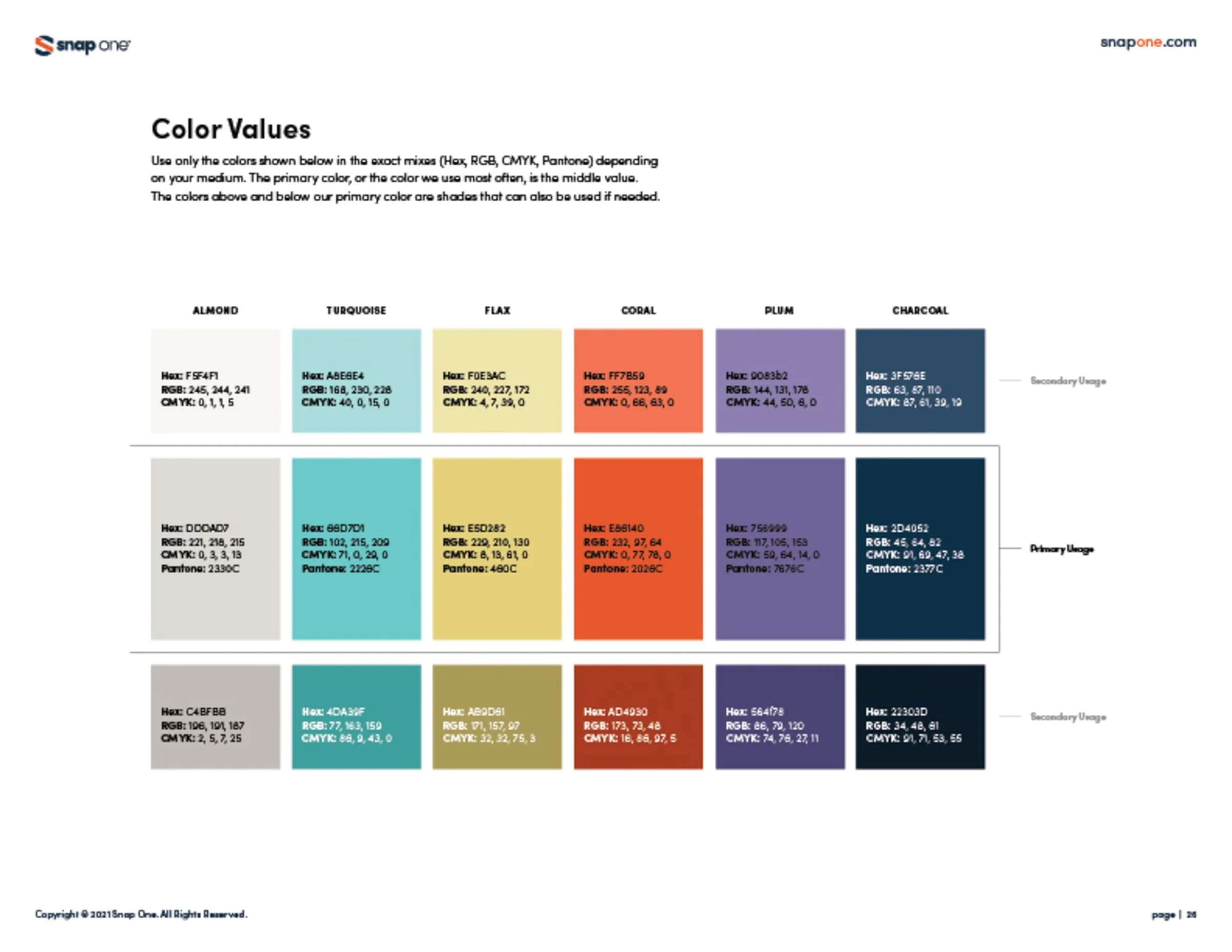
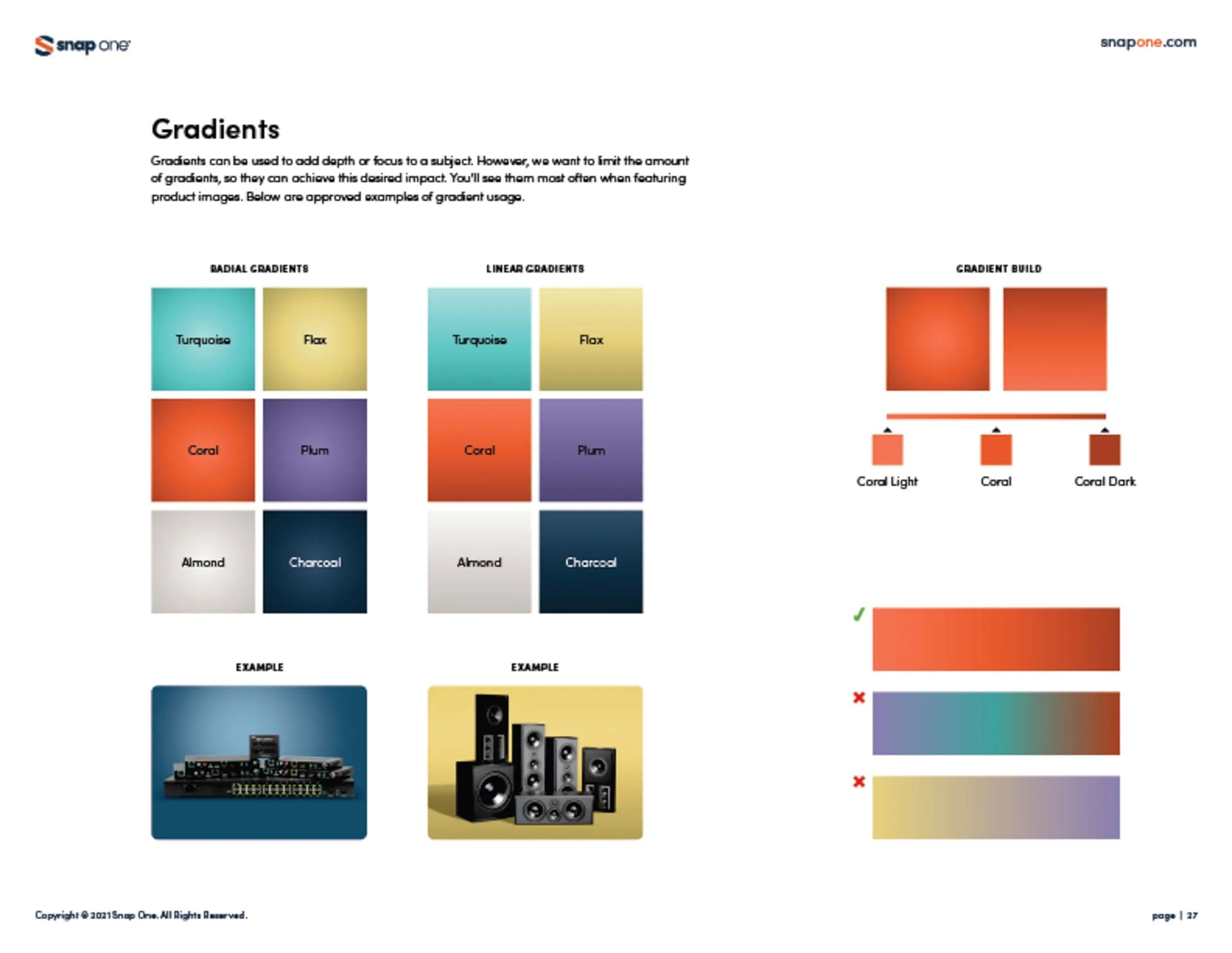
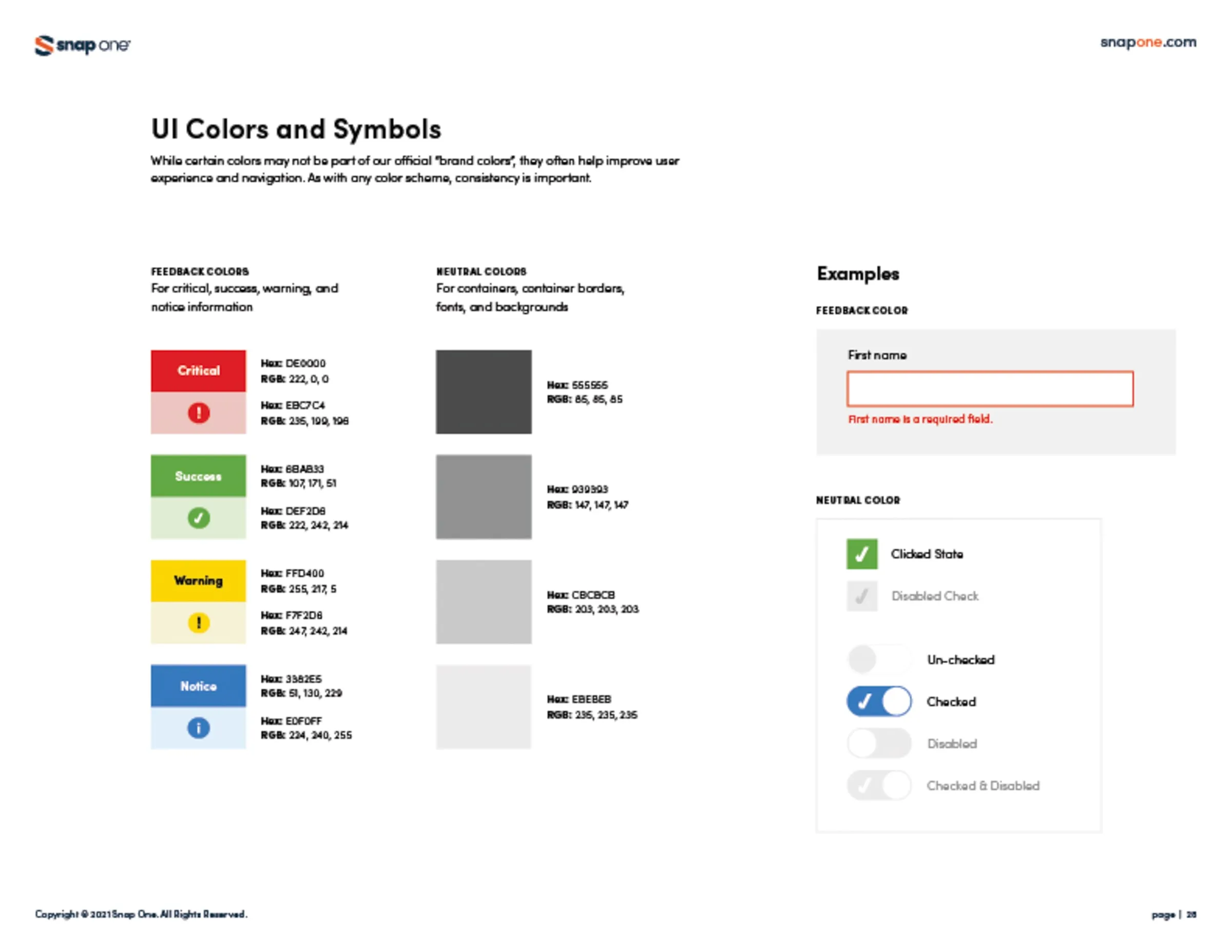
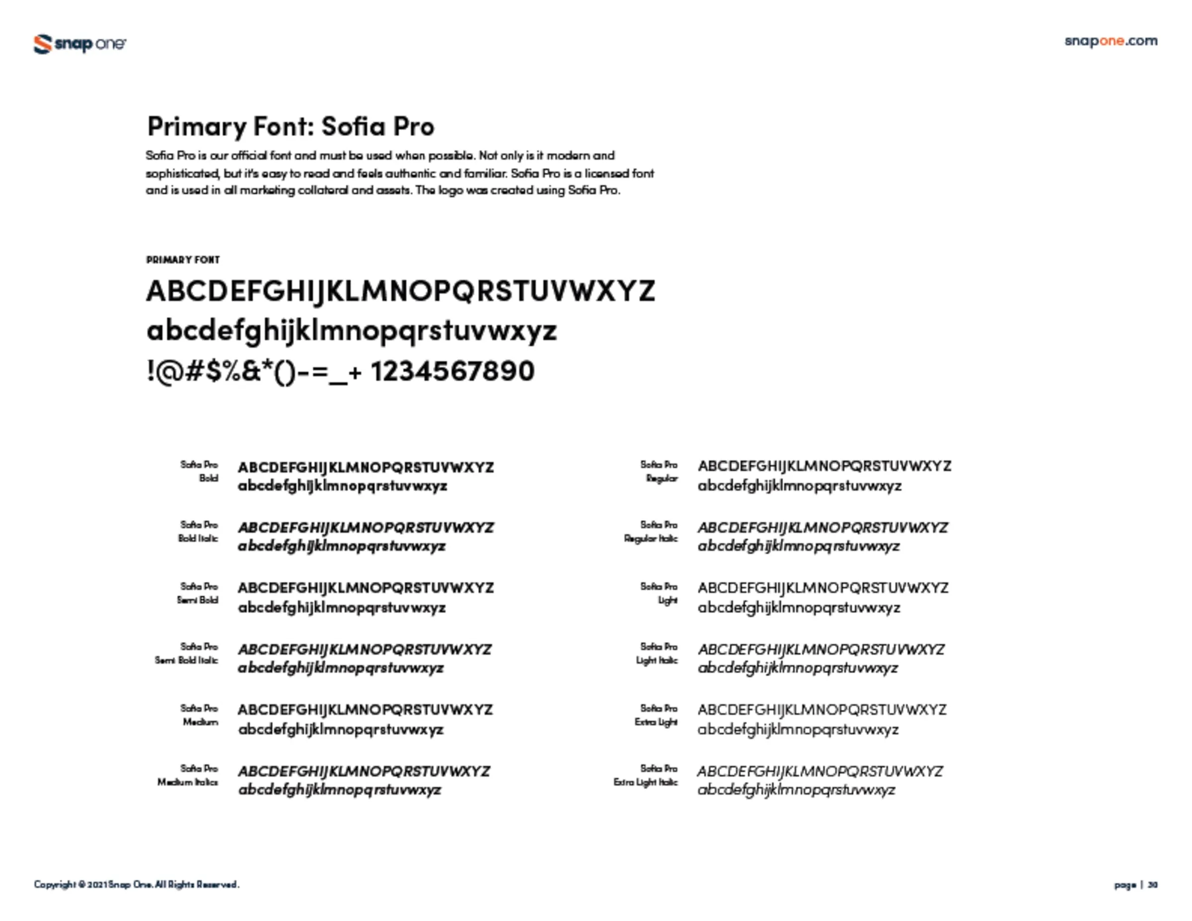
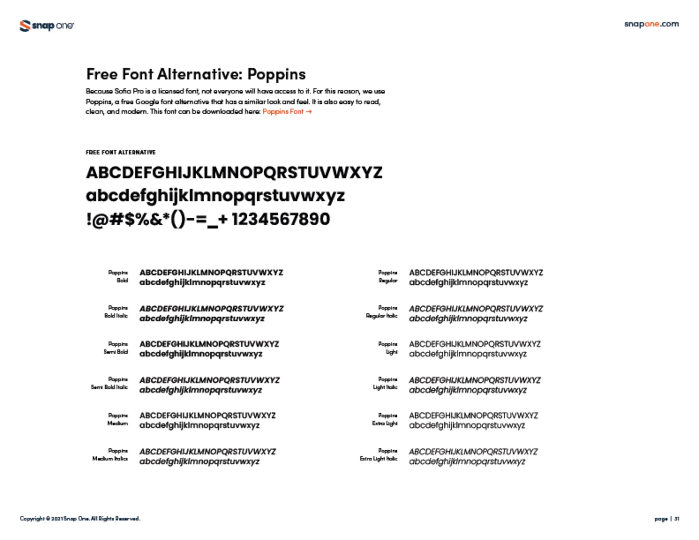
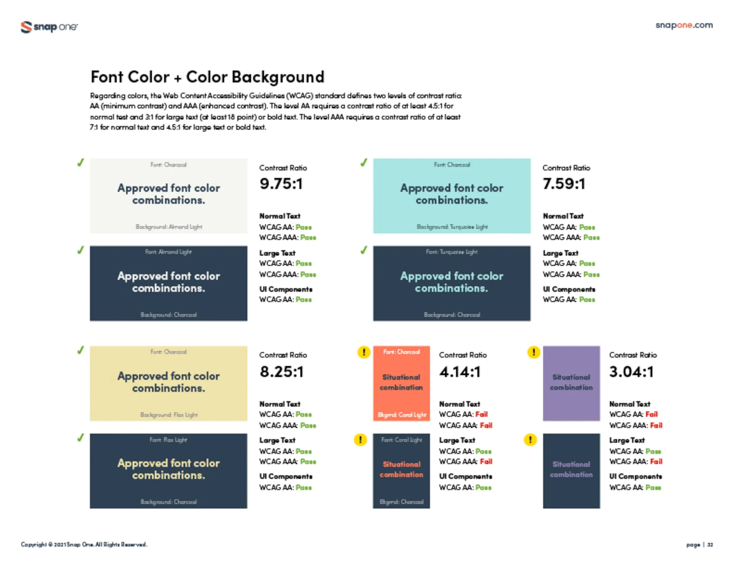
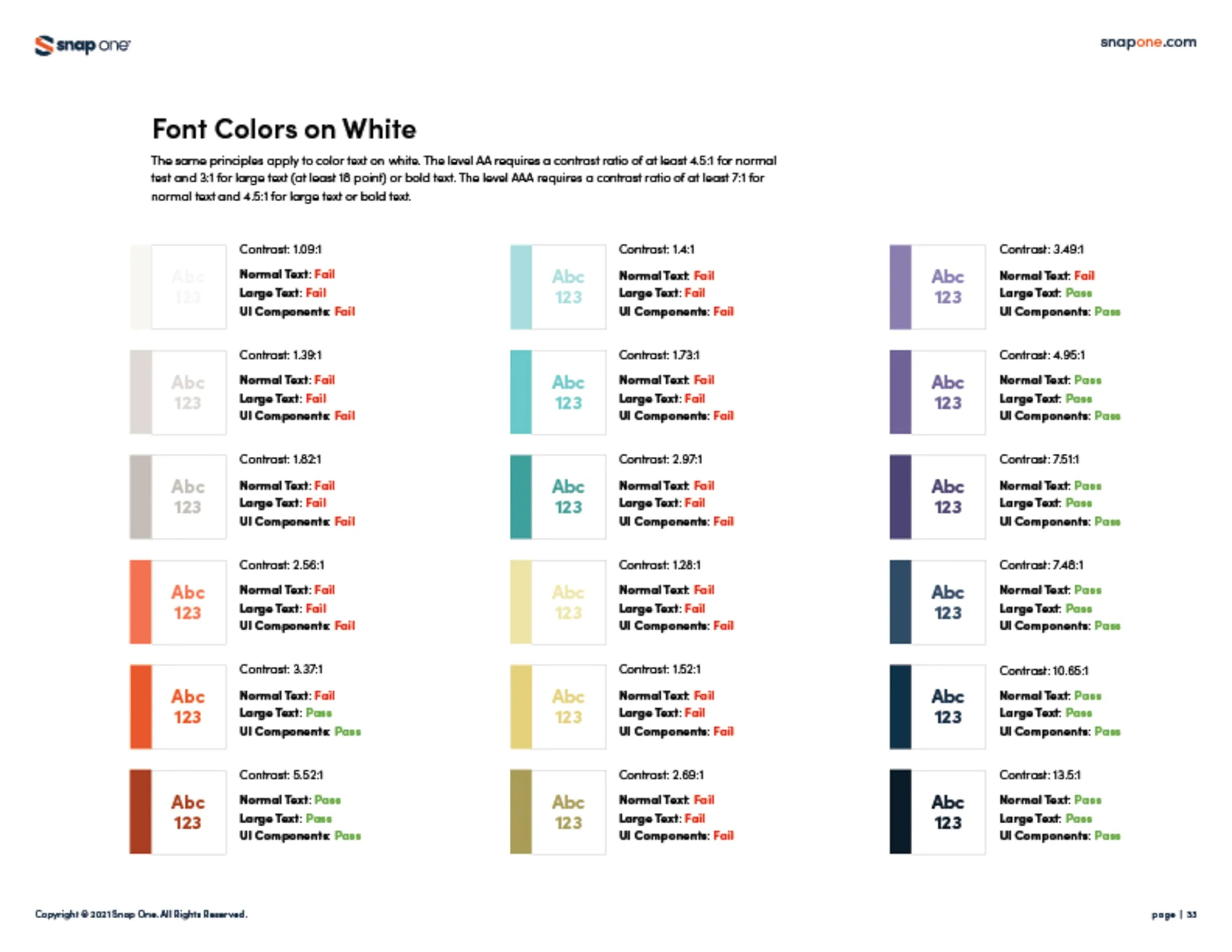
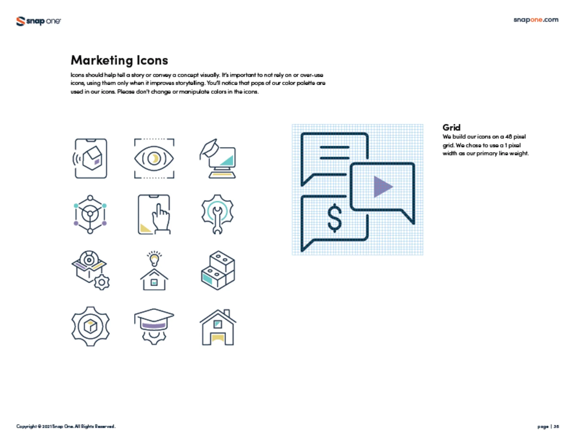
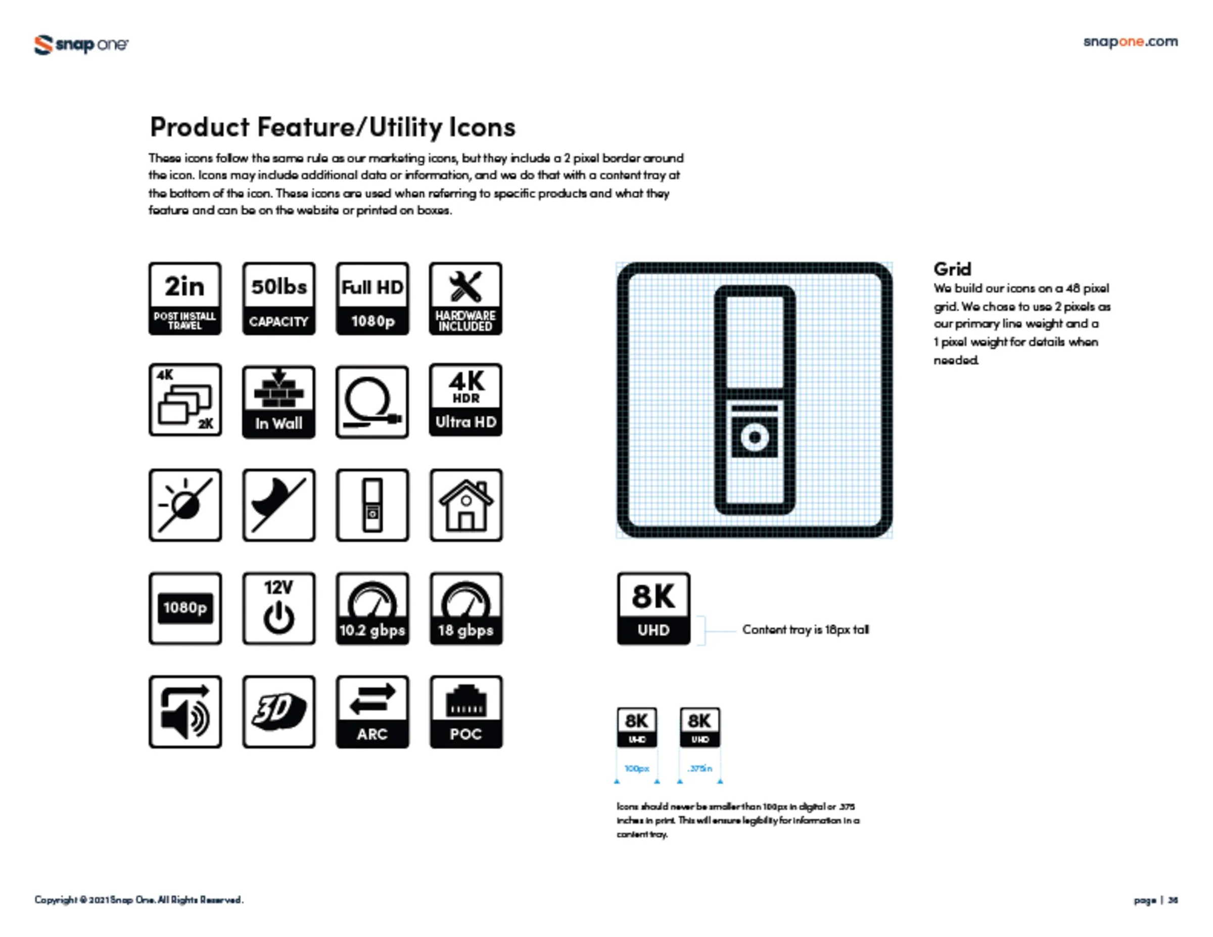
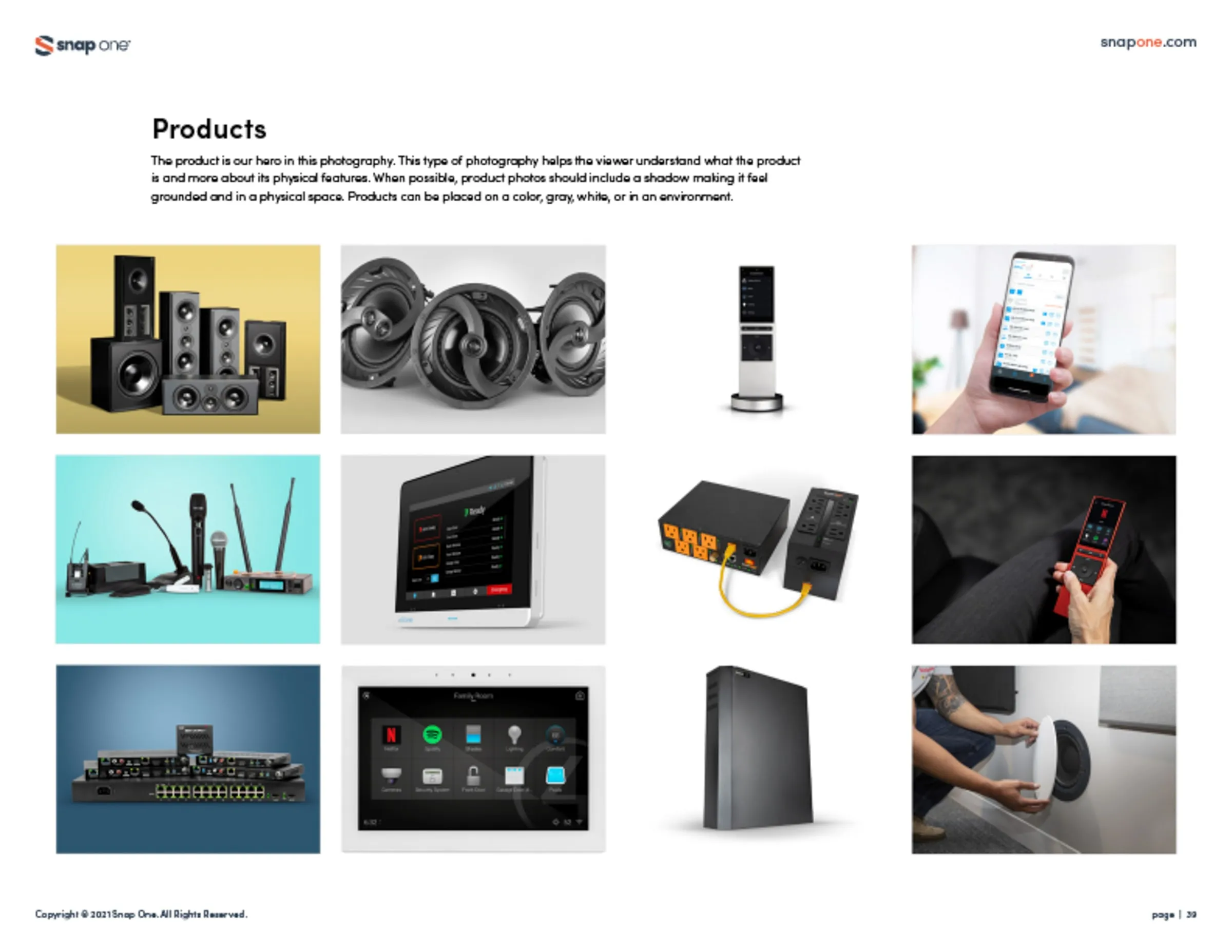
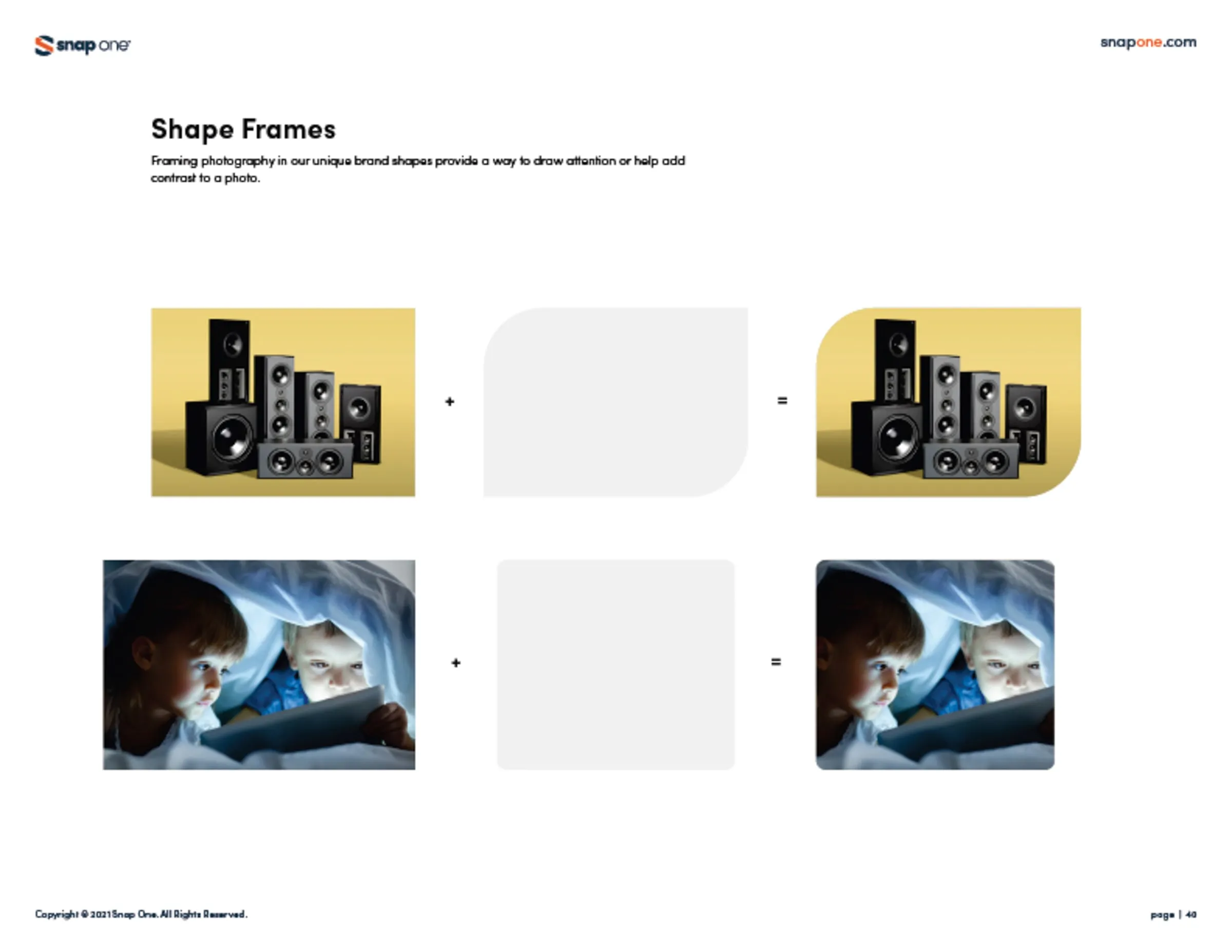
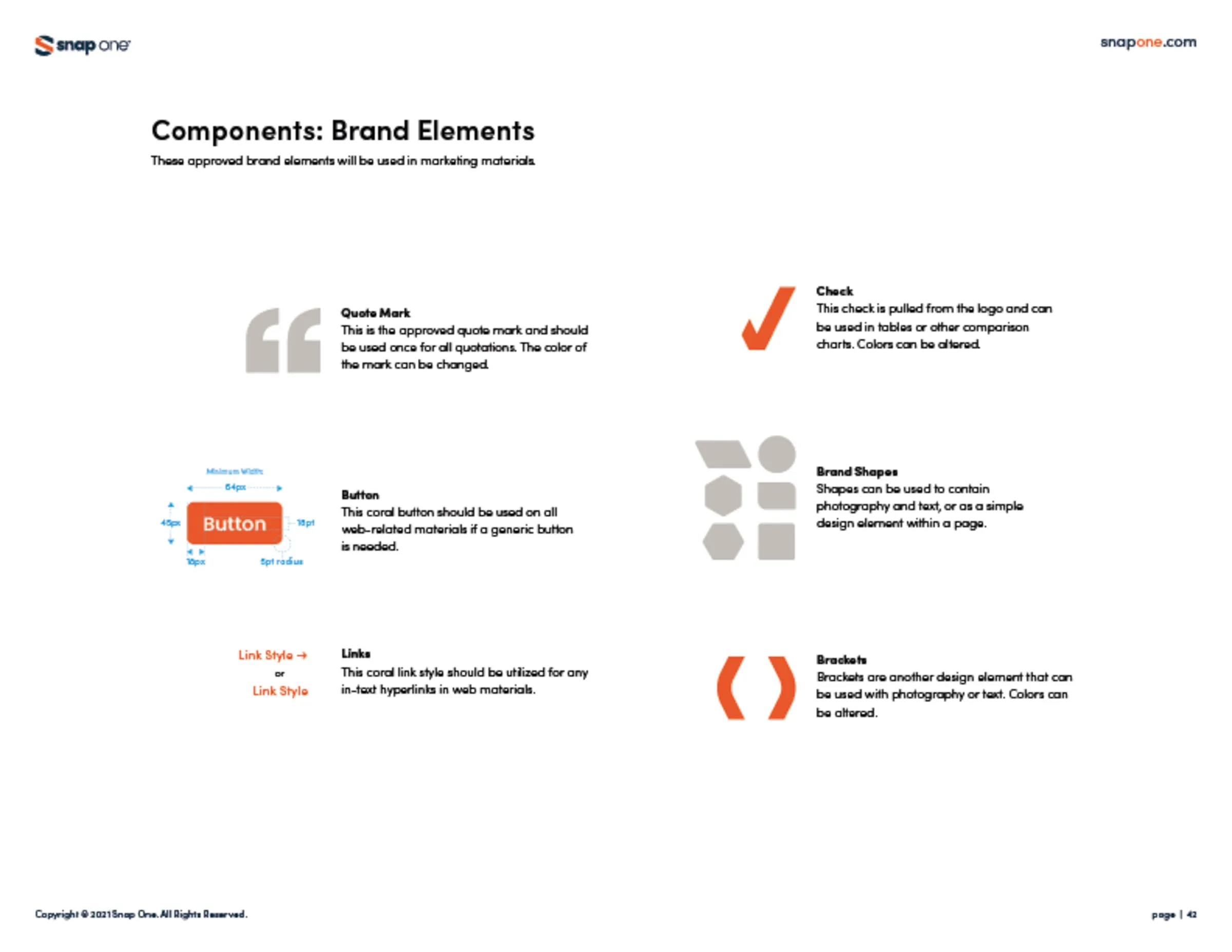
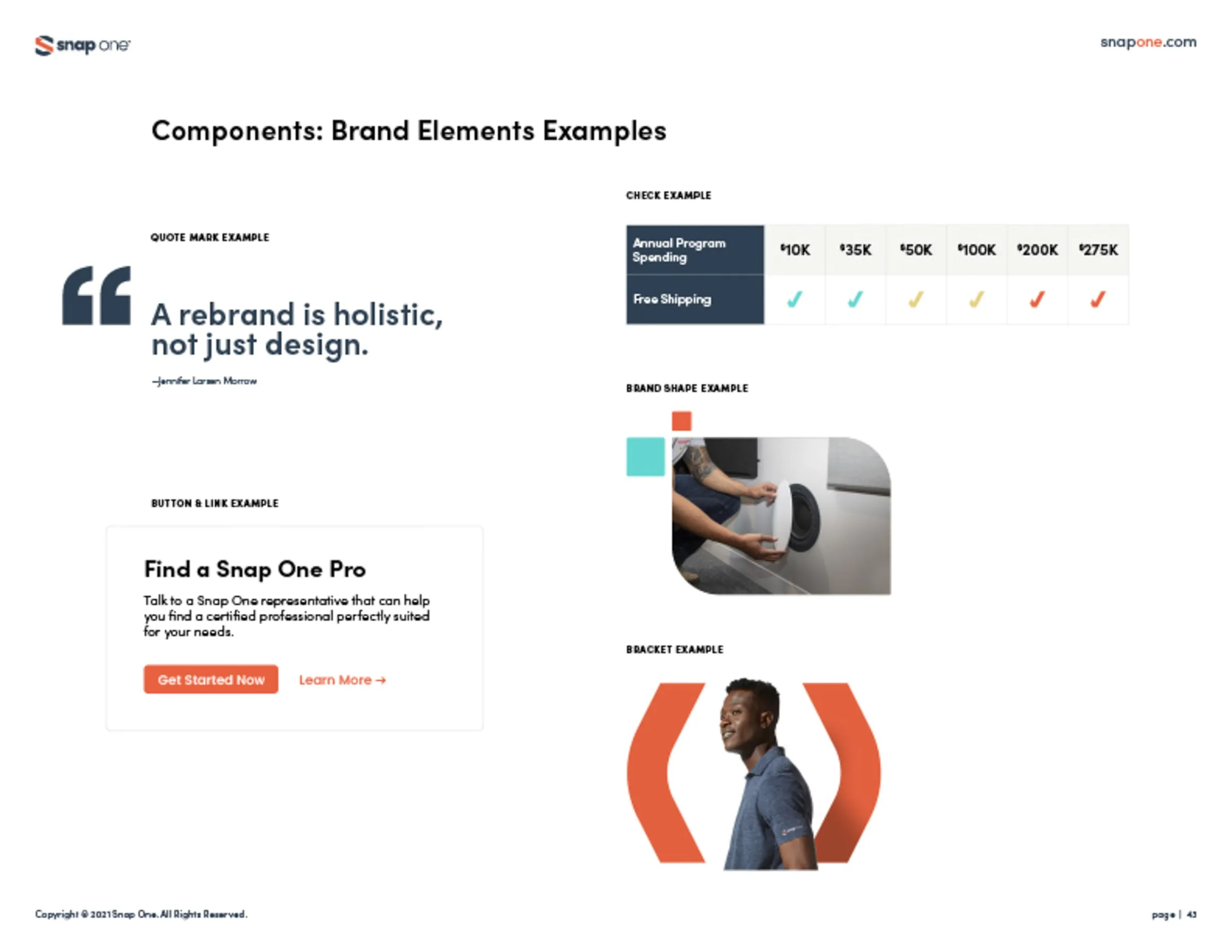
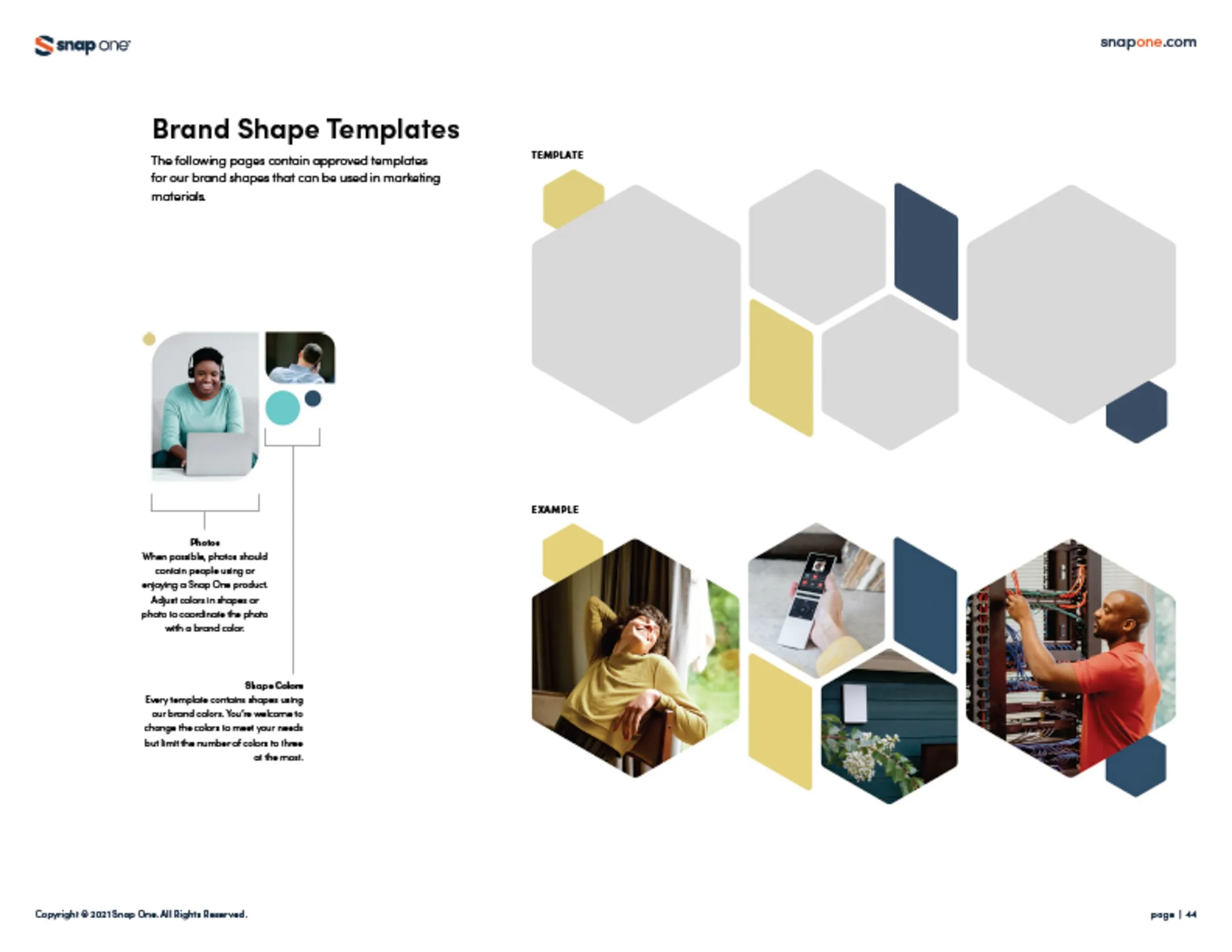
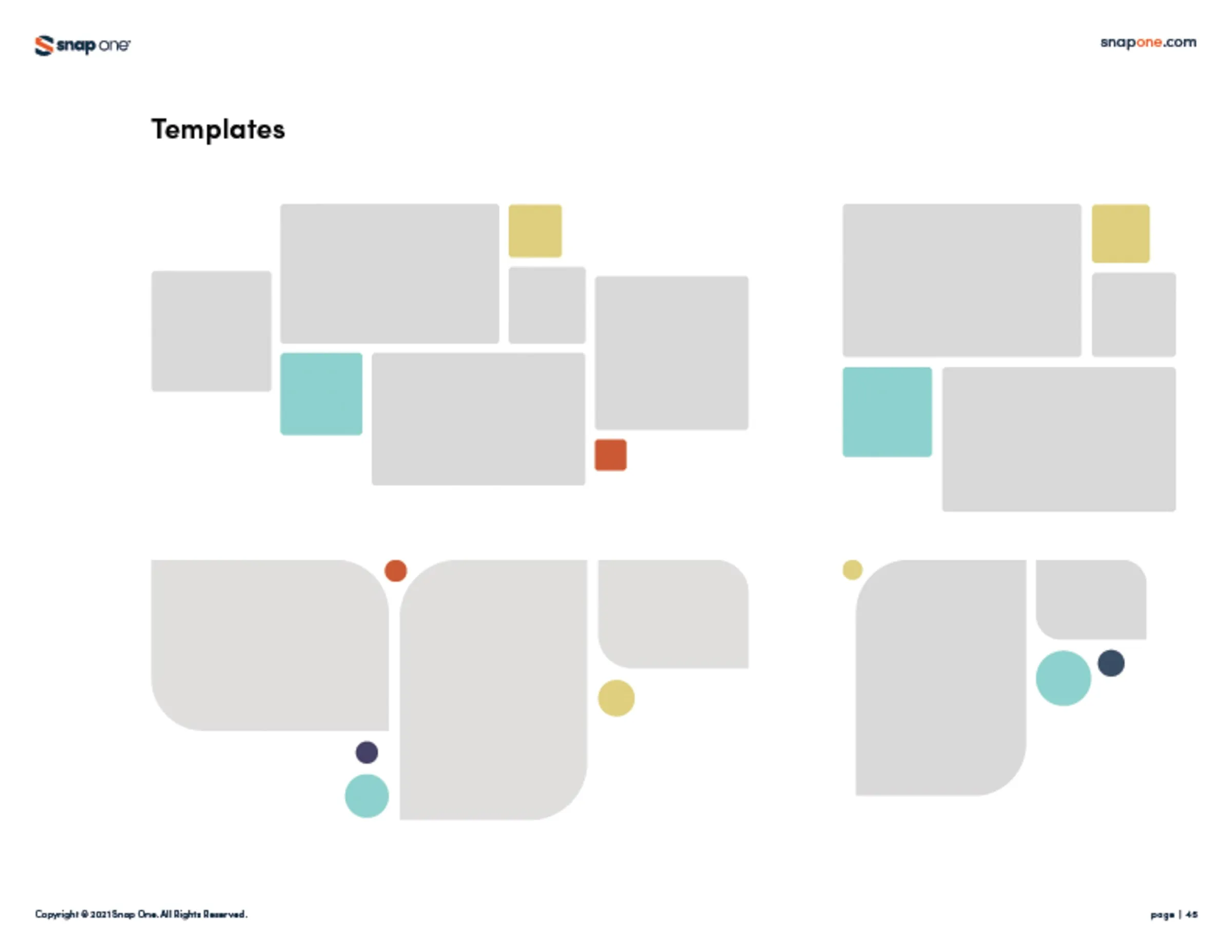
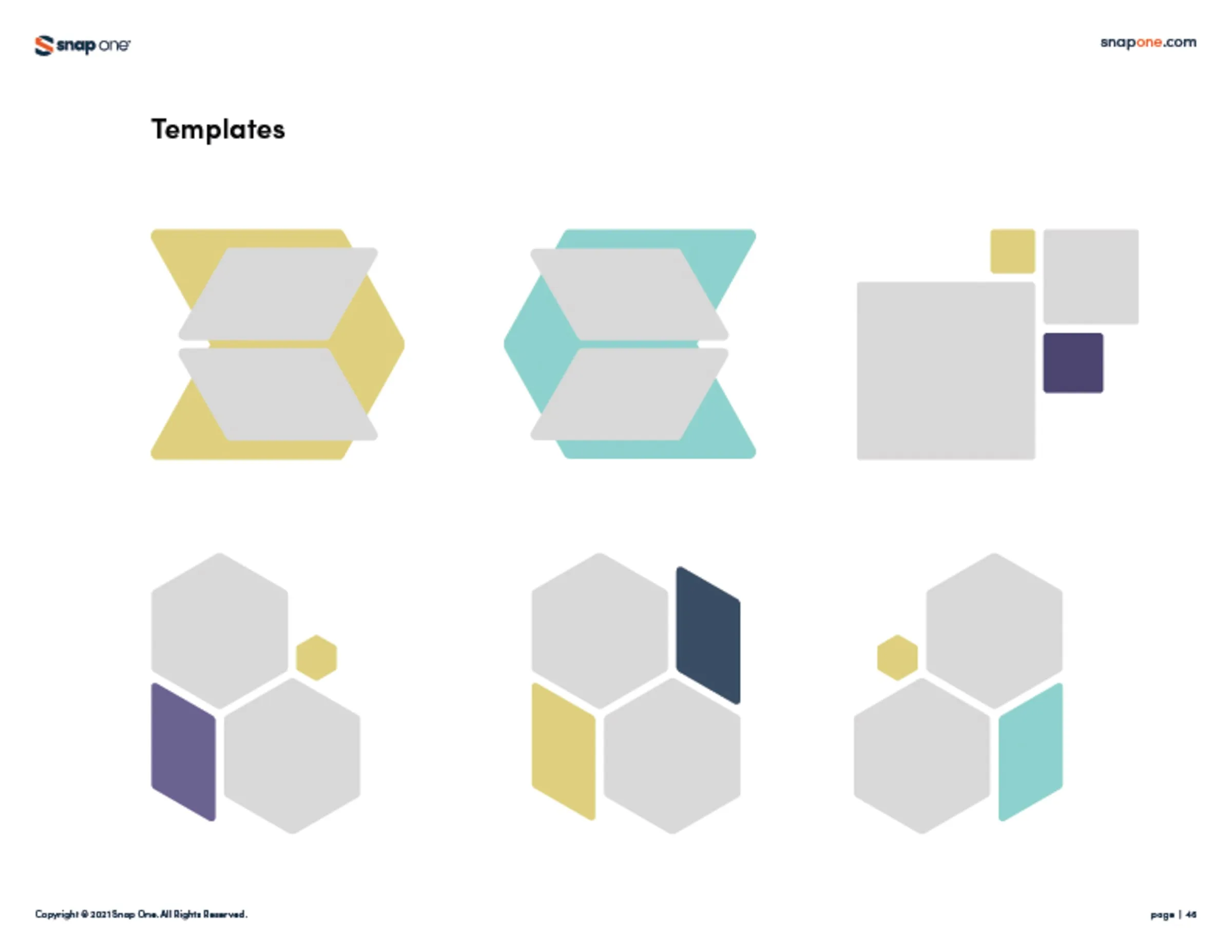
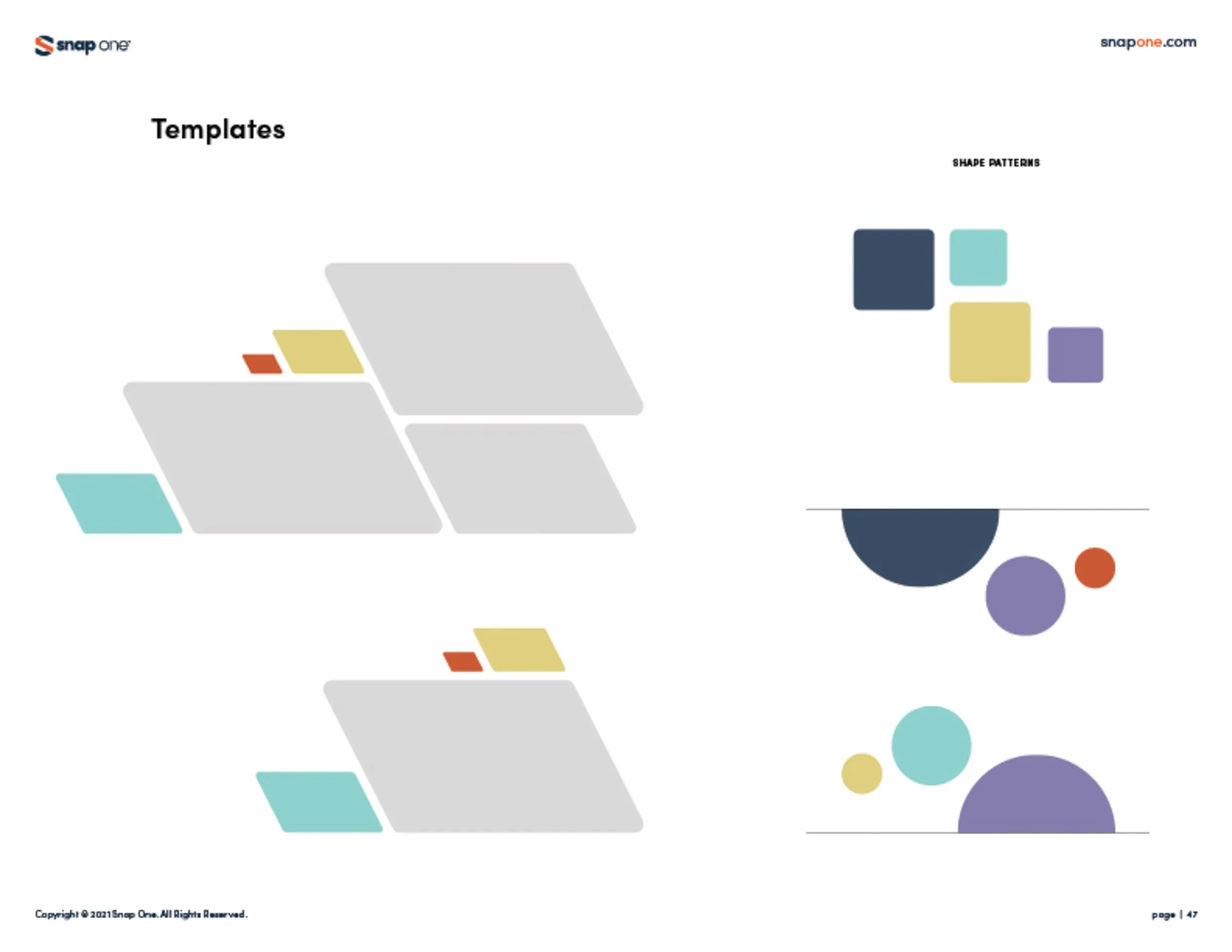
We created the new logo and extensive brand collateral in Adobe Illustrator, InDesign, and Figma. The brand book covers the company story, voice and tone, logo usage, the color palette, fonts, icons, photography, and layout components. We also built a shared brand folder library with every file format and asset, so internal teams and external partners could use the brand correctly.
The result
A complete brand book and design system that the whole company — and its partners — could follow, keeping Snap One consistent across print, digital, and product materials from the day it went public.
The work
 (opens larger)
 (opens larger)
 (opens larger)
 (opens larger)
 (opens larger)
 (opens larger)
 (opens larger)
 (opens larger)
 (opens larger)
 (opens larger)
 (opens larger)
 (opens larger)
 (opens larger)
 (opens larger)
 (opens larger)
 (opens larger)
 (opens larger)
 (opens larger)
 (opens larger)
 (opens larger)
 (opens larger)
 (opens larger)
 (opens larger)
 (opens larger)
 (opens larger)
 (opens larger)
 (opens larger)
 (opens larger)
 (opens larger)
 (opens larger)
 (opens larger)
 (opens larger)
 (opens larger)
 (opens larger)
 (opens larger)
 (opens larger)
 (opens larger)
 (opens larger)
 (opens larger)
 (opens larger)
 (opens larger)
 (opens larger)
 (opens larger)
 (opens larger)
 (opens larger)
 (opens larger)
 (opens larger)
 (opens larger)