WattBox Brand Pages
Summary
A redesign of the WattBox power management brand pages, shaped by interviews with dealers, Datacom, and IT professionals.
- Client
- Snap One
- My role
- Senior Designer
The problem
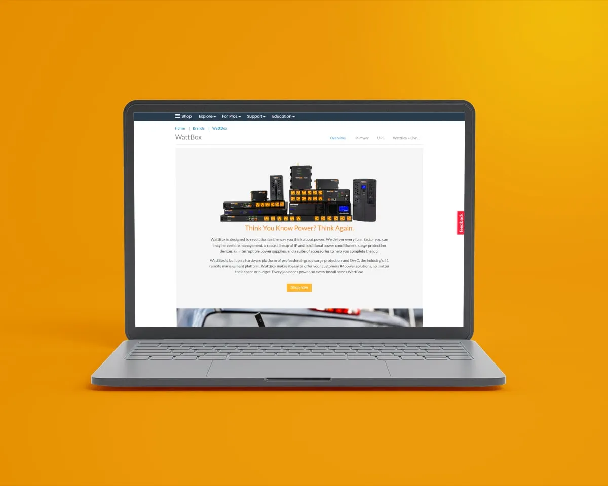
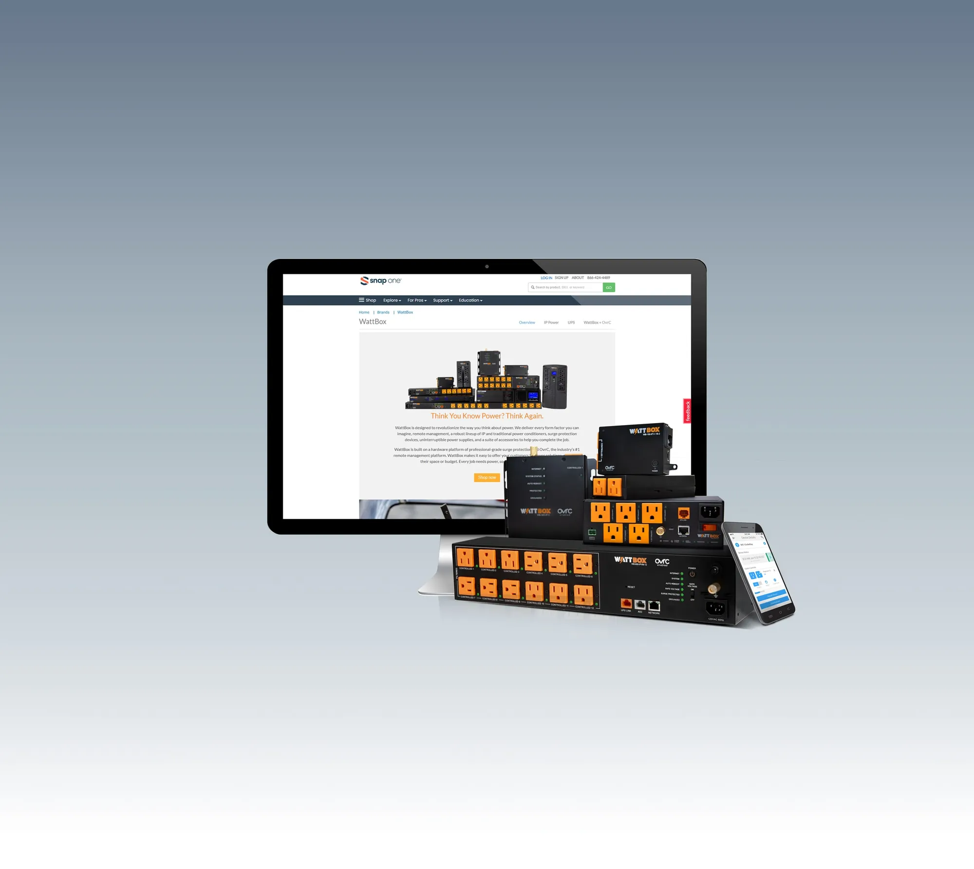
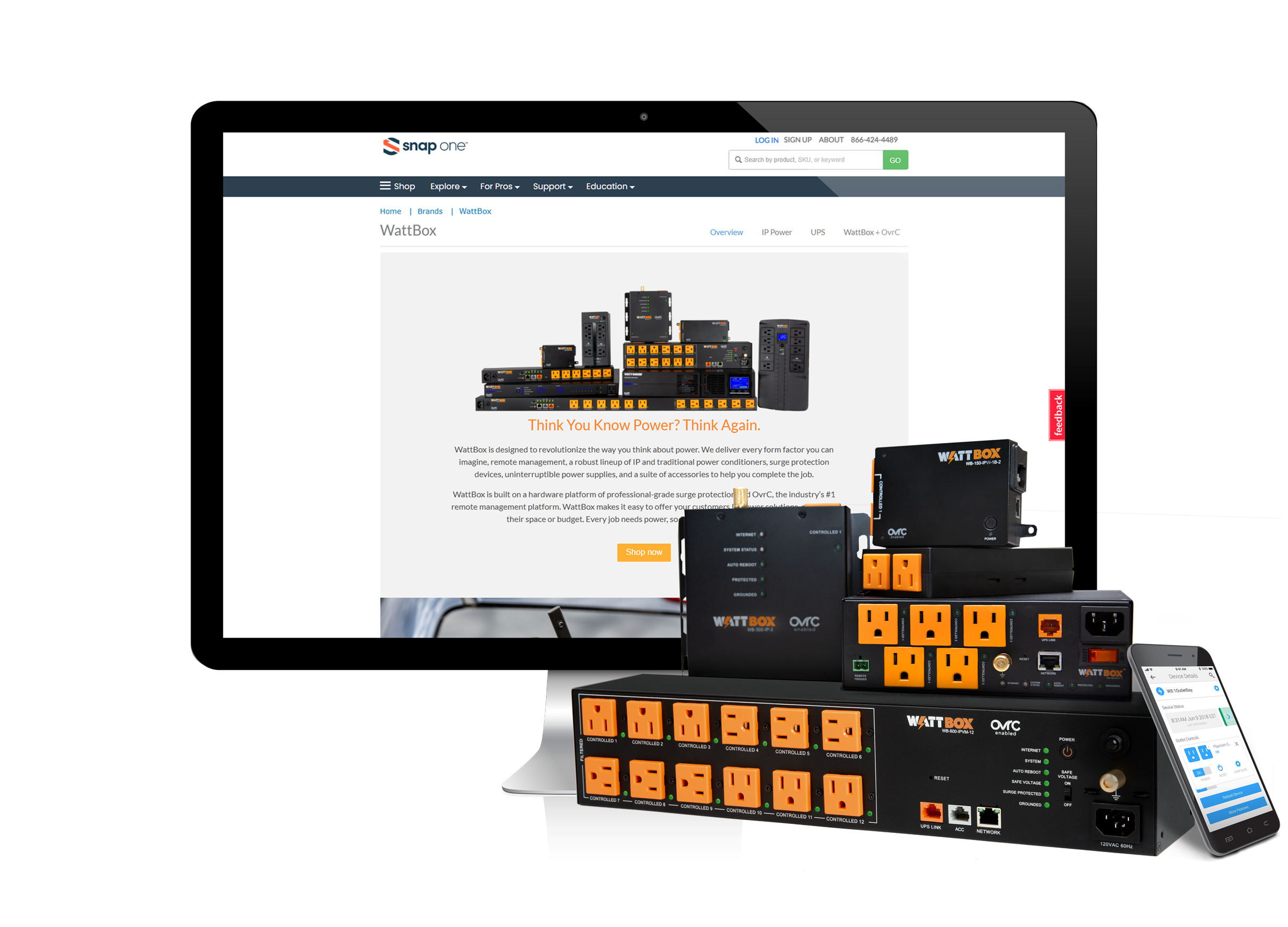
The WattBox product pages were outdated, hard to navigate, and didn’t show off key features or integration capabilities. They didn’t match Snap One’s design standards, which fragmented the experience.
My role
I led the UX and visual design, from interviews and personas to wireframes, high-fidelity design, and testing.
The approach
Interviews. I talked with product managers, marketing, and sales about WattBox’s market position, then surveyed and interviewed dealers, Datacom professionals, and IT experts. Their pain points: complex installation, no real-time monitoring or remote control, worries about surges and overloads, and systems that don’t scale.
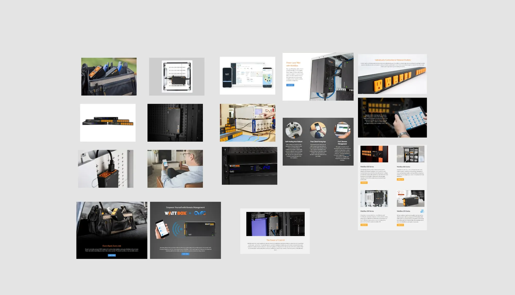
Opportunities. The pages needed to show how OvrC simplifies installation and remote management, highlight real-time monitoring and control, explain surge protection clearly, and show how WattBox scales.
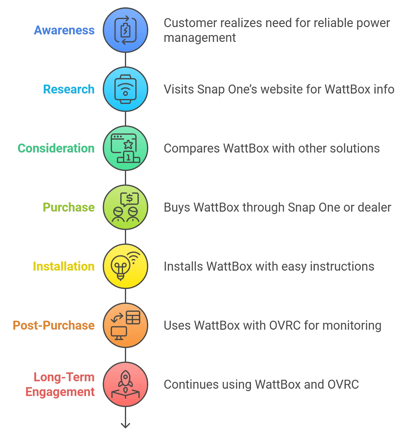
Personas and journey. I created personas for an AV installer, an IT manager, and a small business owner, and mapped the journey from discovery through installation with OvrC to long-term use.
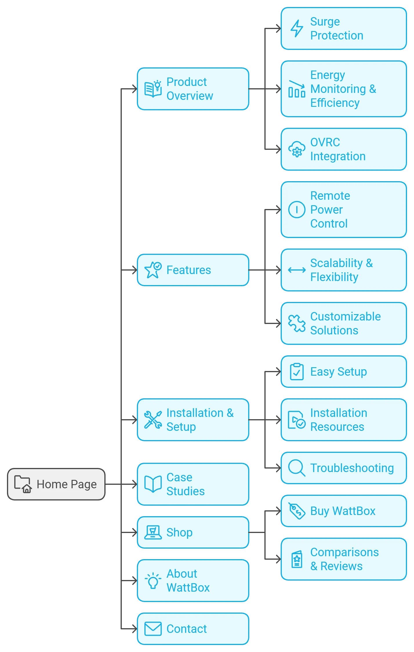
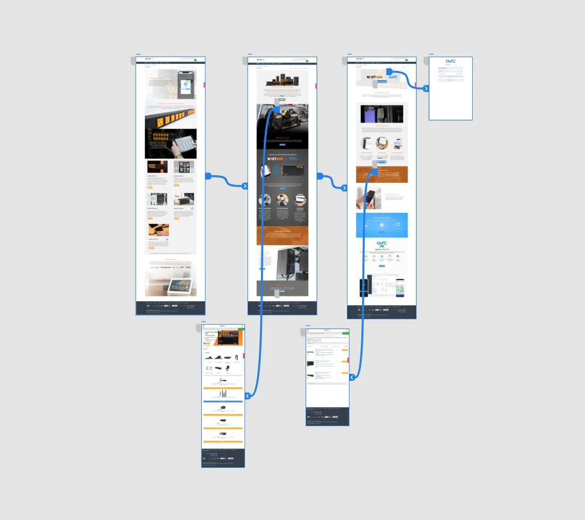
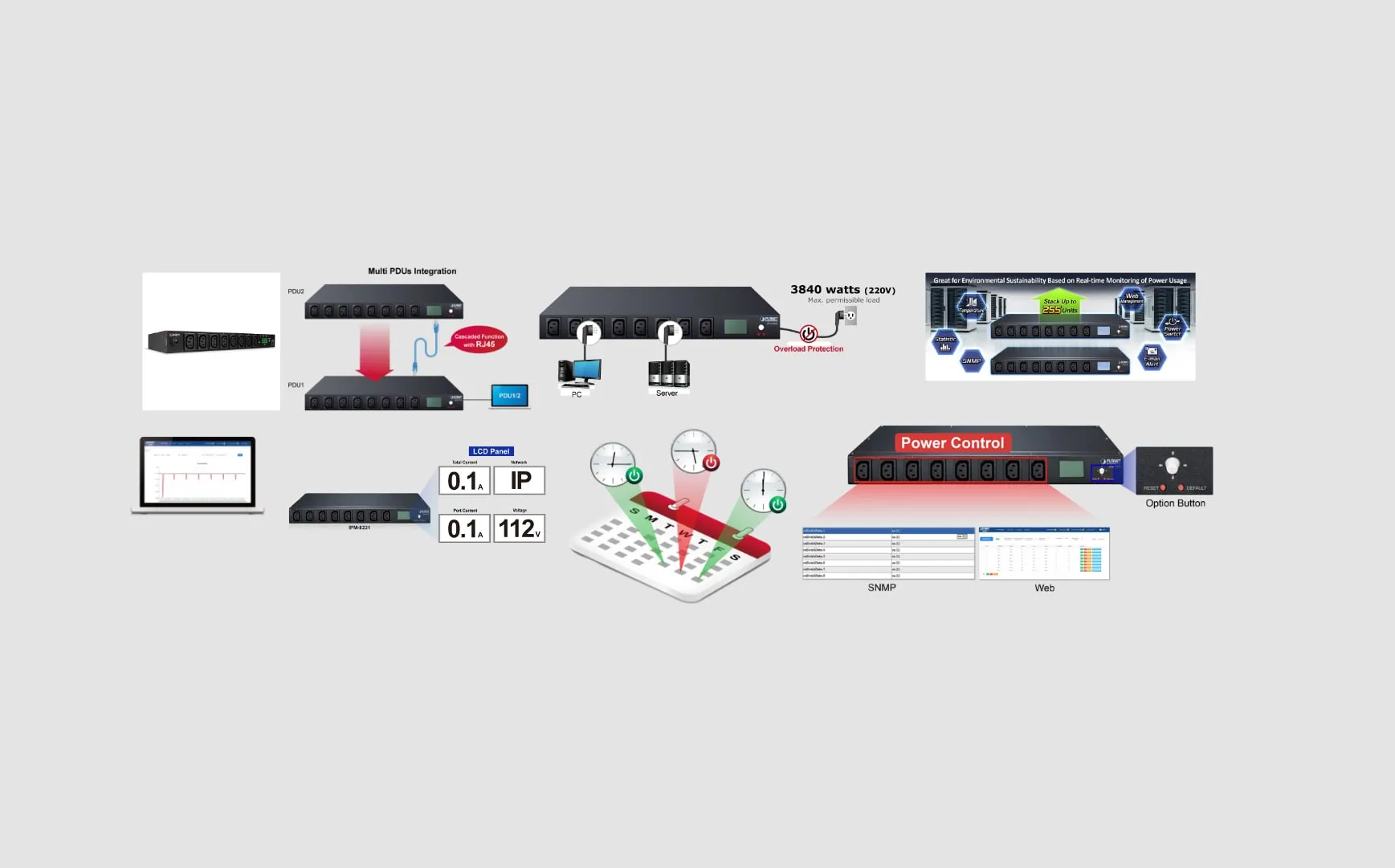
Prototypes and site map. With the copywriter, product manager, and photographer, I sketched rapid prototypes and built a site map, informed by competitor research.
Design and testing. I explored high-fidelity designs aligned with Snap One’s design system and refined them through user testing with product managers, creative teams, and marketing. Accessibility was reviewed with the development team.
The result
The redesign simplified navigation, made products easier to discover, and highlighted features like OvrC remote monitoring — improving customer satisfaction and engagement with the Snap One ecosystem.