Luma View App Icon
Summary
A redesigned Luma View app icon that ends confusion with older apps and stays clear across iOS, Android, and desktop.
- Client
- Snap One
- My role
- UX and Visual Designer
The problem
The existing Luma mobile app icon looked too much like older-generation apps, confusing users and making the updated app hard to identify. The brand needed a distinct, modern icon that reflected the app’s advanced features and stayed consistent with Luma.
My role
I led the redesign: interviews, research, icon design, mockups, and cross-platform testing.
The approach
Interviews. I talked with product managers, marketing teams, and designers about the audience, core functionality, and brand, and interviewed current and potential users about how they used the app. They asked for an icon that is easy to spot on small screens, uses modern high-contrast color, signals advanced features like AI-filtered events, and still feels like Luma.
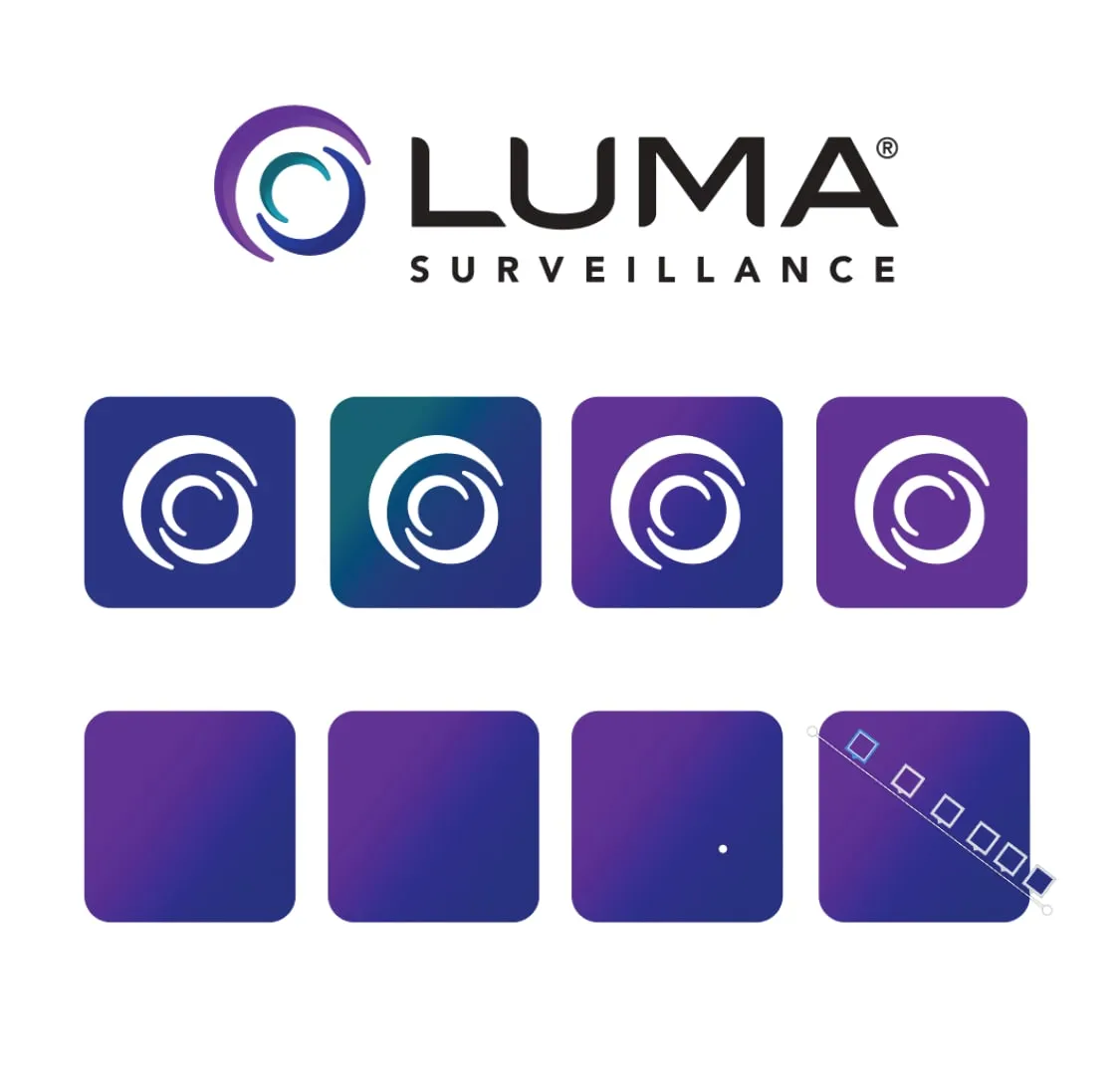
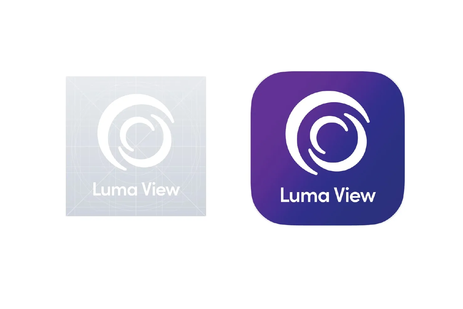
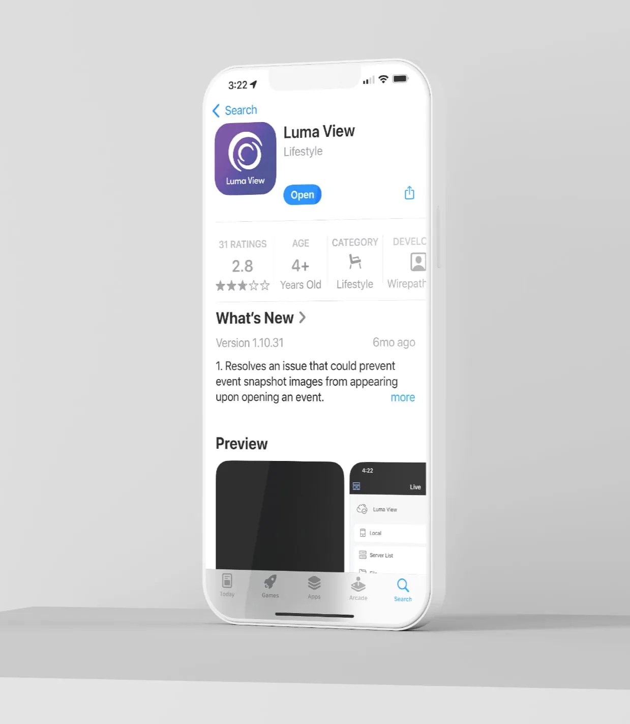
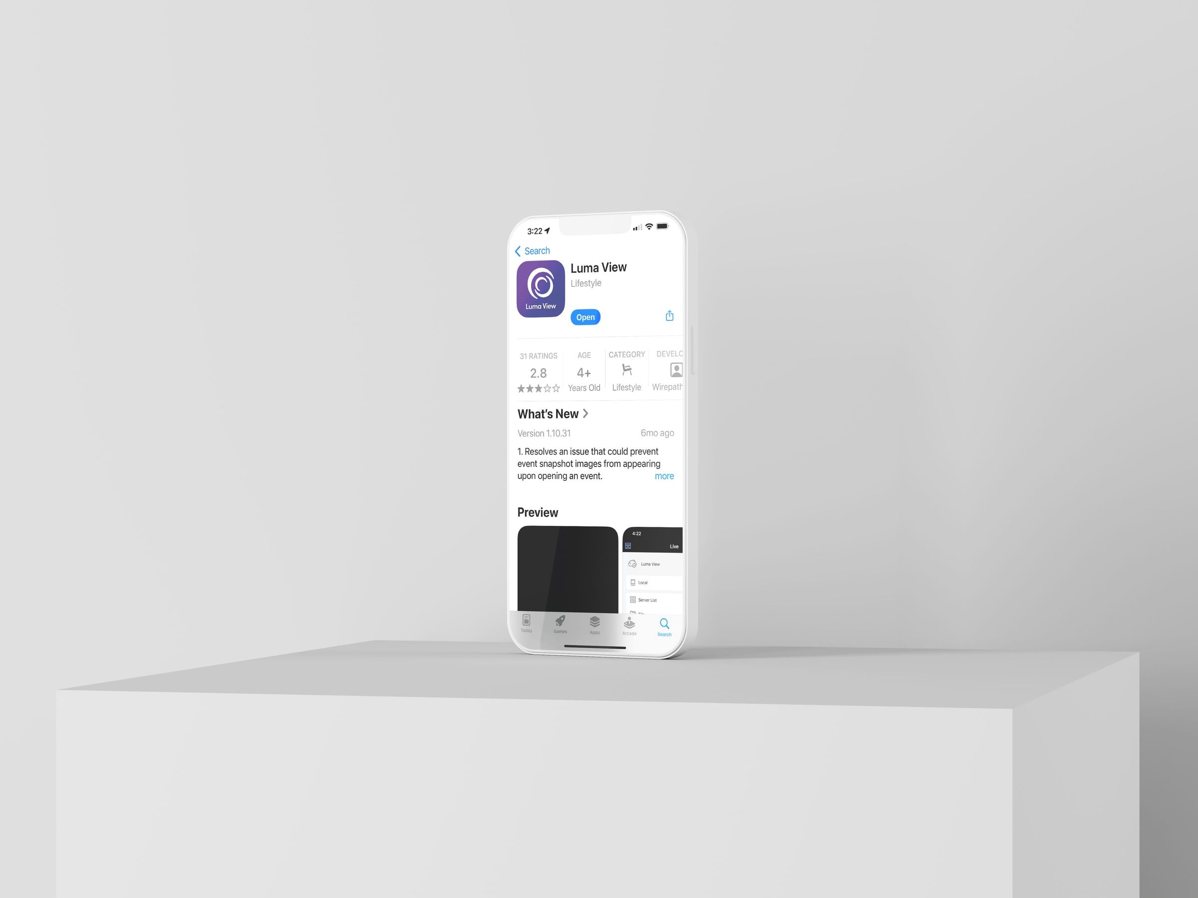
Design. The new icon uses Luma’s primary and secondary colors in a purple-to-blue gradient that stands out on many backgrounds. I followed Apple’s Human Interface Guidelines for spacing, aspect ratio, and scaling so it displays correctly from iPhone to iPad.
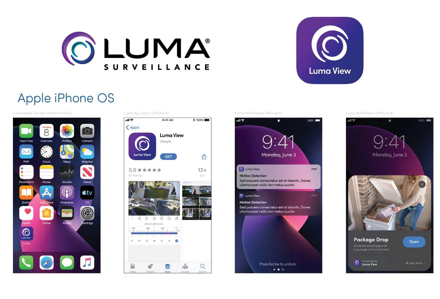
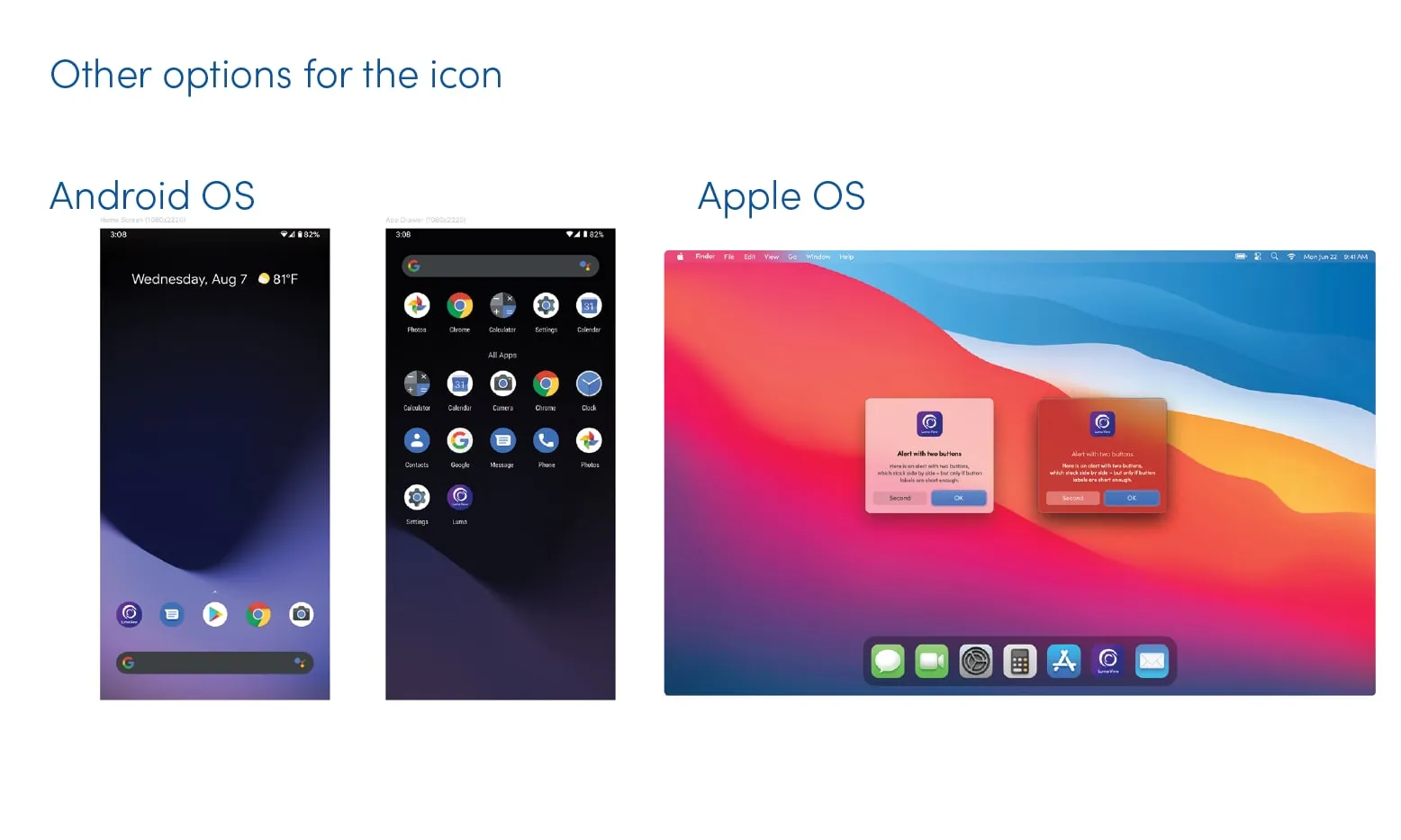
Mockups and testing. I created high-fidelity iPhone mockups to see the icon next to other apps and on different backgrounds, then tested it on Android and Apple desktop platforms to confirm it stayed clear and recognizable.
The result
The new icon improved brand recognition and the user experience, with clear visibility and consistent display across devices and platforms.